Hello!
I am a student, beginning to learn InDesign techniques to create magazine spreads.
Any critiques would be greatly appreciated, thanks for your help!
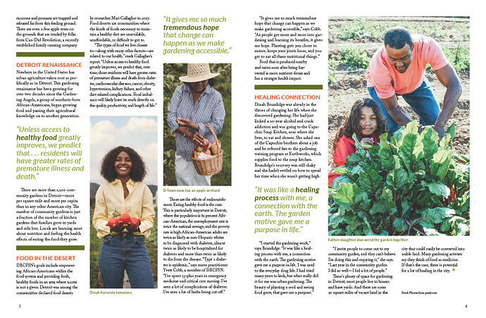
After a quick glance, I would suggest making the copy less scattered. Don’t make the reader have to jump or guess where the next paragraph starts – make it easy. I’m speaking specifically about the second spread first page where the two images meet. Would it work better if the images were side by side? Do you even need two images of woman holding fruit?
Also, never underestimate the power of white space. You don’t always have to fill the entire spread. Maybe you could open it up by removing the bold green bars between each section. You already have separation with the orange type.
Best of luck.
Every so often, we get a student asking us to critique a magazine spread. While your spread isn’t at pro-level (which I wouldn’t expect from a student), I would say it’s better than a lot of what we see.
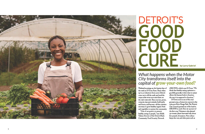
– Make DETROIT’S, GOOD, FOOD, and CURE all the same width.
– General comment on both spreads would be that the text feels heavy. Maybe that’s just the rendered JPEG. Consider reducing the size of the body copy (leave the leading where it is at first and see how that looks). You might also look for a visually lighter font.
– Subhead on the intro spread seems crowded. Reduce the size and give it a little more leading. What if the green bar were taller and you reversed the headline out of it? Also, have the green bar wider so that it overlaps the photo for a bit of visual interest. Respect the grid, but it’s okay to bust the grid when it’s called for.
– I agree with @BenBerryBiscuit’s comments. The text on spread two seems a little choppy. Fixing the visual weight of the font as mentioned previously will help, but I’d still spend some more time working on this. Fewer pull quotes, really just one of this spread would suffice. Maybe reverse the pull quote in a green block to tie back in to the change I suggested for the intro spread. Use the green blocks as more of a design element. As it stands, the green bars, the pull quotes, and the photos are all saying “look at me!” and the result is a bit chaotic.
– Look up “hanging punctuation” and use it in your pull quote.
Give it some air.
Are you saddled with a specific word count? That could be the reason your page two layout looks a little “busy.” If so, I would use a body typeface that is a bit thinner. That would help with the busy look. Great job for a student so far!
I agree with BenBerry… it’s got some issues… but it does have a level of design applied that is apparent, so better than a lot of what gets printed. That said, it does seem pretty frenetic… it’s not immediately soothing to look at… It almost looks daunting. I agree with opening it up, giving it more space and let it breathe. This comes down almost entirely to typography. It appears the body copy is probably heavier than it needs to be… so you might consider scaling it down and hair and looking for some negative space somewhere. I would also consider breaking the grid with a paragraph or a quote. I’m a fan of the a three column grid… but spanning two columns on a pull quote, for example, creates a nice visual break. But mostly, it feels dense. See if you can find some breathing room.
I’ve spent a considerable part of my career designing magazines, newspapers, and other publications, so I have difficulty looking at two spreads as something apart from the design of the entire publication. Doing so is a little like judging a painting after seeing only a small corner of it.
Each publication has a basic design and personality that is consistent throughout the magazine. This includes typography, column widths, underlying grids, headlines, subheads, cutlines, bylines, color schemes, pullout quotes, and other items. Just as important, a publication’s style guide also states which instances warrant deviating from the standard style and to what extent. For example, important feature pages should grab attention more than the jump pages.
As a student, I understand this is likely a school assignment. However, it’s crucial to design spreads while keeping the overall magazine design in mind. This approach ensures a cohesive and visually appealing layout. While your assignment may not be to design an entire magazine, thinking in those terms is still beneficial.
All that considered, you might already be considering these prerequisites (consistent column grids, standard typeface, etc.), which put you ahead of most magazine layouts other students have posted here.
As others have pointed out, your second spread seems cluttered. Still, I can envision situations where a specific and higher-profile story composed of discreet sections could use the appearance you’ve given it. However, this cluttered look with the heavy bars and excessive pullout quotes would never work across an entire magazine, but as a featured story, maybe so.
However, I don’t think your lead headline composition is working. The ends of the stacked words create an odd diagonal, and the negative space to the right comes across as simply leftover space instead of a design element. Similarly, the empty three lines at the end of the story come across as just that — leftover space. In addition, there are no credit lines beside the photos and no publication name and issue information at the bottom, as most magazines have.
Several people have mentioned putting more air into the layouts to make them less dense and heavy, but this can be problematic. Airiness can be an important design element, but not simply leftover space. However, most magazines, especially newspapers, are jam-packed with stuff. Publishers think of space as money. To them, airiness and open space often appear gratuitous and wasteful. Similarly, editors think in terms of the stories, so open space to them means short-changing stories that might need trimming to make room for that space. Probably half the arguments I’ve had with editors involve using open space.
Thank you for all of the responses, there is so much to learn from here. I greatly appreciate the time you’ve taken to share your expertise! Taking it all in and will apply it to much more than this initial project going forward.

