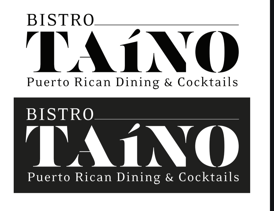
I designed this logo for a restaurant near me. They wanted a monochrome logo that was clean and straightforward.
But, I can’t help but feel it’s still missing something. Any suggestions?
Font is list pencil.
Any feedback would be greatly appreciated.
Thanks!
I’m still very much an amateur in design, however something about the TAINO strikes me as wrong. It is mostly the font for me, the disconnected elements of the letters as well as the very tiny horizontal line in the A, stylistically it is nice but readability isn’t.
-If you are set or constrained by that lettering, you could potentially offset the visual complexity by increasing the white space above/below the TAINO.
-Add another line below TAINO to better frame the name of the restaurant.
-I would also increase the weighting of any separating lines used because all of the rest of the typography seem very bold, and the black/white contrast is probably not helping here.
Well anyway, take my feedback with a grain of salt. That is just how I would experiment with this to make it more refined and visually coherent.
List pencil? What is that? I can’t find a typeface by that name.
I mostly like the letters. They’re distinctive and still quite readable. I’m wondering about your use of the lowercase í. I can understand why you didn’t want the acute mark raised above the cap height, but why did you make it lowercase? I’m not even sure this bothers me, though — it might be part of the logotype’s distinctiveness.
If it were me, I’d remove the thin line after BISTRO. It’s already a hairline, so reducing the logo even more will create issues with the line. I’m never a fan of letterspacing lowercase type, so if it were me, I’d reassess the tagline. For some unknown reason, letterspacing uppercase doesn’t bother me. Have you tried a contrasting sans-serif font for the tagline?
Even though they asked for B&W, if it were me, I’d still work up a color version using colors appropriate to Puerto Rico and the Caribbean.
All that said, my most important comment is that I like the gist of it but would experiment with a few modifications.
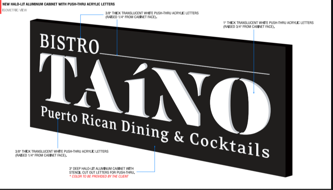
What is the signage intent for outside the venue?
What is the interior decorative usage going to be?
There are some production issues in making this 3D, extruded, lit fabricated (you can’t) and even halo lit.
If you’re just painting it on a board, no worries.
Sorry, font is lust stencil. Agreed, I think going uppercase for the tagine might be the way to go. I feel like without the line after bistro, the logo would look disjointed. Also great point on the lowercase í, I could do upper case and just shorten typeface. Thanks!
The intended use will be all encompassing. To be used for exterior/interior signage, printed/digital menus, businesses cards etc. Interior colors are mostly pastels. Similar to the painted house of Old San Juan, Puerto Rico.
Then you need to design with all that in mind.
Anyone can put that logo on a piece of acrylic and backlight it, but if you want to go for anything fancier, that particular font is problematic. I don’t hate the font itself. Just don’t ask me to put LED tape inside of it.
I see what you mean. A rework may be in order. My friend who does fab and install made me this mockup. Pretty much on of the few ways to make it into a sign.
Not necessarily a re-work. But you see where the sharp points have been clipped to account for the cutting tool radius. It isn’t awful, but it is a concession.
(nice mockup BTW!)
It’s not often we see this kind of consideration put into a logo design here.
To see someone actually take the step to realize the signage, it’s a very nice thing to see.
And it isn’t often one sees push-thru these days. I do a lot of it here, because like you say, sometimes it’s one of the few options for lit signage.