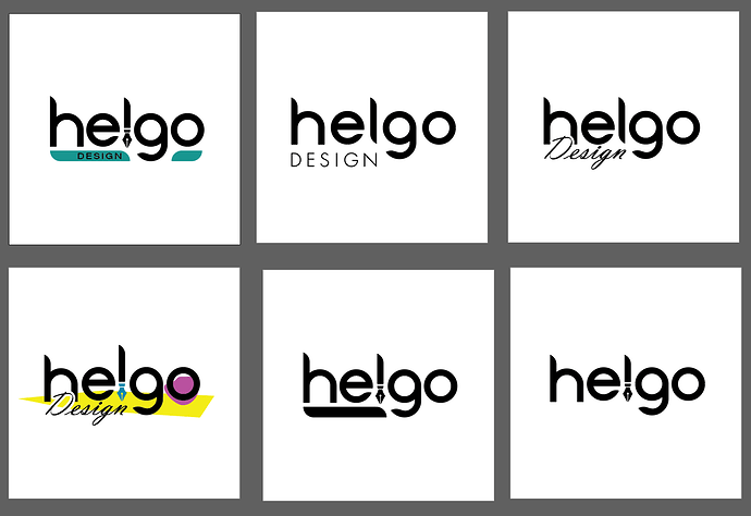
Im happy with helgo but very unsure what to do with the design part.
Help and overall feedback is very welcome.
Drop it.
i thought might be: use the 2nd design (top, middle), but play off the letters “go” somehow…maybe add some sort of stylized, colorful flourish, giving it some forward-moving action. look at the artwork of peter max, from the 60s for inspiration. it doesn’t have to be as wild/psychedelic as max’s art, but something with some flow/movement.
that may not be your style at all, just a thought. ![]()
The “e” stands out like a sore thumb. Change the type face.
Substituting “l” with a pen does not work. Your emphasis is on design, not illustrating.
I’m with Hotbutton, I’m afraid. All of them display no where near the level of typographic understanding and sensitivity that you would expect from a professional designer and many of them resort to cheap visual clichés.
I think I’d suggest strongly that you start over.
Yeah that might be a way to go. Been thinking of that too.
Thanks for replying.
I think he referred to design part not the whole logo. Might be mistaking. Please enlighten me in what is wrong with the typo in helgo.
I read your post in the other thread about grid logos. I understand your standpoint.
I agree; drop the word DESIGN. The word isn’t needed in the logo. If you do use it, the middle one on the first row works the best.
The biggest problems I see are the letters in helgo.
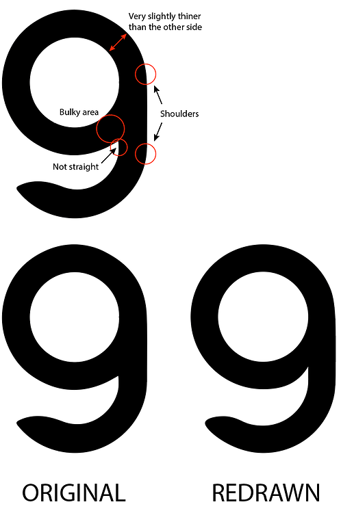
Taking the g for example, you’ve drawn the letter geometrically instead of optically altering it a little to compensate for the optical illusions. Drawing type and getting it to look just right is hard.
The biggest problem is the bulky area where the bowl connects with the stroke. There’s too much visual weight in this area. The standard way to deal with this kind of thing is to taper the bowl part a little until there’s a nice visual balance of weights.
Whenever a straight line connects with a circular element, little shoulders are created. Even though they’re geometrically accurate, an optical illusion occurs at the transition point. The way around this is to smooth it out so that it looks visually unnoticeable.
I’ve only redrawn one letter to show you what I mean, but the same kinds of little glitches appear in the h and the e.
I’m not really a fan of the unusual stroke terminals, but that’s just a matter of opinion.

