Hi everyone. I made this tee awhile ago, and I was the one who came up with the concept and altered the image to make it look great. At least I think it looks great. Anyway, I have the tee on my dad here, and I would like to know how you all think the (a) graphic looks, colorwise and clarity (b) the drop of the graphic from the top of the tee and (c) how it looks overall. Thanks.
Not quite sure what you mean by “came up with the concept…”
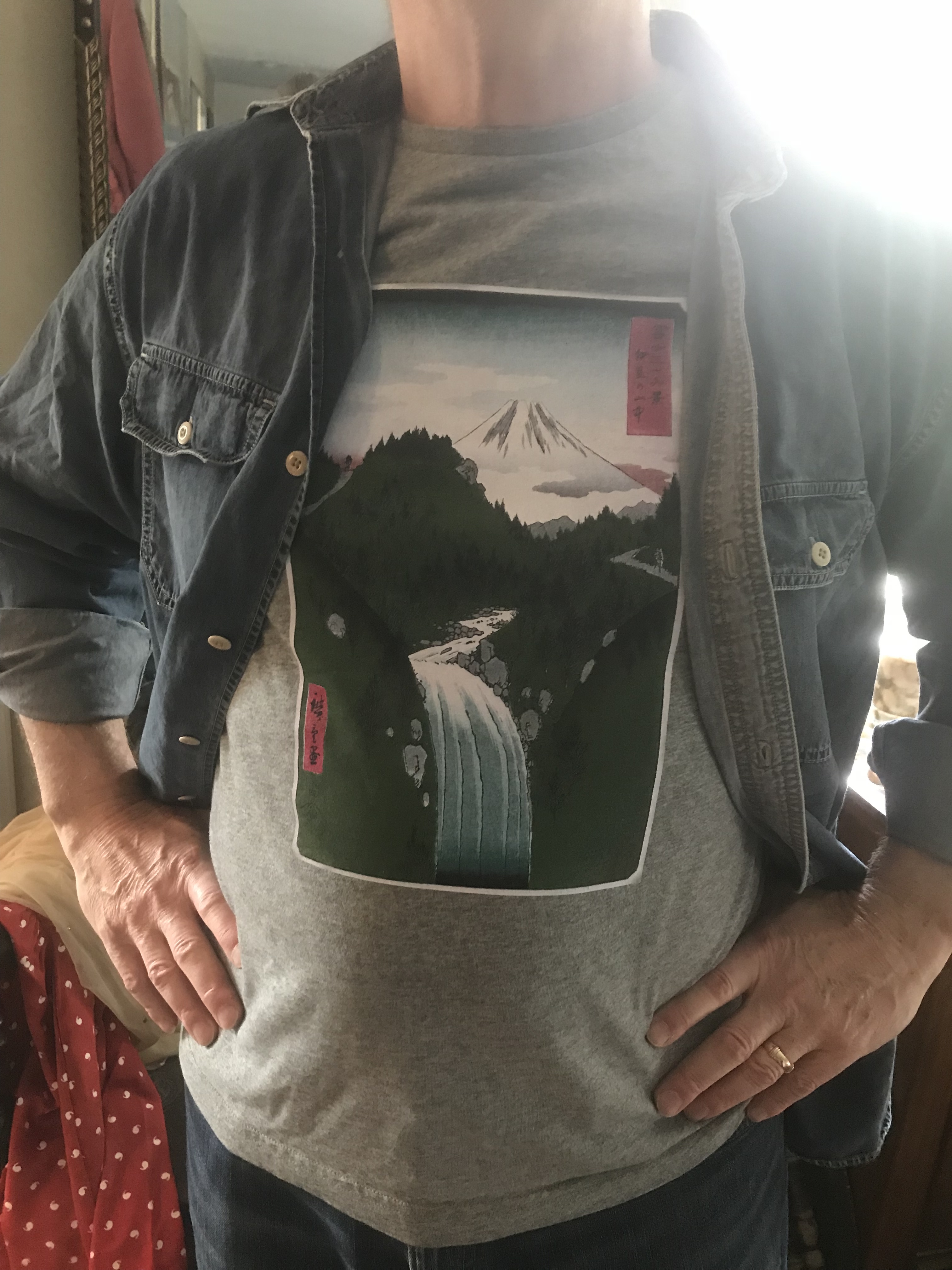
It’s a faithful reproduction of Utagawa Hiroshige’s In the Mountains of Izu Province
Versions of the print are held by various museums.
He died more than 100 years ago so no worries there.
If you got the image off WikiCommons, they take the argument there that a photo of a Public Domain image is itself public domain.
Not exactly seeing that you did anything to it at all. Just pasted it on a T-shirt for whatever reason. If you and your dad like it, that’s all that matters.
1 Like
Well yeah, it is an image that has been around for awhile. What I meant was, is the image size good for the shirt? Is this thickness of the border nice? Etc.