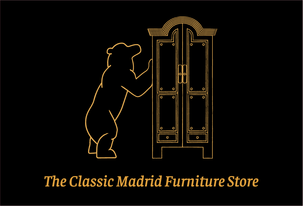
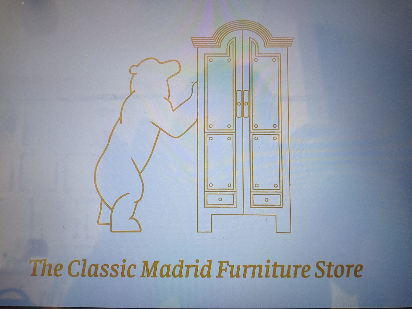
I made a logo for a fictional store called The Classic Madrid Furniture Store.
The brief was “Hi! I am Nickie, I just founded a new business called The Classic Madrid Furniture Store. We’re looking for someone that can make a good logo for our furniture store. I’m interested in a logo with a gradient color scheme. Would you be able to take this on?”
The bear comes from the famous statue in Madrid called Statue of the Bear and the Strawberry Tree.
I am new to this graphic design process and couldn’t figure out how to apply gradient I know how to make gradients but you know the result was a mess.
Way too much detail. Way too many fine lines and elements.
While the artistry is very nice, it isn’t suited for a logo.
First, any client that asks for a gradient simply to have a gradient should be gently steered in the appropriate direction. Gradients don’t always reproduce well in print. You might create several versions of the logo for different uses, one of which may include a gradient.
You also need to ask the client who their customers are, who is their competition, where are they located and what is their main focus of sale (brick and mortar or online.)
Will anyone outside of Madrid get the bear? To me, the logo may denote furniture sturdy enough to withstand a bear attack, but I might wonder what that might have to do with the name of the company.
Since you’re a beginner, I suspect you don’t fully understand what a logo should be and what purposes it needs to serve. If you’re serious about this, you must invest some time in learning the basics.
Here’s a start: pick up a copy of David Airey’s book, Logo Design Love. Read and study it cover to cover, then read it again. Once you’ve digested everything in that book, pick up a copy of his next book, Identity Designed: The Process and do the same.