
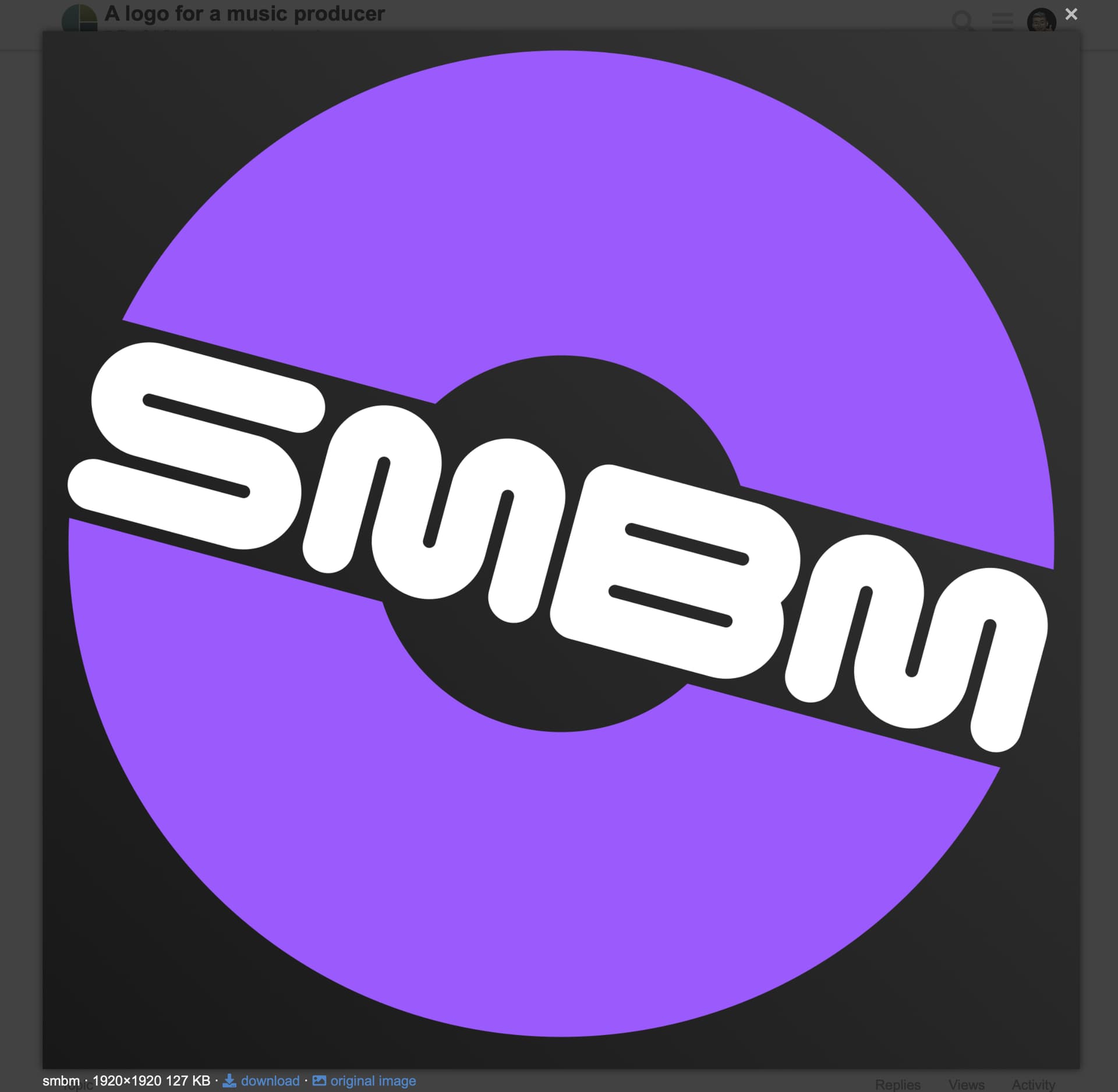
You have uploaded a png file with white lettering on a white background.
Not enough info to go on to make any sort of critique. If the producer works in the classical field,it’s awful. If drum and bass, etc it is more relevant, if a bit uninspiring.
The lettering needs a lot more work. That B does not work against the rest of them. Why bot make it more like the S?
Even then, the weights are all wrong. There is little, if any, optical compensation. The negative space means they are fighting each other. The relationship between the lettering and the semi-circular shapes is unbalanced. It feels like it needs a lot more refinement.
As I say, no effective critique as to whether it works or not can be given without more information.
what info do ya need? and whatchu mean optical compensation?
The typography is interesting and the overall composition is clean and simple.
However, whether it’s appropriate for the music producer depends on what kind of music this producer produces. Before a design is even started, the problem must be well-defined before a good solution is possible. The end result usually needs to look good, but it needs to look good within the parameters of the problem being solved, and you haven’t told us what those parameters are.
For example, someone who occasionally arranges and records live venues for amateur traditional folk musicians would need an entirely different logo from an experienced and successful studio producer handling and guiding the efforts of urban hip-hop artists.
jazz fusion and funk
the disc was the producer’s idea
OK, that helps a lot. I like it — especially for the funk. I see less jazz fusion in it, but that might be fine if that’s what the client likes.
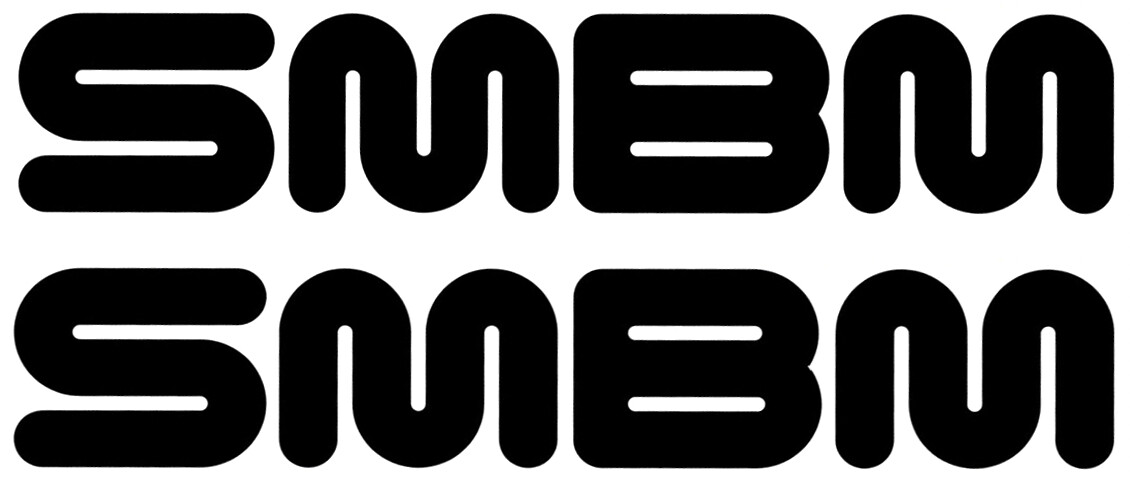
Since so much of the design depends on the geometry of the type you’ve used, much depends on getting that geometry exactly right. There are optical illusions in the type that I suggest addressing
Even though the S and the B are considerably narrower than the M’s (I measured them), both the S and B look wider. Rather than making the widths geometrically similar, I’d make the widths optically similar.
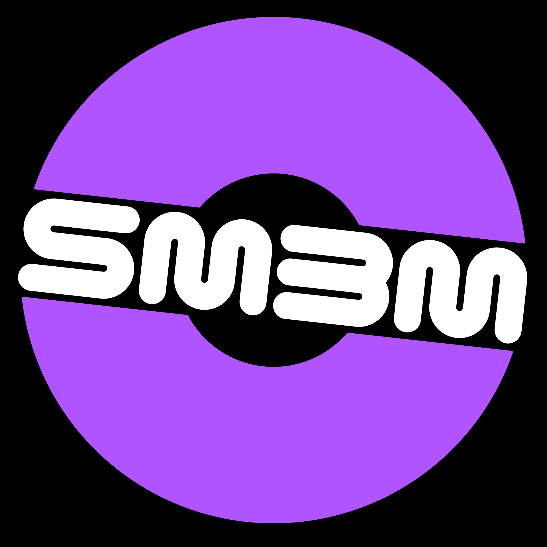
i made the B similar to the S as @sprout suggested
how are the widths now?
The open counter spaces help the B match the other letters, but the B could easily be mistaken as a 3.
Sometimes the best way to explain is visually. You might disagree with my suggestion below, but the top is yours, the bottom one is where I’ve subtly adjusted the various widths. Lots comes down to matters of opinion. I think that no matter what, that B will be the problem letter — it’s just visually bulkier than the others.
thanks y’all!
Hmmm … Jazz fused with Funk, maybe call it Junk ![]()
Or Fuzz ![]()