A quick poster design

This is a poster design

The goal is to wish my customers a happy new month. Venient Print is actually a printing press brand located within a university over here in Nigeria.

It’s only used in digital format

The target audience are university students

Am just a student

It’s a self directed project

I understand the concept, but it’s a little difficult to figure out at first glance.

Why is it “Happy New Month” instead of Happy 2nd Half of the Year? Why have you repeated the text twice, and why doesn’t it line up? I’m also wondering why you chose that black marker typeface.

Granted, I am not a student in Nigeria, so I am not your target market, but this does not resonate with me at all. It feels like some different elements were slapped together with no design intention. I think you can do better.

Ahh thank you very much JUST B for your constructive feedback… I actually used that font cause it part of the brands font, its playful and organic and thus resonates with the students

And as regards while I repeated that text and didn’t make it line up with the other, I was only trying to achieve an asymmetrical balance and that’s why I aligned it with another short line at the top right corner…

And about using Happy 2nd Half of the year, I believe that would have actually worked better…

Thank you but then how could I have done better?

Thank you very much Stevo but what could I have done better?

Work on listening skills.

1 Like

Let me preface my comments by saying that I am not trying to unnecessarily tear you down — even if my comments come off as harsh — I am trying to help you improve.

I get showing six calendar pages with the X to symbolize six lapsed months. But why the lower case “L” letters in the upper-right and lower-left corners? Why did you choose brush stroke font when all of the other elements are clean and crisp? Why the massive difference between the initial letter and the rest of the letters on Happy New Month? Why did you cut off the H, N, and M? Why repeat the copy? Why is the copy cut off? If this is a social post meant to create or reinforce brand awareness, why put the logo top center instead of in a signature position?

Maybe you are going for an edgy or David Carson inspired design. (That’s a stretch, but I’ll give you the benefit of the doubt.) If so this isn’t it.

Bottom line, this isn’t working. It looks like a bunch of disparate elements that you slapped together. I don’t see design thinking. I think you can do better than this.

Thank you so much Eriskay for taking the time to critique my work, but then I don’t really get your point, besides how can I improve my listening skill and how will that improve my design skill

I am very grateful Stevo for your thoughtful critique it means alot to me…

So I will try as much as possible to give you my reasons for some of my decision please do correct me when necessary.

Now those thin lowercase l at both corners are just small lines thee purpose is to achieve balance.

And I used the brush stroke because it’s one of the brand fonts and have been using it for a while now so I decided to just slap it there since it kinda organic and different.

And I cut the H N M into half just to representing the halfing of the year don’t even know if that’s necessary.

I also made two copies of the body write up and cut one into half just to achieve asymmetric balance.

And making the H N M initials bold while the others are small is just to make them kinda like what captures people attention and makes them wonder why…

And lastly you talked about putting the logo in a signature position instead of top middle … Please can you explain better I don’t really know what that mean. Or maybe you can send a picture that illustrates that.

And finally you talked about unity that the elements aren’t united but then how can I unite them what am I supposed to look out for next time and how can I improve this particular design and make it better. Also how can improve on my design thinking please…

I hope to see your reply soon Stevo O :blush:

You have been given valid opinions from @Just-B and @Steve_O, but all you did was trying to justify why you did what you did, hence my remark of “listening skills”. I should also mention that both Just-B and Steve_O are seasoned designers, and suggest you listen to what they said.

No malice intended, but I understand while you’re so immersed in your own work you tend to let your thinking process evolve around them. We all have gone through that phase, and hopefully learned from it. I hope you do too. After all, that’s what we get paid for.

1 Like

Both @Steve_O and I voiced our comments as questions, but those questions were meant as a polite way of pointing out problems you need to think about because your solutions are not working.

I’ll try to be more direct.

Please remember that I’m not trying to tear you down. I’m trying to point out some problems that, in my opinion, you need to address in the hopes of doing a better job.

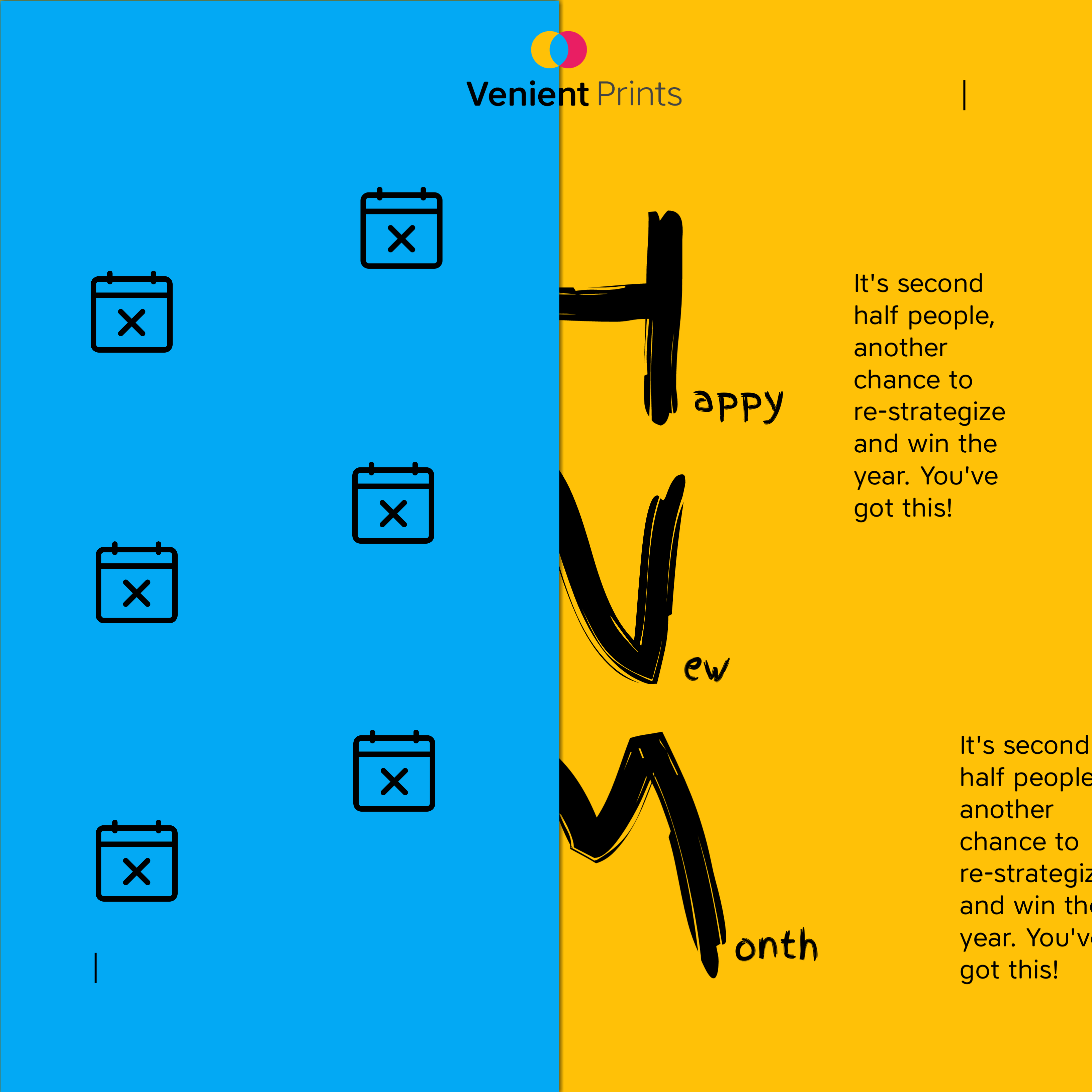
A poster or online banner needs to communicate its message immediately. They must catch a person’s attention and immediately communicate a compelling message. If the poster fails to do that, the viewer will dismiss it and move on. Your poster’s message is cryptic, like a puzzle. It doesn’t immediately communicate the message that Venient Prints is a good printer wishing its customers a happy 2nd half of the year.

At first glance, the little calendars with X’s make no apparent sense until the viewer figures out that they represent months that have passed. Figuring that out isn’t possible without reading small text, which is confusing and poorly written since it doesn’t mention anything about the year. It only says, “It’s second half people.” When I first read it, I thought, “What is a second-half person?” The cut-in-half letters are difficult to read. All of this adds up to something that takes 8 or 9 seconds to figure out. Even after someone figures out the half-year thing, you confuse it further by saying Happy New Month instead of Happy New Half Year. Worse still is that you’ve done nothing in any aspect of the design to tie it into Venient Prints — the only thing in the entire layout that communicates anything about the printer is the small logo at the top.

So far, I’ve mentioned practical problems related to the poster’s function. I’ll move on to aesthetic concerns now.

The handwritten typeface isn’t working. I wouldn’t use it even if it is part of the printer’s branding. At least, I wouldn’t use it the way you have because it doesn’t match the rest of your poster.

Repeating blocks of text makes no sense. I have no idea why you did that. Bleeding text off the edge of the poster makes no sense either, and it looks like a mistake. The text is also poorly written. For example, the second half of what? Re-strategize what? You’ve got what? None of this has anything to do with the printer.

You mentioned the small vertical lines in the two corners were for balance. What do they balance? Each other? They’re superfluous and look like mistakes. You mentioned the repeated second block of text lines up with one of those vertical lines, but that’s a nearly invisible alignment. The text blocks should line up with each other. Of course, neither the repeated text block nor the vertical lines should be there.

The calendars are misaligned for no apparent reason. Again, it looks like a mistake.

On a positive note, I like the concept of building the design around various halves that play off the year being halfway over. Still, everything looks scattered and confusing, and worst of all, as I mentioned, the poster doesn’t readily communicate a meaningful message about the printer. And it certainly doesn’t do so in the time people are willing to invest in deciphering a poster they never meant to see in the first place.

2 Likes