Hello people. I’m back after a long break. Thought I should do some work and come back when I have something to show for it. I’ve been interning at a design studio for a few months. Recently I was asked to work on a tent card for a company that works on sustainable energy – LED bulbs etc. The card is supposed to be a moral/ethical guide for the leader and her team within the company. My brief was to stay away from anything related to what the company does since the staff already know what they do. So, I worked on a generic leader/teamwork idea. I have already received some feedback on it, and I know that there is primarily a problem with the execution of the concept. But it’ll be great to get some more so I can figure out how to rework it.
How and where will the tent card be used? At an event?
Just a cursory pass at it…
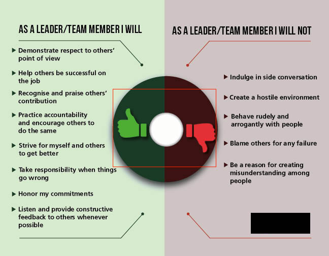
- Not sure I like the background elements. Is there meaning in those…things?
- While I understand making the check-boxes each a different color in an attempt to breathe some life into it, I also disagree with doing so.
- That might not be Comic Sans, but it might as well be Comic Sans. Maybe that’s not a bad thing. Maybe it is.
The copy could use some massaging.
- “Help others succeed in their job.” in their job is superfluous.
- “Listen and provide constructive feedback to others.” to others is superfluous.
- “Strive towards making others and myself better.” It’s best to avoid using the ‘s’ at the tend of ‘toward’ but it also isn’t right following ‘strive.’ You can’t ‘strive toward’ you must ‘strive to.’ ‘make . . . better’ is also too non-specific. I’d rewrite this whole line.
1 Like
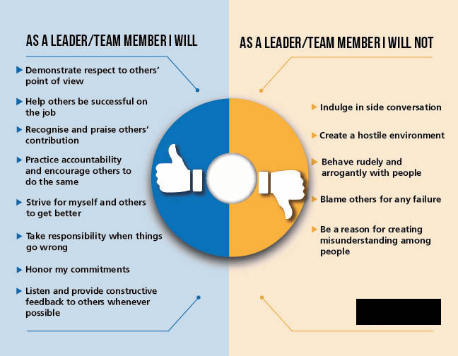
I’m guessing the background is supposed to represent team members around a table, but the first thing I thought of was an old rotary phone. In general, I am not a fan of the way this looks. The boxes with either the check or the X overwhelm the copy (which is really the most important thing), the angled type seems odd, the color scheme seems a little childish. I sort of understand the directive to stay away from graphics directly related to what the company does. The flip side of that directive is that this is completely generic looking. This could apply to any company.
Good eye HotButton identifying the comic sans. That needs to change.
Scrap this and start again. Sorry.
I’m in agreement with the other comments.
I feel the rotated alignment of the bullets is too relaxed; it really breaks them away from the headers.
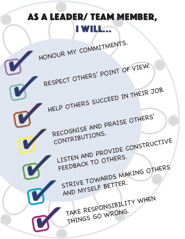
You could probably condense “honor my commitments” and “take responsibility…” into a single bullet “be accountable”
Perhaps some iconography for each point would help alleviate the monotony of the checks and X’s.
Out of curiosity, was this text provided?
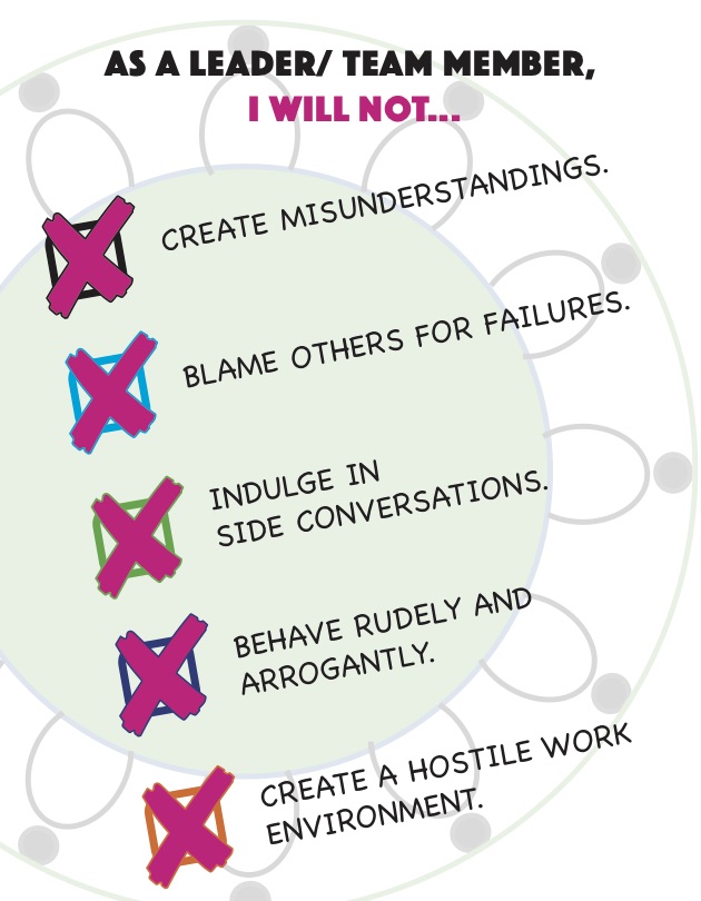
Emphatically crossing out the checkbox with big purple Xes looks like an anger management issue going on there…
Seems like way too much content for the purpose.
Thanks for the feedback, everyone. Much appreciate it.
@DocPixel The card will be used in their offices, placed on each person’s desk.
@HotButton It’s not Comic Sans, but Chalkboard. I get your point though. Will stay away from it in the next iteration.
Agree that the “strive” sentence needs rewriting and “though” shouldn’t follow the word. Though I have to disagree with the usage of “toward” instead of “towards”. Whether it’s with the ‘s’ or without, it’s more a preference thing wherever either is used than an actual rule of grammar.
@Steve_O Happy to start from scratch again. Do you think I should be looking at a fresh concept altogether or rework the design differently, that is, use different images and font, layout etc. for the same idea?
@kemingMatters The text was provided. I’m not sure how much liberty I’m allowed to take with it. Will check. And thanks for the tip about the iconography. Will try and work on that.
@PrintDriver ![]() I see what you mean about the angry crosses. Back to the drawing board it is for me!
I see what you mean about the angry crosses. Back to the drawing board it is for me!
@Schweta, the text you’ve been given is so trite and overused. ![]() It needs a lot of rewriting and editing.
It needs a lot of rewriting and editing.
If you are stuck with it though, I’d try an approach that adds some uniqueness. Maybe reversed-out type on a black background, with bullets, without the checkmarks, might help it be taken more seriously by the end users.
The following may seem irrelevant to your original question, but part of graphic design is solving problems for the client.
I’m guessing that their morale and team spirit are low, and management is reluctant to address problems with specific employees. They hope that handing out a card on team behavior will motivate everyone to behave better. (It won’t.)
You aren’t in a position to recommend leadership classes to them, but if this is the situation, maybe there’s something there you can add to the design concept.
Thanks DP. Will keep what you said in mind while redesigning the card.
1 Like