Sometimes it’s difficult to critique these sorts of things since so little is known about the clients, where they’re from, or what might be suitable for their specific situations in their parts of the world.
I can give you a critique from the perspective of someone in the United States where I live, but I’m not sure how meaningful that will be for someone in Zambia (where your forum IP points).
There’s lots of global homogenization that’s taking place regarding design, which I think is too bad. It’s as though people sometimes assume that an aesthetic style that is appropriate in Australia or North America is also appropriate for Africa, Southeastern Asia, or the Middle East. I think regional and cultural differences are important in design, but now I’ve gone off into something of a rant.
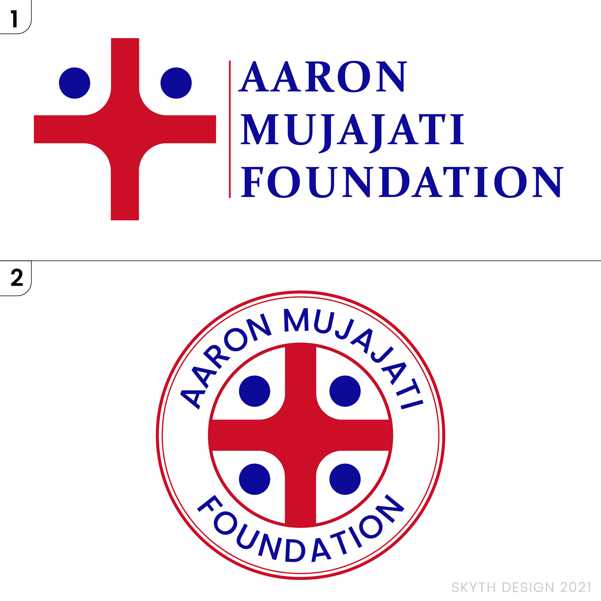
Anyway, from my U.S. perspective, the top arrangement is more contemporary. Logos consisting of seals or emblems, like the bottom one, aren’t as common as they once were. Consequently, this type of treatment appears outdated and old-fashioned. Government agencies still hang onto these seal solutions, but even there, they’re becoming less common.
If it were me, I’d choose different typefaces — ones with personalities that contribute personality to the design and don’t look like they were typed out using the standard fonts that came with your computer.
The straight-forward red and blue seem awkward. There’s not much subtlety in those colors, and again, from a US perspective, they’re the colors of a flag.
The red cross might cause some confusion with the Red Cross — the international relief organization. Since your logo is for a medical foundation, you might be running into trademark issues regarding that cross too.
I don’t understand the reference to people that you mentioned in the logo. I’m assuming you’re referring to the blue dots. But to me, they look only like blue dots — not people’s heads.
The thin line in the bottom logo will cause printing and legibility issues at small sizes.