Noice, maybe make the text a bit bigger?
1 Like
The image treatment is . . . what it is.
You could do much better on the typography.
1 Like
In the immortal words of my college GD professor,
“Do Over.”
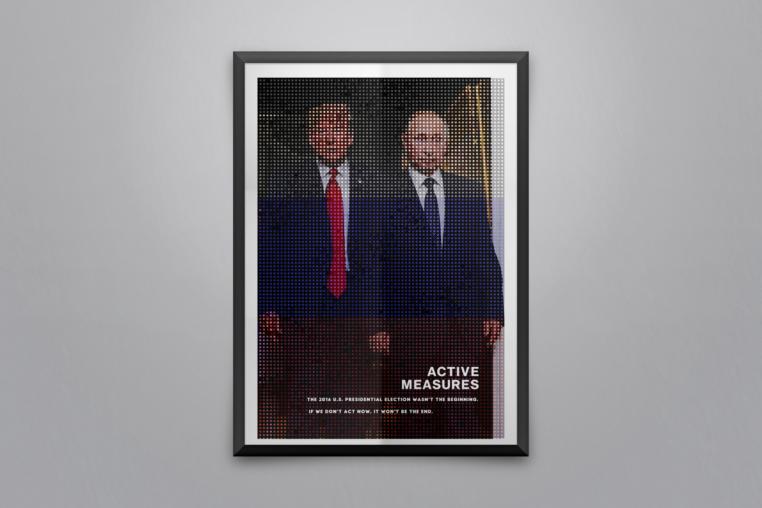
Is that a Russian flag superimposed over the image? What’s the purpose of the needlepoint-like texture you’ve applied to image? Does it serve some kind of purpose that I’m just not picking up on?
Zooming in to read the text, I understand what your poster is about, but I’m just not sure the design decisions you’ve made (overbearing textures, and difficult-to-read text) effectively support your message.