Audience: Pregnant women aged approx 25-35, looking for natural relief from nausea and other pregancy symptoms, that are located in the city.
Your Experience Level: Student/part-time professional
Nature of Job: Self-directed project for a fictitious client
Purpose or Goal: My client needed a new mark that would better represent the values of their small business and also to attract their preferred customers: pregnant women.
They wanted their new identity to be vibrant, positive and uplifting while also being elegant.
My thinking was to draw on inspiration from existing marks and branding from natural skincare and beauty products (hence the typeface of the “Z” monogram); As I think those are products that demographic would likely use.
I also thought it was important to create mark that had a visual relationship to acupunture as my clients business isn’t well known and they’re operating in a very competitive market.
Let me know if you think I hit the mark or how I could do better!
Please be brutally honest, the only way I’ll grow is from the feedback!
The details in dots and needles and all that will be lost in print, or in danger of being lost, plus a nightmare to embroider or use somewhere else on different substrates.
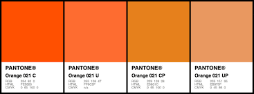
Your colours need to be appropriately named, Navy Blue is not good enough, it needs a Pantone reference or a RIP could mix it up in print.
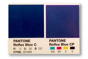
RIPs have CLUTs (colour lookup tables) and a list of the breakdowns of colours, it will know what Reflex Blue is and how to convert it - but it won’t know what Navy Blue is - so it could actually be converted to any colour and that would be bad!
Plus, another person/company wouldn’t know what Navy Blue is so you’ll have colour consistency problems.
You’ll need CMYK breakdowns too for coated and uncoated stocks.
The serifed white (or light pink?) text on the pink is hard to read.
To my eye, the orange is a bit jarring against the subtlety of the pink. It may be intentional. It’s not a calming combination and orange usually denotes “hot.” I’m not saying it’s wrong, and I’m certainly not your demographic, so lets see what others say. Plus, I’m not a fan of “hot” orange because it always wants to shift green on a 4-color spew press (inkjet digital)
As Smurf2 noted, you should standardize your colors. Start with Pantone, as that is your limiting factor. There are only about 1500 Pantone Solid coated colors and only about 1000-1200 of them are printable in CMYK (Smurf’s Reflex Blue being one of the CMYK-unprintable ones, )
As far as acupuncture and needles go, that is about the last thing you want to call attention to. Most people don’t like needles and actually avoid acupuncture because of them. You want more to promote the feeling of calm and natural balance (the opposite of nausea-inducing IOW.)
I don’t hate it. Just don’t ask me to make it dimensional at the size you’ve indicated in the top one with the plant. Pushing too small there. And certainly can’t get any kind of halo lighting into it.
Pantone 021 is my nemesis. That sucker should be taken out behind the woodshed and buried deep. I still have nightmares about a job from years ago that required literally yards and yards of that color on 4 different media on 3 different machines and they had to match!
I think you did a nice job with this. I like the mark and the type is understated and well balanced. I immediately saw the needles in the mark. Whether or not that would be a turnoff to potential clients, I don’t know. You’d probably have to do some testing on that. I’d at least consider an alternate to the orange. While I like orange for its vibrancy and energy, perhaps a more soothing and calm color would work better.
I like the Z logo and think its delicate nature pairs up very nicely with acupuncture. For that matter, I like it a lot.
Because it is such a delicate logo, it could cause reproduction problems in some instances, like embroidery. Then again, an acupuncturist might not be needing a logo that works in every conceivable situation. I wouldn’t worry about it.
I’m less thrilled with the orange and pink. Orange is an alarming, aggressive color and pairing it with pink is just a little unsettling. Maybe that’s just my subjective reaction, but I have to admit there is something about it that is intriguing and does look nice. Personally, I’d still be inclined to use cooler, more relaxing colors for anything having to do with something involving needles being inserted into one’s body.
As for Gill Sans. I’ve always had reservations about that typeface, but there are plenty of people who use and love it. I think the caps work well for what you need and how you’ve used them. In my opinion, though, Gill Sans lowercase doesn’t match the uppercase very well. The uppercase is clean and geometric, while the lower case has lots of quirky variations between thins and thick strokes. I love Garamond, but I wouldn’t pair it with Gill Sans, even if I liked Gill Sans. The thick/thin nature of Gill Sans’s lowercase tends to clash with the similar but different thick/thin look of Garamond.
What you’ve done is really nice, though. It shows a great deal of sensitivity and talent. I’m liking it.
I have a strange relationship with Gill Sans. When I see other people use it, I think it looks nice. If I ever try to use it myself, I’m never happy with the results.
Gonna go against the grain here, I really like the color pallet you chose. It got a nice warm Burberry / Hermés feel to it. Not every health practice has to be covered in seafoam and baby blue. In fact, when you go for an acupuncture, you want everything to be warm, not cold, to relax the muscles. Often the room will be rather dark and only lit with a warm orange light. So I think the orange fits to the setting. I also like the pairing with the pink, both aesthetically and metaphorically, as it relates to skin.
Now, this got me very curious, as hot orange is one of my favorite colors for accents. I never heard about these printing difficulties with the color orange, like shifting to green and not being able to match itself. Can you two elaborate a bit more on this?
Yes details can be lost at small sizes, so you want your logo to work at all sizes - or least have a MInimum size in the branding - and a Safe Space - that is about deciding a certain distance no elements can touch your logo so it’s always prominent etc.
Pantone is all the one ink, it just looks differently on different substrates, like a coated paper, vs and uncoated paper (like your normal office paper).
Paper is porous, and different papers have different saturation levels, so some colours soak into the paper, others don’t.
Normally, you’d pick a Coated version of your Pantone Colour and then Pick a Uncoated colour.
You would also pick a different colour for your CMYK breakdown, as a lot of Pantone colours cannot be recreated in CMYK.
So you’ll have small mismatches across substrates in colour. But you’ll be in a far better position than anyone else.
Always reference your Pantone colour to a print vendor, as they can print your file and match it to the Pantone book they would also have a copy.
But you pick these from Pantone books -not from the screen.
I’m one of them. Love it (despite / in spite of its flaws). In fact there’s not much Gill has ever done that I don’t love – apart from fiddling with his children of course!
There lies the rub, Perpetua is beautiful. His sculptures are just jaw-dropping. Do / should we separate the work from the man’s depravities.
Colors have different symbolism and cultural connotations. Given the name Zheng, I would ask if the owners of the business are Chinese, and research whether my color choices project good health in Chinese culture.
Orange, the color of Buddhist robes, and pink, the color of peach blossom, are both auspicious colours that are certainly safe to use in this TCM context, from a Chinese point of view.
That makes a lot of sense, when I do my next project will include a usage guide! Out of curiosity, at roughly what size do you think a mark like mine would start to encounter print-related issues?
Ahh, so you’d use the Pantone coated gamut and work back from there?
How would you obtain the appropriate CMYK values then?
That’s a good point, had never considered that in my colour selection!
Yes, as most printers will have a Pantone Book to reference the colour.
That’s the best way to achieve consistency in print.
If you provide the same CMYK file to different printers without any colour reference you will get 2 different colour printed jobs.
Heck, if you gave it to same printing company and they ran it on 2 different printing machines it would come out different.
Pantone books are a good start. But the CMYK equivalent (which is also shown in the books) will look slightly different.
So - as said earlier - you use the CMYK values from the Pantone book - and reference this Pantone Colour to the printer so they can match it as close as possible.
Typically, I’d look at the CMYK swatches and compare them to the Pantone Swatches from the Pantone book - to get a better CMYK match.
You can see under the Pantone colour it gives a CMYK Breakdown of how it looks.
on Coated Paper. The Pantone Uncoated book would also have reflex blue but it wouldn’t look as rich.
You can see the CMYK breakdown on the right, but it’s duller than the Pantone ink itself.
You’d do your colour in the CMYK - or find a closer matching CMYK variant, and use that breakdown for your CMYK.
And always relay to your print vendor what colour it’s trying to match - that way they can adjust settings on their end when printing to ensure it gets as close as possible to the brand colour.
Depends on what you mean by CMYK. LOL.
What most designers do is get a hold of a Pantone Bridge. It will show you what Pantone thinks their colors will look like when straight-converted to a CMYK press. What they don’t take into consideration, like most of the design software world, is that some print machines have wider gamuts to their CMYK inks. I know for a fact my 4-color wide format vendors can hit a far wider selection of Pantone colors than most conventional press printers, and the ones with 6 or 8 color machines are even better at it.
And NO do not get the Extended Gamut books. Just don’t. The first person that makes me buy those is going on The List. You don’t want to be That Guy.