Looking for feedback on this school assignment I completed. I was tasked to make a Mini Cooper ad campaign (print and web) that fit within the brands personality of being fun, independent, and adventurous. My solution included using the brand’s bright secondary colors and make Paul Rand-esque illustrations of iconic scenery. What are your thoughts?
I like it. It’s bold and colourful and stands out. It also conveys the sense of adventure that is part of the brand. However, how will these be seen. If the audience only sees one, then it might not make as much sense. Together, it conveys the sense of travel. But one image on it’s own might not.
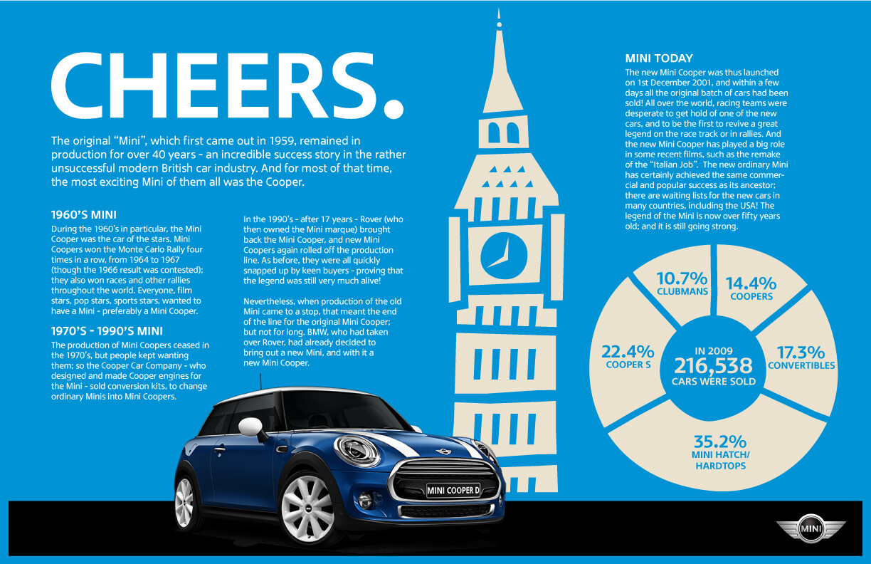
I’m not sure about the history image (the first one). It’s interesting, but I’m not sure if it sells the car. I’m not sure what context it would be used in.
You’ve come up with a very good concept here. As @SabrinaHartford implied, the concept needs to be extended across the ads in a way in which everything works together to actually sell the cars. The first ad is more complex with lots of (depending on the situation) things that aren’t necessarily associated with automobile ads. The remaining images look more like the basis for some really good ads that haven’t been fully fleshed out.