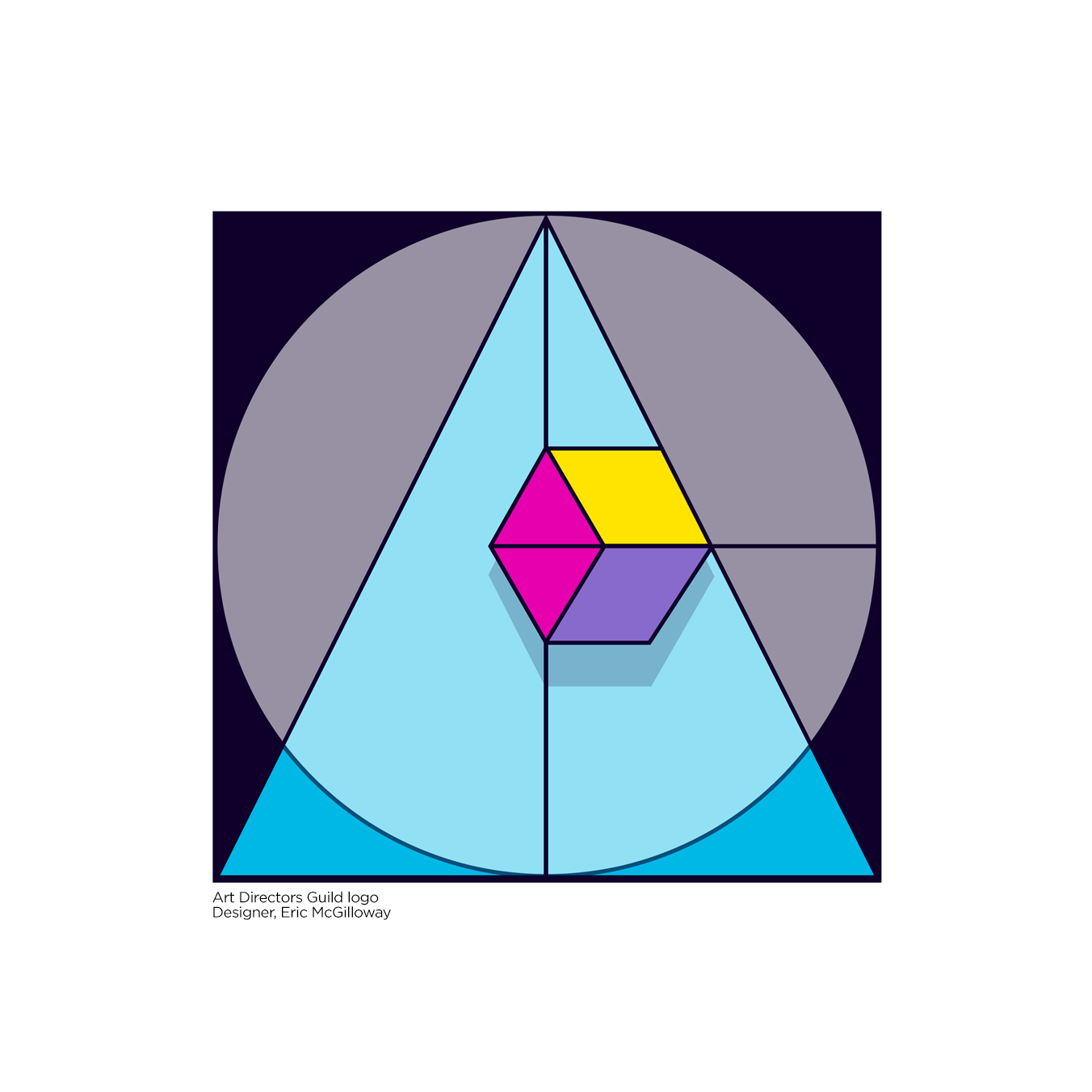
Designing a remix logo for the Art Directors Guild.
Maybe some of you are in the guild and are helping out too.
They have their original which they will not abandon but they like to have a few remixed versions for publications and websites, etc. So they send out an email asking us members to designs a few.
This is why I did what I did:
The cube is a dimensional symbol for solidarity. Each visible side can be representative of the other 3 crafts; Set Designers, Illustrators, and Scenic Artists.
The cube suggests dependability, honesty, and integrity.
I chose the color yellow for success and confidence. Sky blue for self-expression and entertainment. Blue-violet for imagination and magenta for kindness and cooperation.
Never to late to give advice or opinion. I think the bottom design is best, the other is nice, though I’m not a fan of the cube, doesnt connect to the sphere. Holler!
6 colors? (7 if the gray is not derivative of black.) Even art directors should know better.
The really funny thing about this logo, I see a Cloak, a Ring and a Wand. LOL. And I only saw that Harry Potter movie once.
Way too much overthinking here.
Stick with the original and add “bling.” Don’t go for “new” or “esoteric” or “hidden meanings”
Think about your audience and what would attract them to a publication or website. If you are not constrained by spot color, go all out. Scenic artists, illustrators and set designers are visual element people, not flat and boring people.
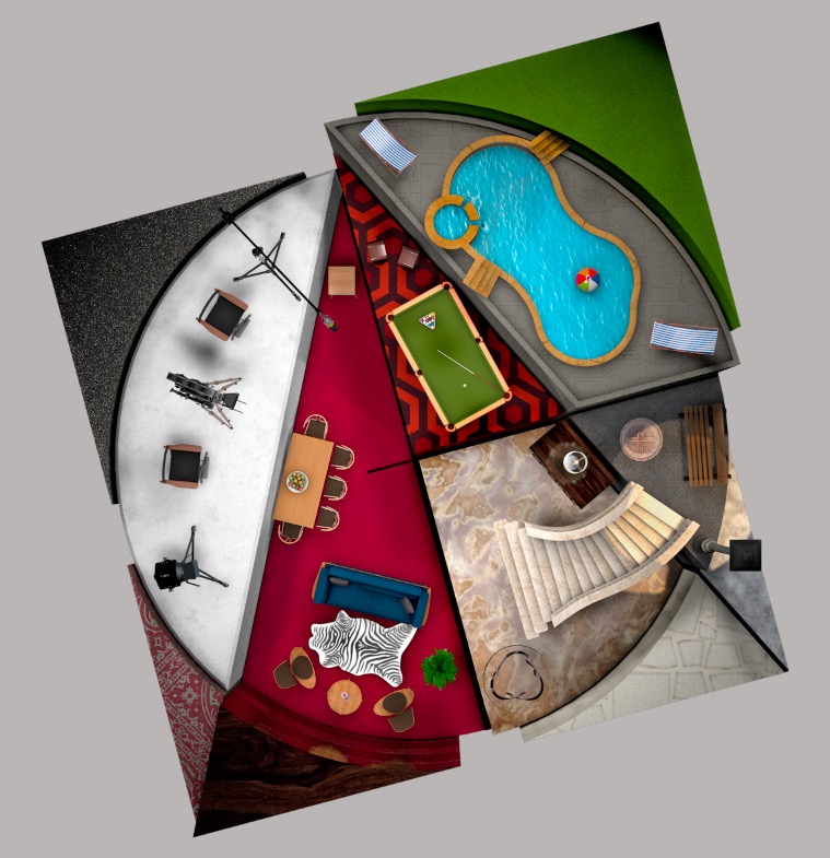
I revisited their direction. No mention of color limitations. They’re asking for a remixed version of their original. Hero version is exactly the thing I will try. Thanks PD.
This could make a very interesting variation of the Art Directors Guild’s existing logo, but it breaks just about every rule of thumb for a primary logo if that’s what you had in mind.
I’m also not at all sure what pool tables, swimming pools, stairs and most of the other things have to do with design or art direction.
Its a remix logo. They want something cool and exciting as a variation. Everything you see are parts of different sets either in film or tv. The Art Director is responsible for set design, among other things.