Hey everyone
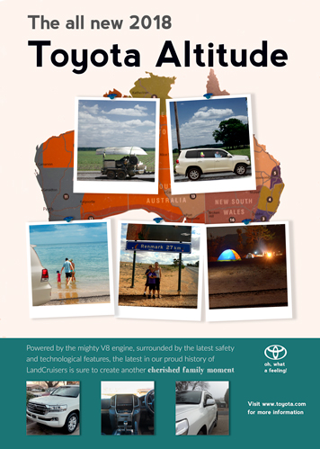
I would like to ask for a critique on this advertisement I designed for a school project. Basically, the brief stated that I had to photograph five of my own images to place into the layout of the design, with the purpose of advertising a certain product or place of your own choice. One of aspect that was emphasised on was making it look realistic enough to be believable by creating a strong concept.
Advertisements for an automobile really should highlight the automobile itself, as in large glamour shots of the vehicle presented in the best possible settings that make it look desirable to the target audience.
The concept of your ad seems to be that the Toyota Altitude is a great way to explore destinations in southeastern Australia, which is fine for people living in that part of the country. Where your idea breaks down a bit is in the implementation of that idea.
You don’t need a bunch of small photos showing random things. Instead, you probably need a single, large photo of the automobile as the focal point, right in the middle of one of those destinations, like a camping trip or a visit to the beach. People need to be in the photo having the kind of fun made possible by their new Toyota Altitude. The photo needs to be strong, unambiguous, straight-forward and full of emotional appeal.
The requirement that the ad show five separate photos is a little odd. You’ll rarely run into a requirement like that in the real world. But if it were me, I’d do as you’ve done at the bottom of the ad — show a few details of the automobile’s interior. Everything above that, however, would be that big, powerful, good-looking, emotionally grabbing photo I described along with a few choice words driving home the message.
In advertising, it’s necessary to imagine yourself as part of the target audience. Then you need to think, as part of that target audience, what it would take to grab your attention and entice you into wanting what is being sold. Look at other automobile ads to see which ones grab your attention and which do not, then pick apart the reasons why.
Take a look at how Toyota poses their cars for ad work.
https://www.google.com/search?q=toyota+print+ads&client=firefox-b-1&source=lnms&tbm=isch&sa=X&ved=0ahUKEwiOks2bn-3bAhXB1lMKHXLaBssQ_AUICigB&biw=1218&bih=641
If you are going to break your photo of the car into panes, be sure the image makes sense. Your clipping is awkward and the rightmost pane looks to be in a smaller scale, even if it isn’t. It’s an odd angle to view the car and it clips way too much of its form.
Your grammar may need attention. Starting a sentence with “Being powered by…” isn’t correct. You don’t need the Being in there.
Also, in your ad, when referring to the LandCruiser line, it is one word and it is capped as I just spelled it.
When presenting a new concept, pay special attention to Toyota’s existing branding. Nowhere do they use wussy italic or serifed fonts, preferring a bold strong sans serif.
Okay, I see where you’re going with this. Or at least I think I do. I get the feeling that you’re going for a travel / adventure theme – here’s a map of all the places we’ve been with Polaroid snaps loosely laying on the map. If that’s the case, I would applaud you for thinking about a concept rather than just throwing stuff at the page.
That said, and as Just-B and PrintDriver have said, this isn’t working. Look at the ads in PrintDriver’s link. Those ads have one thing in common: a nice, large hero shot of the cars. Chopping the car up, not showing the whole car, and having what is shown so small isn’t going to fly.
You could take this travel / adventure concept and apply it to another product pretty easily. Something like a Clif Bar where having the Clif Bar laying on the map could have the look of someone who is plotting their next adventure and going to power said adventure with Clif products.
If, on the other hand, you are set on having an ad for Toyota, sorry, but it’s back to the drawing board.
In addition to what everybody else already mentioned, here are some “quick wins” that you could implement to make this stronger.
-
Pay close attention to your typography. “The all new 2018” is hard to read when it’s styled like that on top of that background. It’s also so far away from “Toyota Altitude” that it almost looks like it’s not related. Also, even though it’s the background image, the legend on the map is very distracting. Perhaps cover it up by one of the smaller photos.
-
Is that the logo for Toyota Altitude? If not, I’d suggest finding and using it, or choosing a font that is more similar to the Toyota logo.
-
What are you trying to show me in the bottom photos? If you’re trying to convey that this car is perfect for creating cherished family moments, I’d like to see photos of how the car offers that. Show me friends in the back seat laughing. Show me the cargo space at a tailgating party. Show me more than a door handle.
Now that you mention it, there is an awful lot of door handle in the ad overall. Granted it might be the best looking part of a Toyota.
Before I give my critique, I want to point out that I am a student taking an introductory print publishing class, and am still learning the basics of design. With that said, here are some things I noticed about your advertisement:
I like the strong contrast you created with the bold title of the “Toyota Altitude” against the black background. It really helps to draw the eye in and establish the hierarchy of the design. However, the “all new 2018” part gets completely lost in the details of the map, and I almost didn’t see it.
The pictures you took are strong, and really help to capture the concept of a car that helps build memories of family adventures. Using the map as a background also works great with communicating your intended concept and message.
One thing I didn’t like is the different font you chose for the end of your description, where it says “another cherished family moment.” It’s too similar to the rest of the text, and doesn’t make it clear if you are trying to create contrast or not. If you are, I would suggest choosing a font which stands out more, even if you did something as simple as italics: just something extra to create that differentiation.
Hi everyone
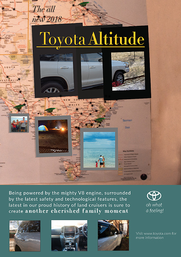
After reading everyone’s critique, combined with the teachers feedback for that class, I basically redesigned the top section to address the concerns raised in the feedback, while still basing the ad off the original concept, as well as refining the strongest part of my previous ad. So if you were curious, this is the redone version.

Once again you have gone off brand on the typeface and text treatment.
Toyota would never allow you to do that to their company brand.
Their current tag (at least in the US) is “Let’s Go Places.” not “Oh, what a feeling.” Let’s go Places" is far more apropos to your ad focus anyway.
Check this out:
https://www.toyota.com/brandguidelines/typography/
Also check out the other sections of those standards.
Best to learn this now. When working with brands it is necessary to work creatively within their guidelines.
Next work on your hierarchy and your grid.
Dropped out white type is difficult to read when it is in a skinny typeface. It’s also difficult to print without filling in.
