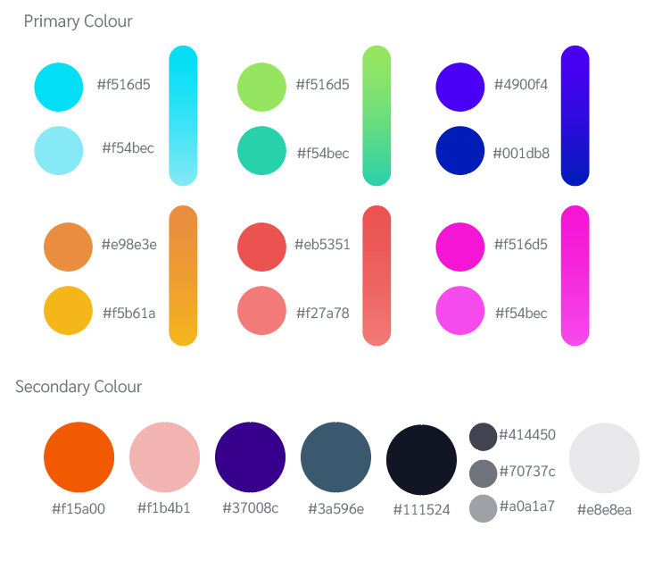
Can you please advice. These are colours selected for a rebranding. The logo will stay the same as the previous one. But the layout will contain shapes with these colours. Its a rebranding for a design agency.
These are great IF you never want anything printing. Not many of them can be reproduced accurately with inks.
1 Like
That’s a lot of colors, and their relatively worthless hexadecimal codes.
There’s no way anyone could possibly offer advice of any kind here. You’ve presented no context other than “the layout”. The layout of what? Rebranding? Of what? Tires? Cosmetics? Underwear?
As you will read in the question above “REBRANDING FOR A DESIGN AGENCY!”
What kind of design? Interior? Landscape? Architectural? Textile? In what market?
1 Like
Glad to know GDF is more trustworthy than the said design agency.
3 Likes
Twenty-one brand colors, huh?
This gives me all kinds of confidence in this design agency.
/sarc
1 Like
You’re asking us to judge the appropriateness of colors by how pretty they are rather than by whether or not they’re appropriate to meet the unique branding needs of whatever company will be using them. Since all we know is that the colors are for a “design agency,” it’s impossible to say whether or not they’re appropriate for the company.
On a more practical note, as @StudioMonkey mentioned, most of these colors lie outside the CMYK gamut and will be unprintable using standard four-color process printing without them dulling way down. In most situations, this limitation would be a deal-killer. If all this design agency is concerned about is online digital use, I suppose they could work.
The bigger question is why doesn’t this design agency already know this bit of basic design knowledge.
1 Like
You should use Pantone Formula Guide Solid: Coted + Uncoated
Pantone is a global standard for color matching. Each Pantone color has a unique print number, an RGB value and a hexadecimal code.
If you choose the right Pantone colors, your branding will look great both on screen and in print.
2 Likes
What all the others have said is note worthy and if this is for a design agency, that provides some context. However its hard to judge on just colours alone.
Regardless, I would say invest some time into finding the CMYK versions of these colours (or as close as you can) and further than that, reduce the amount of colours being used perhaps.
There are just way too many and even then the only gradients that are standing out are the green/turquoise and the yellow/orange.
Can you maybe elaborate as to why there are so many primary colours in the first place?
1 Like
CMYK <==> RGB conversions are neither straightforward nor reliable.
You might get different results depending on your software and color profile.
Fo example, Adobe’s and Serif’s apps can yield different CMYK values of the same RGB color. The same sometimes is also true for Photoshop and Illustrator.
That’s why you should use Pantone colors, each of which has an ascribed RGB value and a hexadecimal code.
Moreover, Pantone colors kind of straddle the CMYK and RGB color spaces. There are many Pantone colors which can’t be reproduced using the four basic CMYK inks.
Take a look a the C and CP versions this color:
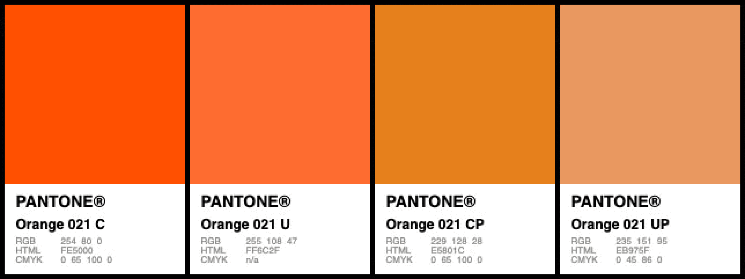
The C version is a true Pantone color, whereas the CP version is it’s CMYK equivalent.
No matter how hard you try, you will naver get the same color with CMYK alone.
1 Like
That really has little to do with what software you’re using and more to do with what the starting colour profiles are - and what the colour profiles are in difference between them.
Technically, if all Software is setup to use, for example, Coated Fogra 29, for CMYK, and Adobe RGB, for RGB, then the conversion should be identical in the software.
It’s really more to do with input vs output profiles.
But you’re not a million miles off - there still can be differences regardless.
Well, they just give you their best conversion for the Hex values or RGB values - but you could still see differences if the the Output Profile is ProSRGB vs Adobe or Apple RGB etc.
Not really - some CMYK colours and some RGB colours can be in the same output values as a Pantone colour - but not all Pantone Colours can be reproduced in CMYK or RGB - so what you see given is an approximation - the closest that be achieved.
That’s quite typical of this colour - it’s one of the worst Pantone colours to pick - due to how it can appear in Pantone vs CMYK vs RBG - the colour just cannot be reproduced outside of using a Pantone spot colour.
The U version is actually the exact same ink as the C version - it’s just that it’s on Uncoated stock of paper.
The colour is quite saturated.
The CP version is actually a CMYK depiction of the C version.
Same with the UP.
So if you’re using Pantone 021C - and using a Spot colour you can expect those colours on Coated and Uncoated Paper.
That’s why you’d pick a different Pantone colour for the Uncoated paper - so you can get a better match.
And if you were using CMYK - expect the CP version.
3 Likes
Funny that no one noticed that the hex numbers are wrong.
3 Likes
I’m currently working with a client (a medium-sized city) with an extensive color palette. All the colors work together to create a general color personality for the city. Using all their colors in everything isn’t necessary, but the colors provide a starting point that keeps the general look of all their materials consistent. It works quite well and provides the needed color flexibility for everything from their sewer department to their parks and recreation efforts.
A brand personality that relies on super-saturated Pantone colors will be completely lost when the colors are dulled down to CMYK no matter whose conversion formula or tables are used. And it will, of course, be impractical to use twenty-some Pantone colors for all their printing.
In other words, the OP’s color palette won’t work in print unless the client is OK with the entire personality of the brand being dulled down and lost.
There are so many things wrong with the OP’s post and color choices that I suppose no one even bothered to check the details. You’re right, though,
1 Like
Or maybe it’s all about the details. Details are important.
And is the OP really so wrong? A distinction is made between logo and layout, and specifies that the layout will use the colors. There’s nothing wrong with the supporting graphics of a brand being colorful or limited to a particular pallet. Print versions may be less saturated but it would still make the same impression.
1 Like
Details are important, but only when isn’t something larger making them irrelevant.
Yes, the OP supplied inadequate context to the problem then failed to provide additional context when asked. If this person works for a design agency, I’d expect communication from someone in the business of communicating. For example, an explanation for choosing these colors and why they were appropriate for the design firm would have helped.
The OP stating the obvious supplies very little context.
I agree, but if you’re implying that I said they otherwise, you’re incorrect.
I disagree. The proposed color scheme uses an intense, saturated, and emotionally charged color scheme. They’re great colors if one wants a brand with those characteristics, which I can only assume is the case since the OP did not explain the color choices.
Unfortunately, those qualities would be lost in the dull CMYK approximations — significantly undermining the emotional and dynamic character of the brand. As I already wrote in my previous post, “…the OP’s color palette won’t work in print unless the client is OK with the entire personality of the brand being dulled down and lost.”
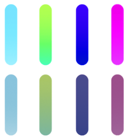
The following colors from the OP’s palette, for example, aren’t even close between the top RGB row and the bottom CMYK row.
1 Like
I was able to get better results using Pantone colors:

Still, the blue and pink gradients can’t be faithfully repproduced in print, even using Pantone inks.
2 Likes
The closest Pantone ink matches for some of those colors might be in their Neon & Pastel series, but I don’t have one of those swatch books to check.
Gradients in Pantone colors are almost as bad as transparency overlaps in Pantone colors. In print you will have to deal with intersecting line screens of two spot colors…good luck with that without converting to CMYK