ADVICE - hjdESIGN LOGO

Hi,

I am new here. I am starting my own freelance graphic design from home.
My business name is HJ Designs.
I am working on a logo and have decided on two. I also applied them to business card designs and narrowed it down to two lots.
I wanted to get some feedback on both business card designs.

Thanks.

Contrast.
The “DESIGNS” is not going to be legible and will most likely fill in at business card size.
The logo itself, I don’t hate it but it’s yet another in a long line of monogram designs out there. I might revisit the hook on the J a bit as it’s a bit lower in the heirarchy from the rest of it and makes me wonder if it’s supposed to be “HI” rather than “HJ”

Quite the disconnect between your business name and your email address…?

1 Like

I like the logo and the pattern made of it (not so much the other pattern, which kind of reminds me of Space Invaders):
image

Yes, just about all your type is in the fill-in danger zone. While I hate the word “design(s)” in anyone’s business name, I do like the way a lightweight sans serif looks when used the way you did. But PD’s right; when you set it reversed, surrounding it with ink, it’s gonna fill in.

Well, if you really are a Nubian Soul Queen, why hide it? Personally, I don’t mind that kind of peek into your personality, especially since you’re an individual freelancer, but you do run the risk of someone seeing that as unprofessional and/or having ethnic bias rear its ugly head.

1 Like

@PrintDriver Thanks for your feedback. I will alter DESIGNS so it doesn’t get lost.
Are you referring to the J on the top logo or bottom logo?
It reads HJ DESIGNS.
I was going to swap my email for my other email which has more connection to my business name. which is heidi.h.joseph@gmail.com

my style is bold, abstract, patterns, geometric and different so i wanted that to show in my business card which is promoting my style and who i am as well.

The “J” with two parts. The solid one is ok, but again the contrast of the dark purple on dark gray is not so good.

I see you mentioned a style in your last post. Most designers can’t afford to have their own personal style. Illustrators do, that’s how they get hired, but a Graphic Designer has to be a chameleon. They have to be able to bend to the style needed by their client du jour. Don’t allow yourself to be pigeonholed into any given style.

1 Like

I agree with you on that one…now I am seeing PACMAN the game in that first pattern…
iI do create patterns so that is my style which is bold and abstract.

The type is something I will fix…even tho its in outlines will that prevent the fill-in to happen.

I do plan to change my email to my other one which has more connection to my business name which is heidi.h.joseph@gmail.com

I might change the word DESIGNS to HJ Create or I will need to think of another word that represents me.

Thanks a lot for your feedback!

Don’t swing in the wind based on advice we may give you here.
If you have a good reason to do something in the way you’ve done it, speak up. Don’t just change it for the sake of changing it. I had a college professor that would have you do things over, and over, and over until you actually argued back, with a good argument, that this is why you did what you did.

As for the outlined letter forms, they will still fill in. It’s all about dot gain, not the letter itself. There are processes and materials that can minimize dot gain but you always have to account for it.

I quite like this one :slight_smile:

I would make the Freelance Graphic Designer a bit bolder though :wink:

Untitled

1 Like

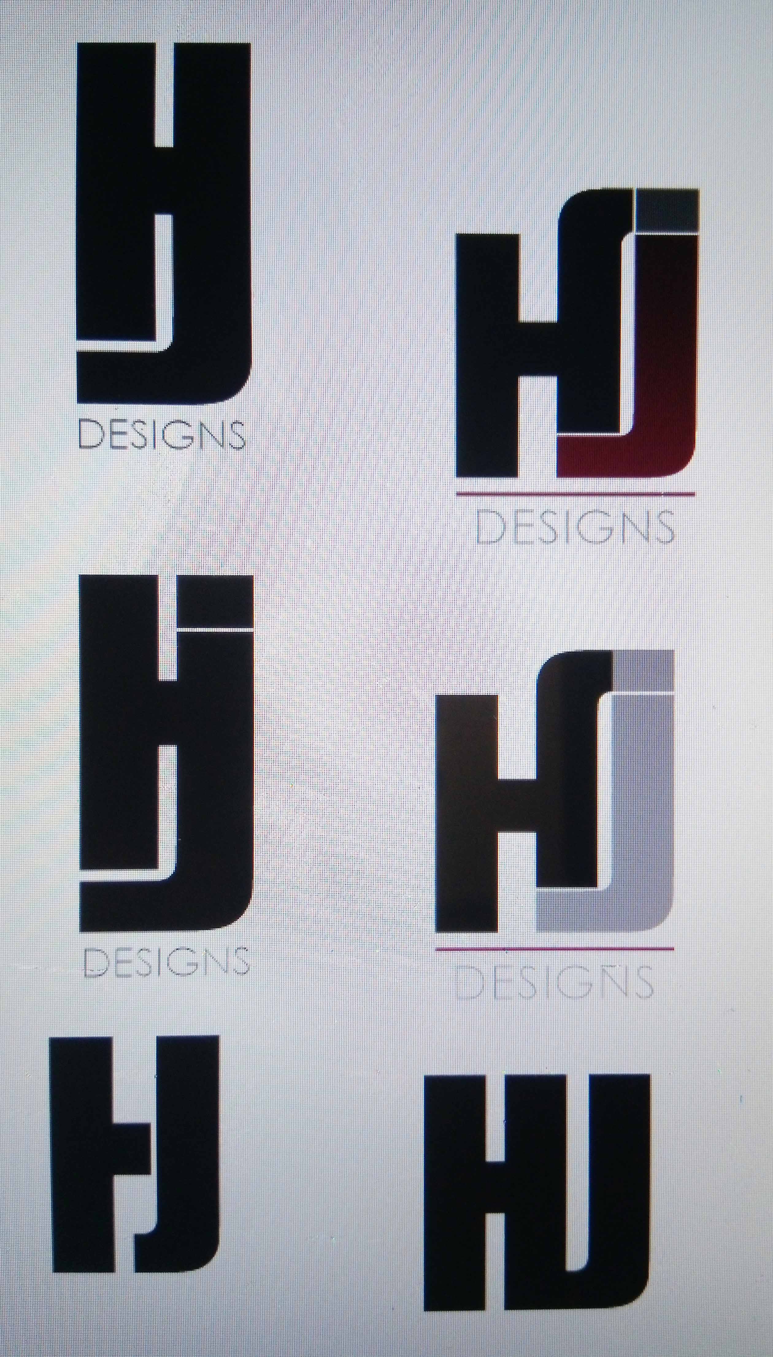
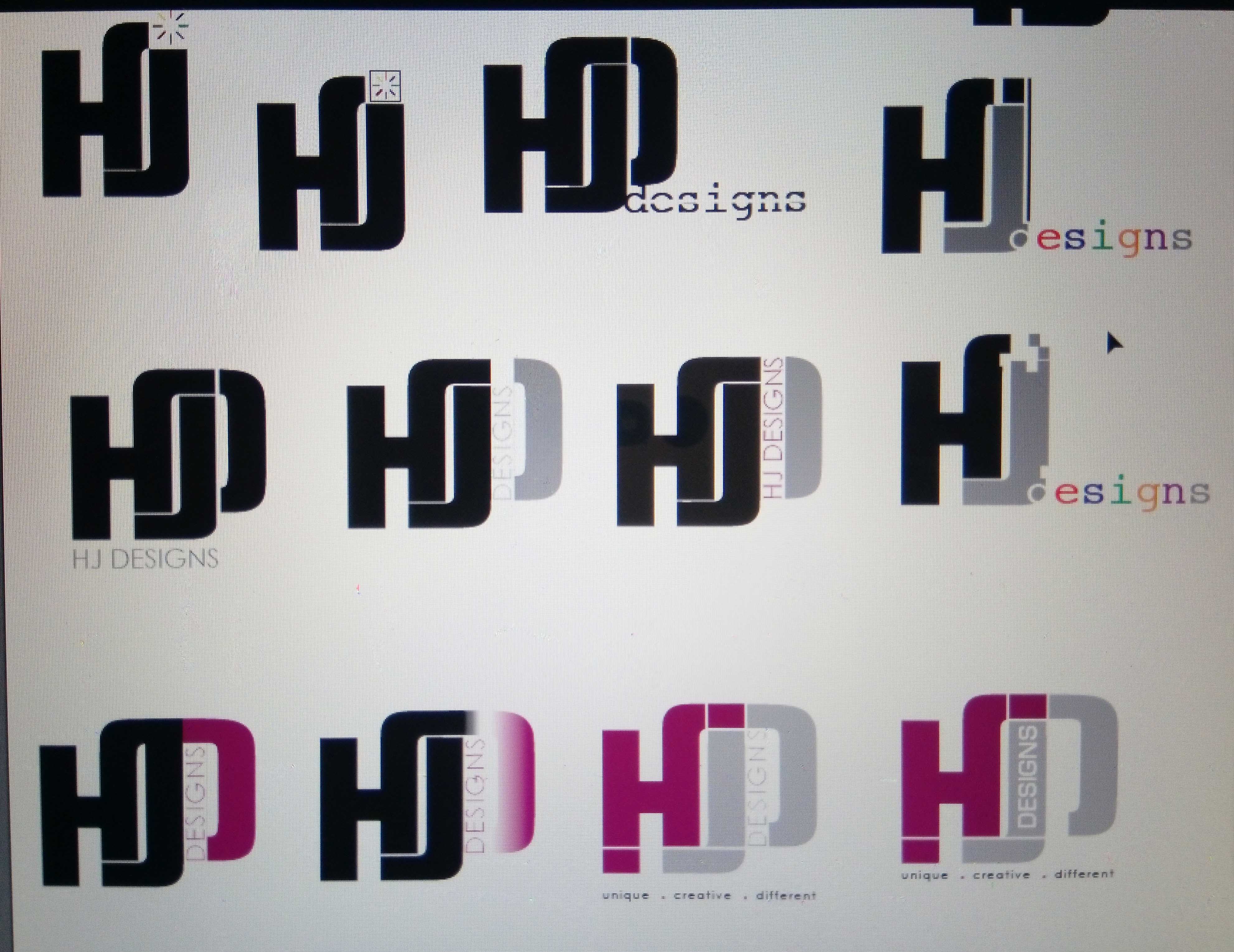
I have something of an unorthodox opinion on logos — I don’t think they’re necessarily needed.

What I think is needed is strong visual branding that’s recognizable, memorable and appropriate to the organization it represents. This might include a logo, but it might not.

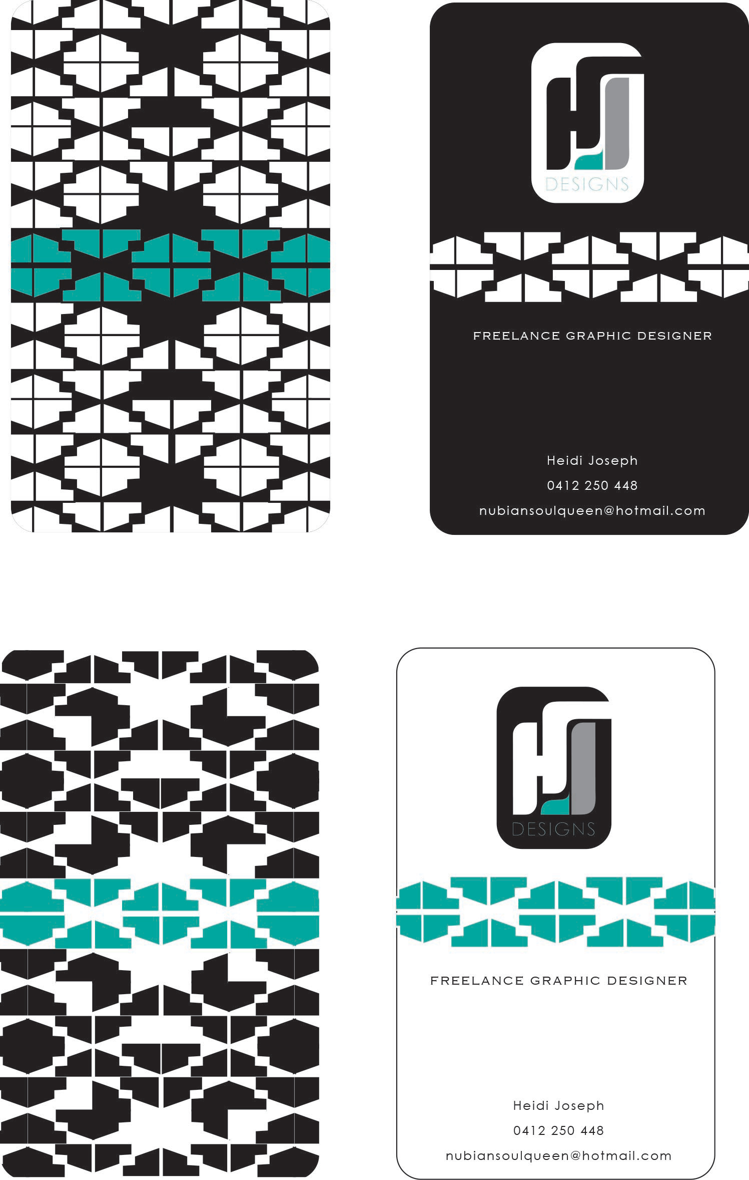
So with that in mind, judging from your email, nubiansoulqueen, I’m guessing the PacMan motif was meant more as an African motif, which is a direction I like. If that’s the case, there are lots of options to stay with that direction while getting away from the PacMan look.

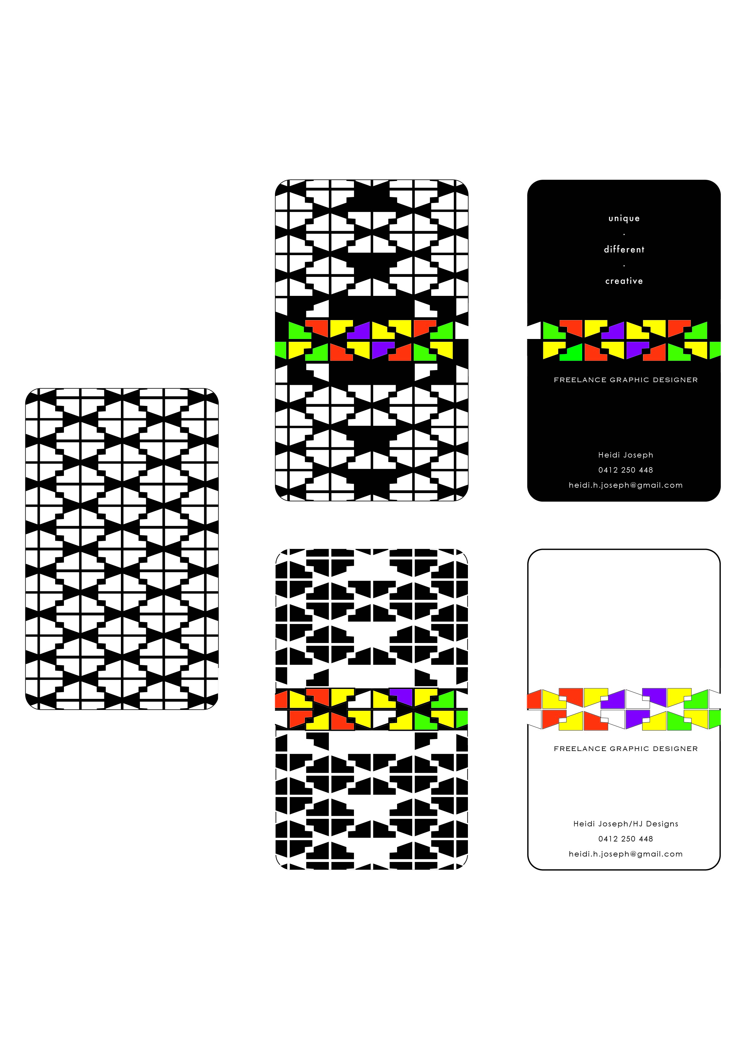
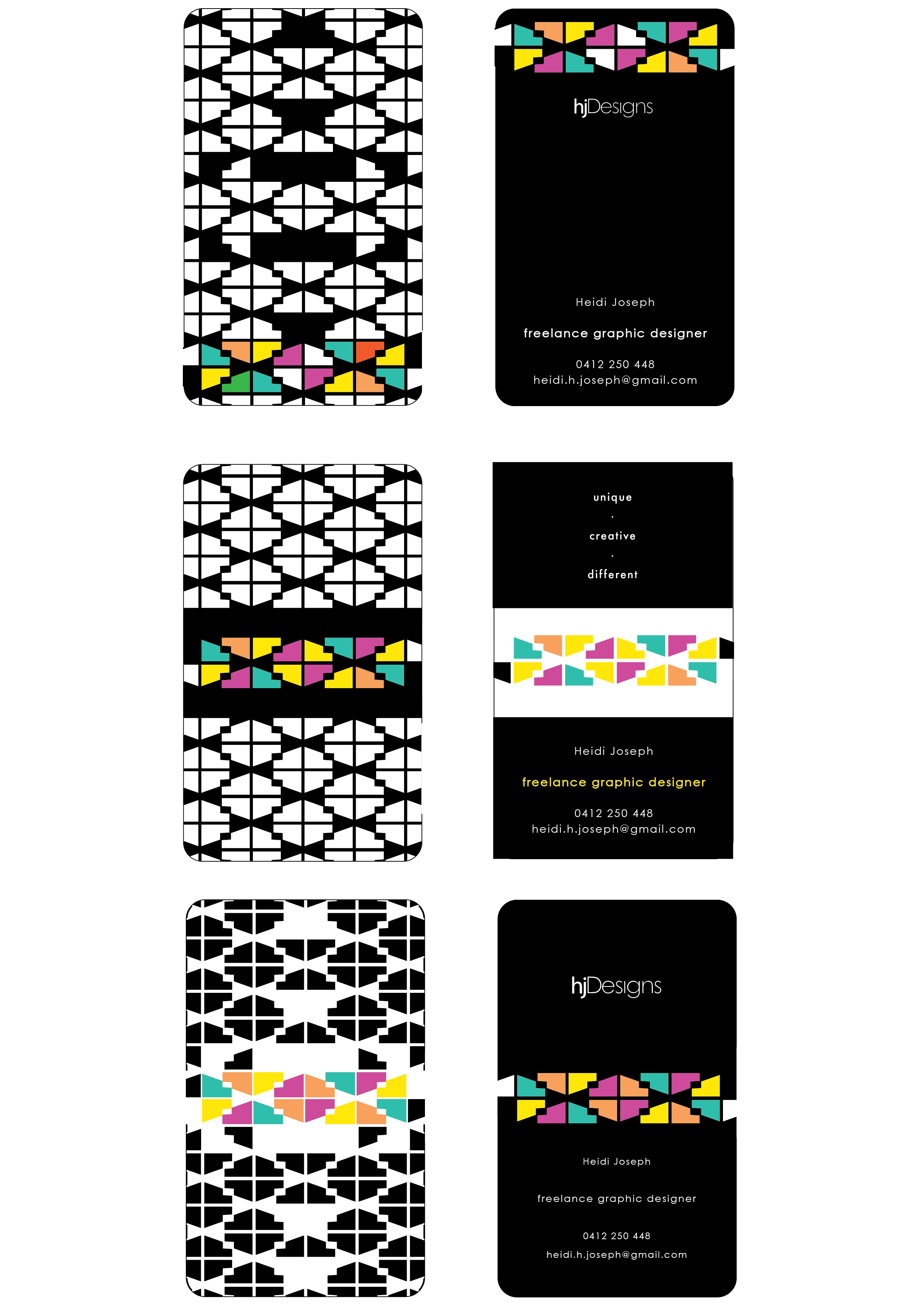
As for the pattern (African or not), it competes with your logo for dominance and has a very different quality from the logo. I’m just not sure the two complement each other all that well. I might be inclined to let the pattern itself be your branding and, going back to my statement about logos not necessarily being needed, just use the pattern in various ways as your visual branding. The only thing I’d be concerned with by heading too far in an African motif direction is, possibly, pigeon-holing yourself into a niche, but then again, that might be a good niche with opportunity — I just don’t know. If it were me, I’d also toss some additional colors into the mix. Aqua, black and white is a psychologically cold combination.

I guess I’m not liking the pattern made from the logo quite as much as others above me. I think it could work out, but I’m thinking there are some refinements to be made in how the pattern comes together. the negative spaces are somewhat irregular in width, for example, which draws attention to itself as being in the awkward middle ground of looking accidental instead of on purpose. For me, it also has sort of a 1970s look to it, but maybe that’s just me.

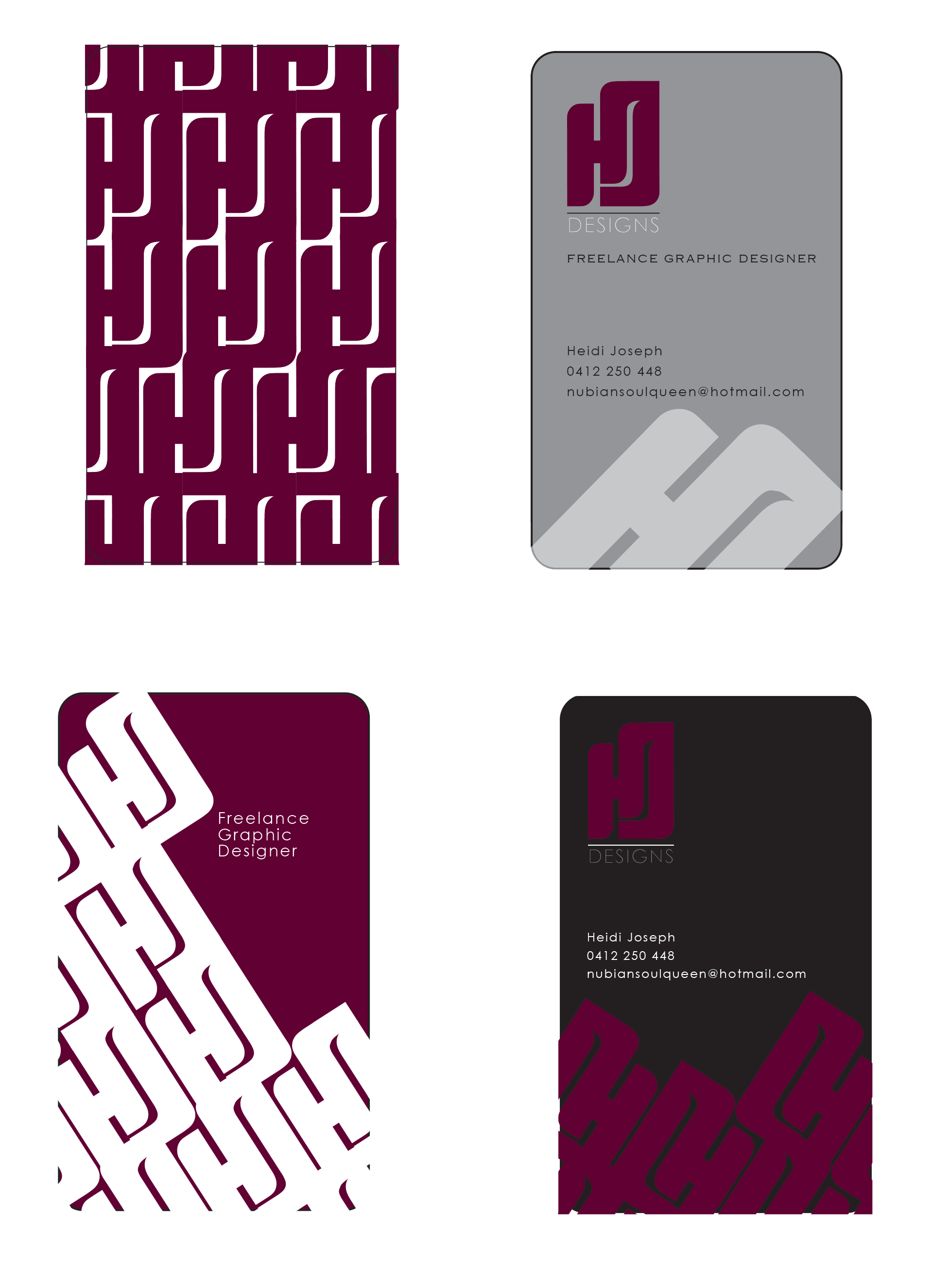
I’d ditch the hotmail domain address, though — it’s nearly as bad as putting an AOL address on your card. Right or wrong, it sends the wrong signal about technical savvy. Then again, you already said you were going to do this.

1 Like

Thank you for the feedbakck , I wil keep that in mind!

Thanks so much for your input.
I really appreciate it.

You are spot on in regards to the top one being african influenced. This could be a positive thing like you said but it could have a negative impact on potential clients and can be a put off and I dont want to risk that.

I am in perth, australia, and i noticed many graphic designers here have that same feel and style. I want to stand out and not be part of the norm.

At the same time not put clients/customers off by my style if that makes sense.

I have alot to think about.

These are ideas I had on paper first as sketches then translated them to illustrator…

Avoid gradients, at least in the main logo lockup. Save it for a bling version.
Also be careful of exceeding 3 colors. You end up with a 4-color process logo or in some instances where plates or thread are involved (think silk screen or embroidery) every color is an additional charge.

The timer spinner for a loading mac…I don’t know about elsewhere in the world but in the limited tech sphere local to me, that is known as the spinning…um…well…never mind…
Plus it denotes a hesitation, a waiting. Not a good association.

I wouldn’t be too quick to nix the African motif. If you have heritage you’re proud of, own it. If someone is put off by it, you don’t want to work with them anyway, right?

The gradients idea and timer spinner symbol were just ideas…i wasn’t going to go for them anyway, just wanted to share my progress.

I forgot to mention that I mainly do designs/patterns for my community and friends and people i know. they are already aware of my style being bold, colourful, abstract, my love for geometric shapes and patterns.

Exactly, so I am going to go with what my gut tells me to go with not with what people want me to be portrayed as.

Thanks for your honest feedback.

Hmm, I don’t think the font for Freelance Graphic Designer is working… Also maybe place it underneath your name, as for right now it says that first and then a blank space with your name, there is no connection between the two. The saturated colors don’t look very pleasing to the eye. If I’d use saturated colors, I’d do neon and the rest black and white. Have you tried to remove the stroke on the last design with the white background?

Hi, Thanks for your feedback…I was in the process of changing the colours as they were too strong for the eye. I also thought my name wont be enough so i thought to place HJ Designs on it as well.
I am not sure if thats necessary since I have freelance graphic designer on there.
I have attached an updated versions of my designs.