This is a hand drawn idea, scanned and cleaned up a bit in Photoshop. Thoughts?
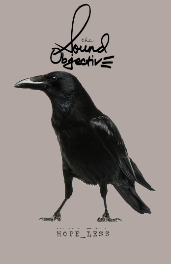
Once again, my 2 cents is stick with the heavy san serif for objective. It makes visual sense to me. The sound is more artistic and free flowing. Objective is more “heavy”. and gives it weight.
I believe that the wider handwriting style works better as in your first option. The width made it work with the heft of “objective” and helped balance out the more vertical weight of the raven.
1 Like
Cool. I’m glad you see that in the original design. I like your description of “sound” being more artistic and free flowing as opposed to the heavy-ness of "objective. I would certainly describe my music as free flowing on a bed oh heavy-ness, if you will. It’s an abstract idea, but I think it fits.