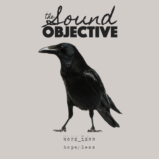
Hello! I’m working on music that I plan on releasing this year and I’m beginning to work on some album cover ideas. The name of my music project is The Sound Objective and the album will be called “Hope-Less” (for now). This is not a band, although I will have friends playing or singing on some of the songs. The music is heavy and dark, in a lot of ways, as it is an extension of how I’m personally feeling about the state of this country, and the world for that matter. It’s hard rock with a bit of metal and maybe some blues and progressive/shoegaze/alternative elements.
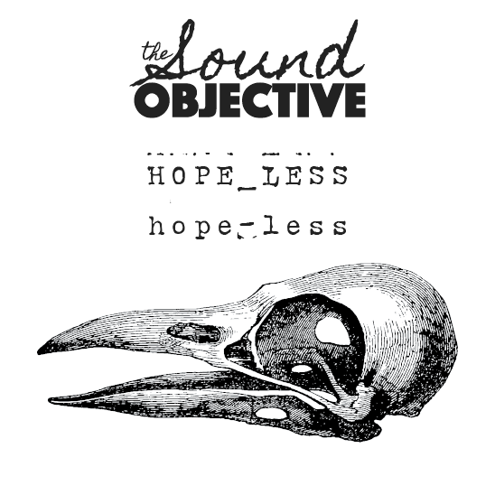
I like minimalistic designs and that’s what I’m going for here. The raven and its symbolism, I feel, represents the feelings entrenched in the music. In the second version of the cover, I use an illustration of a bird skull.
I would love to get your thoughts on the designs and concept. Thanks!!
All in all I think it works pretty well. Between the two the has more prominence and strength with the dominant raven photo. If I had to offer a few nitpicks, I would say that repeating hopeless twice seems unnecessary and confusing. I actually went back and made sure I didn’t misread that the album was titled “HOPELESS hopeless”. Also, the “the” is a little tight to the S, IMO. and the intro line for the S isa little close to the “objective”. And lastly, if you go with one version of hopeless, I’d look at making it a little larger.
Gotcha. Funny, the font I use for “Hopeless” is designed that way, actually. So I didn’t do that on purpose but when I saw it, I quite liked it so I kept it hahah. But I see what you’re saying. Maybe I will try a different font. I will work on the “The Sound Objective” logo as well. Thanks for your thoughts and suggestions.
The contrast between the handwriting type and the heavy sans-serif is interesting and fine, but I’m not liking the handwriting font. It’s just a badly designed bunch of letters that come across to me (rightly or wrongly) as amateurish and screams free font. Besides, it just seems uncomfortably positioned above the word OBJECTIVE. Then again, maybe the emotional qualities of the composition match the music, which would lessen my concerns.
I’m not opposed to handwriting. I’m just opposed to the looks of that typeface. If it were me, I wouldn’t use a typeface to simulate handwriting for just two words in a logo — I’d use actual, custom handwriting.
Before you become famous, a casual listener will not know the album “The Sound Objective” is by HOPE_LESS hope-less, or the album “HOPE_LESS hope-less” is by The Sound Objective.
The Beatles got away with it but then again they were quite famous.
Got it. No apology needed. That’s what I’m here for. I’m not a professional designer, so amateur is right and it certainly is a free font. Of course, it’s all subjective really. But I take critiques from professionals such as yourself to heart and appreciate the expert eye, technical knowledge and experience you all have. Again, that’s why I’m here. So thank you.
I like the idea of using custom handwriting for the logo. That, I can do. I’m just not sure I know how to make it looks good as a vector (outside of using the image trace option). Back to the drawing board…
Hahah definitely. The good thing is I’m not trying to be famous so no worries there. It’s just music that I want to share with whomever is within listening distance. Friends, etc. Of course, it would be great if more people listened, after all, that’s why we create…but fame isn’t the goal.
That’s one of the problems with grungy, organic-looking handwriting typefaces — they never look right because vector is inherently non-organic. At small sizes, the type might look OK, but enlarge it and the artifacts of the vector underpinnings start looking pretty bad — especially if the type was just scanned and auto-traced.
If this really is a logo and not just album art, it probably does need to be vector. If it’s just the album, though, there’s no reason why it can’t just be scanned-in handwriting. If you really do need a vector logo that you can use elsewhere, like a real logo, you might want to consider a different style of type that lends itself to the smooth outlines that vector is good at.
I see what you’re saying. I think I need to think about creating a logo that will work across the board. I will sketch out some ideas and go from there and perhaps come back with just a logo for critique before I go full into an album cover. Thanks again for your thoughts.
Nothing tells me the artist’s/band’s name is “The Sound Objective”, or “HOPE_LESS hope-less”, just like The Beatles’ album “Sgt. Pepper’s Lonely Hearts Club Band”.
I see. I suppose most of the time, the name of the artist is more prominent than the album title. That was my thinking, anyway. I don’t own any Beatles albums so had no idea what you were talking about hahah.
I apparently am not 100% in agreement with most on here. I do agree with @Just-B that doing actual handwriting for “the sound” would be an improvement. But other than that, I believe that the juxtaposition of the handwriting and the sans serif work well.
And I knew right away the band name due to it being at the top of the cover and it being more prominent. At least for the version with the raven photo. The second option IMO is less clear and also less strong as a layout.
The juxtaposition is definitely intentional. I appreciate your insight and agree that the second option isn’t as strong. I am re-working the logo and reconsidering the use of the double typewriter font.