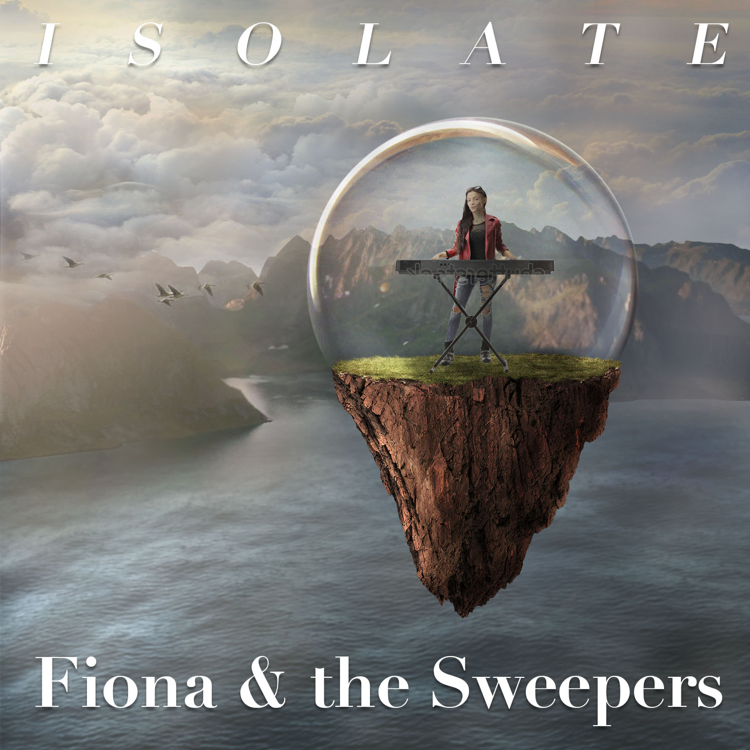
Hello, I have made an album cover for my friend’s new album she is about the release. She is a pop singer, with a big voice. She is a talented keyboard and piano player. I will be replacing the stock image on the keyboard player with an image of her. Her album is called isolate, and we went with the floating in a bubble idea. She had to record this album with each band member in separate studios because of the restrictions.
Just looking for an all around critique, but especially on the typography as it’s my weak point in design I think and I want to improve.
Thanks to all those that reply!
Digging the imagery.
Not a fan of the typography because of the skinny strokes on the serifed letters. I may be biased on that a bit because of my sign work, but I think they are just a little too ephemeral here.
Take care to match the style of the art when you sub in the actual keyboardist/singer.
So many bands lately building albums remotely. Not an easy task. And so many have lost so much income.
I wish your friend the best of luck.
Hey thanks for the reply!
Yeah, I struggle with typography choices and knew that was a weak element here. Would you suggest a bold sans serif instead?
It’s definitely a tough time for musicians for sure, a lot of them have lost their summer touring gigs.
I agree that the typography is the weakest element of the cover.
I could be wrong, but it seems as though you view the words as being separate from the illustration — just something that needs to be hesitantly typed into a spot where it fits, and that the trick is finding the right typeface.
That’s not at all the way to approach it. Instead, the typography needs to be part of the composition and approached with the same artistic sensitivity used to create the illustration (I assume it’s yours). I’m not saying the type needs to look like the illustration or literally be part of the illustration (although sometimes it can be). What I’m saying is that the album cover typography shouldn’t be an afterthought to be added once the illustration is finished. The type should be considered an essential ingredient that works with the rest of the illustration to finish the cover.
This is good advice, thanks!
Let me have a think and try some things out to try and approach it this way and I’ll repost the results.