Here is my work for a client.
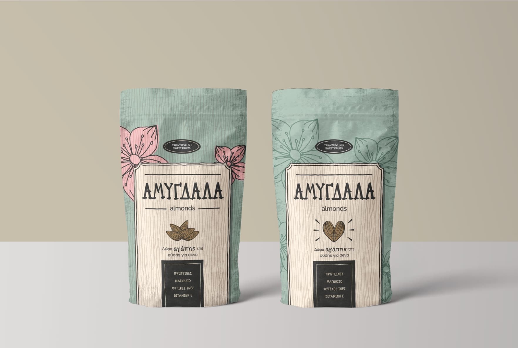
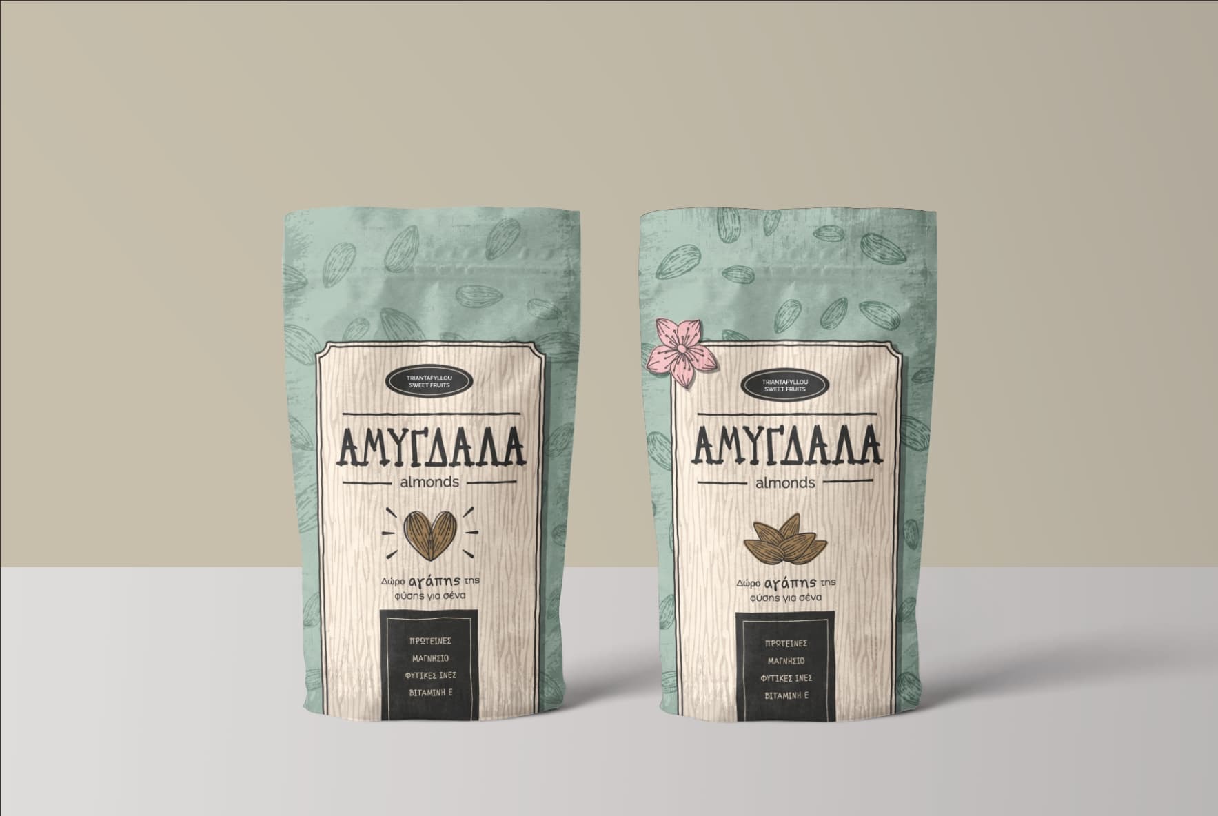
He asked for an almond package design, that will “attract” the eye on the shelf.
That’s the only brief I got.
He has a local farm that produces almonds, onions and watermelons.
After showing him some designs he decided to choose between of these.
The package is not complete (needs to add some nutritional info etc).
What do you think?
Can you suggest me some improvements or fix any mistakes?
To help you understand
“ΑΜΥΓΔΑΛΑ” = ALMONDS
“ΠΡΩΤΕΙΝΕΣ” = proteins
“ΜΑΓΝΗΣΙΟ” = mangesium
“ΦΥΤΙΚΕΣ ΙΝΕΣ” = Fiber
Δωρο αγαπης της φυσης για σενα = A gift of love from nature for you
Everything you see is hand drawn apart from “Triantafyllou Sweet Fruits” font.
At first glance, to me the treatment suggests a “bath” product (salts, moisturizing beads, that kind of stuff). But not knowing the market, it could be a good fit for nuts, as far as I know. Even if it is a misfit among competitors, that may be a strength. Nice work in any case.
These are very nice, and I agree with what HotButton said. At first glance, they don’t immediately communicate almonds or food, but I’m not sure that’s a big problem.
I like the large almond flowers on the first one, but the package contains almonds, not their flowers. I like the pink color breaking up the green, so I might include a few smaller flowers mixed in with the almond drawings from the other packages.
The texture (the vertical woodgrain/almond lines) on the first package seems a little too much. I’d probably confine it to the beige part, as you’ve done on the final three.
I probably wouldn’t arrange the almonds into a heart.
Finally, the blue-green is a color I’d associate more with olive trees than almond trees. I like the color, but I might shift the color a little in the direction of it being greener and less blue.
On the other hand, I’m unconvinced that my opinions on this are anything other than my personal preferences. The packages really are very nice. I like them a lot.
I think the bottom right internal panel would work better with the design on the left.
Instead of a olive green, have you considered and orange, yellow, or chocolate brown? Even a Navy blue might work if you find the right shade. Food packaging is generally brighter, and enticing.
I feel pastels are more bougie supplements, and healthcare.
People tend to like to see they food they are getting too, maybe a plastic window?
I’d buy something like what you have as what you’ve done looks more impressive.
My only side note is:
Almond and nut products are expensive.
So people selling them cut back on expensive design and packaging to keep the price down and maximize their profits.
I’m wondering how this product with fancier more expensive packaging would fair against cheaper looking packaging at a cheaper price.
I do eat almonds, Brazil, cashew and other nuts regularly and they’re expensive already.
That aside, if the client is happy with that and going in at premium level shopping…
I think it’s pretty good. And would look good in higher end shopping markets.
And higher end health food shops, gyms, well-being facilities etc
I have not read all of the responses, so my comments may be repetitive.
The work is really nice, good job. This has a very high end boutique sort of feel.
The one thing I’m not sure about is how these will work at the retail level. Are they going to be on a crowded shelf at a grocery store competing against other almonds? If so, it would be important to view them in that context next to the competitors. Or are they going to be in a boutique or gift shop? If the latter, I suspect they’d perform quite well. I’d think they’d do well with online sales, too.
The briefing was “we want a package which will be something different, stand out from the rest on the shelf, it will be available in many kind of markets”
I asked them about their brand/strategy etc, they answered “we don’t know yet”
The only thing they knew was that they will produce and sell almond butter in the future.
As you can see from the package they don’t even have a logo.
Its doesnt quite sound they know what they want, but it gives you alot of freedom to inform them of what they have and what they could have with the right designer.