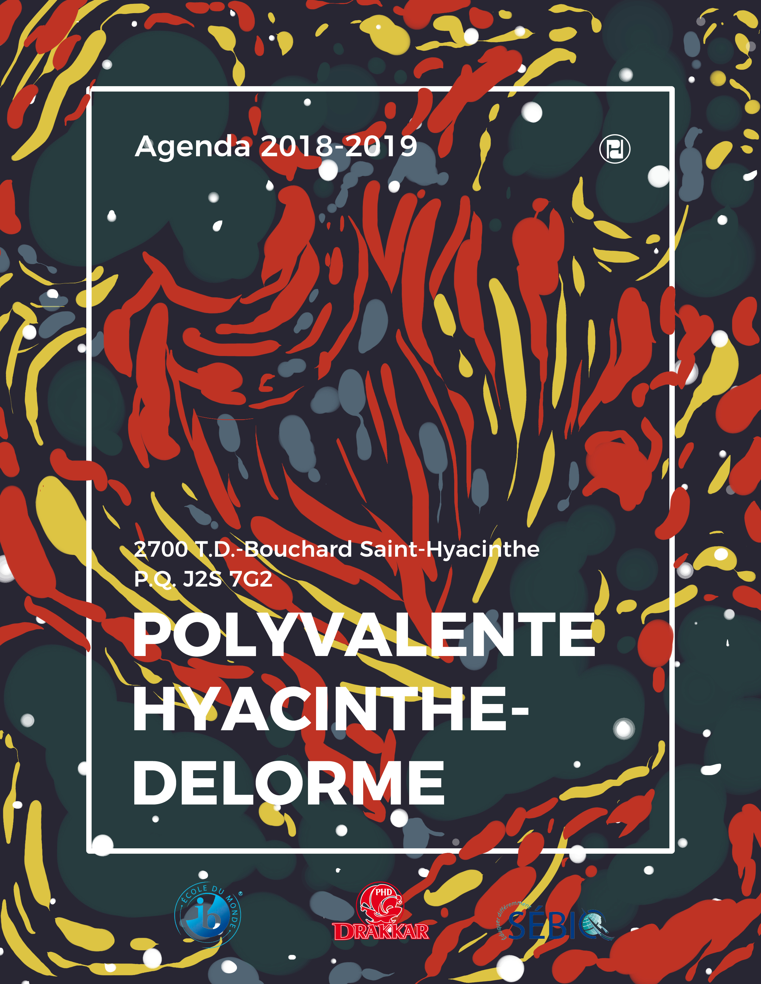
So first thing, I wanted to somehow fit art into the cover, because art is pretty. I instantly thought of watermarbling (like the old victorian book covers, y’know?) but since I don’t have materials to do that, I made a similar effect digitally. The colors printed a bit darker than I expected, but I have no skill in printing stuff, it’s hard to find good(and free) classes on that on the internet.
Note: I had to put the logos in, which kind of broke my design at first, but it looks good enough in the end.
Anyway, I thank you in advance for taking time to critique me!
I’ve always loved the old marbled book lining sheets. When I was in school, sometimes I’d visit the university’s rare book collections just to look at the marbling.
The artwork on your cover is interesting, but it makes the words difficult to read. The logos are completely lost. With such strong, aggressive artwork, you should try to find some way to separate the areas where the words and logos are positioned from the overpowering background.
I like what you have started with the artwork in the background. The colors are way too strong and demand a lot of attention, taking away from the more important information and readability. Perhaps play around with the color combos in the background, something more subtle. Could be lighter with dark text too.
Most logo branding guidelines will not allow placement on a busy background like that. I would use a plain strip to place the logos into.
The pattern looks a bit like a floral fabric print, but some bits look a bit blobby and rough. I would design a darker patch where the text sits and put the yellow parts the pattern outside of the text areas for better contrast.
Like everyone else, I like the pattern, but don’t like the lack of readability.
However, I would also consider the emotion the pattern creates. The reds and yellow give it a very energetic and dynamic feel, which are positive messages. But it also feels a bit chaotic and almost “wicked” which are not values one would associate with a school. Maybe you want to take out some of the more darker colours and harsher lines.
I like the way the pattern passess through the white border. It sort of creates the sense of expanding out of what is possible, which is a great message for a school.