Yes, I’m in the same class as everyone else asking for feedback on a logo for a restaurant you’ve never heard of.
For this logo, our group has redesigned the original logo with better shapes, different colors, and a new font.
Here are four variations. Please be incredibly severe with your feedback unless you like it then kudos. ![]()
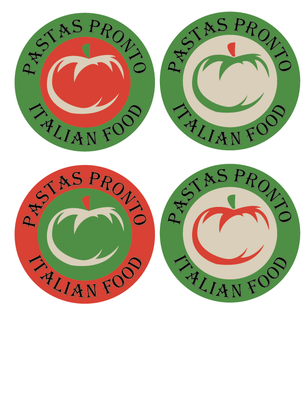
There’s not enough contrast in the dark-to-light values, which is bad for legibility. Squint your eyes and the type mostly disappears.
Speaking of the type, is that Algerian you’re using? I’ll admit to that being one of my most disliked typefaces, but that’s mostly just a personal opinion.
Yes it is algerian. We found it fit the theme for a pasta restaurant well enough, but we will try to fix the colors and find a better font thanks for the feedback. ![]()
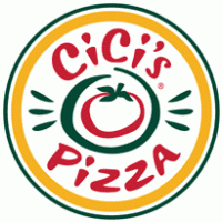
It reminds me of this logo only less readable. I’m not saying the Cicis logo is perfect. But Cicis is the low end of pizza, so it works for them.
Do you have sketches of ideas you can share? If not, you should. Get some pen and paper, crayon and paper, chalk and sidewalk … whatever, and sketch, sketch, sketch.
No, seriously: SKETCH!
Yes, sketch!
1 Like
Readability is key, for just about everything. The viewer should be able to instantly read and understand. So I’m not liking the text placement, size, font, or color. As B said, it disappears due to low contrast.
I don’t care for the tomato either, because (1) it’s not clear enough what it is, (2) it disappears at small sizes, and (3) a tomato doesn’t visually mean “pizza”.
Instead of the circle, which is kind of trite, maybe try a triangle, which could look like a slice of pizza. Smaller circles could represent pepperoni. And try placing the text (yes, different font) above, underneath, sides of triangle, etc. Don’t put text over another part, because it can easily disappear.
I like the lower right one as a starting point.
The colors work well together if you are going for a more organic look and they make sense as far as making that tomato orange red.
Except for the type. That’s not working.
The tomato looks a little too much like a pumpkin because of the stem..
I’d think about losing the badge look and exploring other options.
1 Like
With that it might end up looking like a watermelon ![]() !
! ![]()
On a more serious note, I quite like the design—the colour combinations, the illustration of the tomato and even the universally hated Algerian—the triteness or overuse of the idea not withstanding.
Having said that the design could benefit from having a font hierarchy.
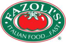
I’ll say this, out of the rash of student work that’s shown up over the last week, I’d say this work shows the most promise. I’d focus on the bottom right. The top right and the bottom left depict a green tomato. I know tomatoes start out green, but a green tomato isn’t very appetizing. I’m not a huge fan of the font, but, considering this is a high school assignment, I’d say it’s okay as it does evoke an old world sort of feel. I would ditch the drop shadow on the font, though. If you changed the type to white, it would be more legible, but that is getting even closer to Fazoli’s.
I should have clarified, but this restaurant mainly cooks pasta, and they don’t make any pizza. Also, this logo is a sort of modified version of the current logo, and it will have to go through a lot of changes, but thanks for the feedback ![]()
![]()
![]()
![]()