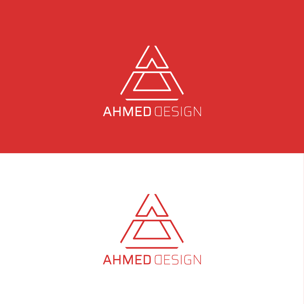
hi I made this logo for my own portfolio do you have any advice to improve it
a : ahmed my name
d : design
1 Like
it’s presentable already if you ask me. But, did you include “D” on the figure?
You’d have to do one heck of a job to convince me there’s a good reason for flipping the D.
1 Like
I suppose you flipped D in Design to mirror the preceding D in Ahmed, but I wouldn’t do that. It just looks odd and comes across as just an afterthought — a little extra detail thrown in for no particular reason. And as RC asked, is there supposed to be a D in the triangular A mark? If so, I don’t see it.
1 Like
I agree with the other comments about flipping the D.
Is there a reason the horizontal line goes through the whole triangle? I’m not entirely sure what that represents considering your other lines have gaps between them.
Other than that, I think it’s good.
I’m usually dead against using a freemium font … no exception here.
Do realize just how many other folks are using Saira too?
If you’re a designer … design your own logo glyphs and let your talent shine.
Other than that, the hierarchy seems harsh. Why is one of the main elements a lot weaker? Having the word ‘design’ weaker seems pointless.
Please flip the D back. It’s not clever or pretty.
1 Like