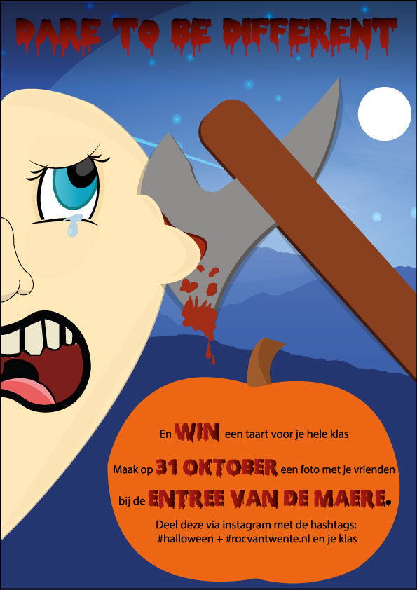
It’s creative and fun (except for the guy getting murdered lol). I also really like the mountains and sky scene. Seems like a creepy, cool night.
My critique is that it’s a challenging to read the “Dare to be Different” because the tones of the font are too close to the background’s tones. I put the image in black and white so you can see what I am talking about:
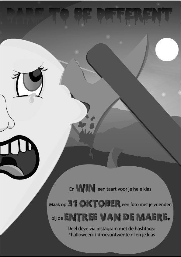
As you can see, “Dare” is hard to read and the other words are difficult to make out as well. I would experiment with different tones and maybe consider either removing or redirecting the gradient.
My last note is that I think the font choice with the could be better. I think the dripping font is cool and fits, but the complementing font seem out of place. I can’t really tell what it is about it, so it may just be me. Experiment with other fonts that aren’t distracting yet add character. As it is now, I feel like that font kind of takes me out of the mood that the rest of the poster has set.
I agree with @brantasm, you need to work on better contrast. Light text goes on dark background. Dark text goes on light background.
More details on person would help too. Looks a bit like a floating head.
What’t the connection between “Dare to be different” and the graphic? Are you daring people to become ax murderers?