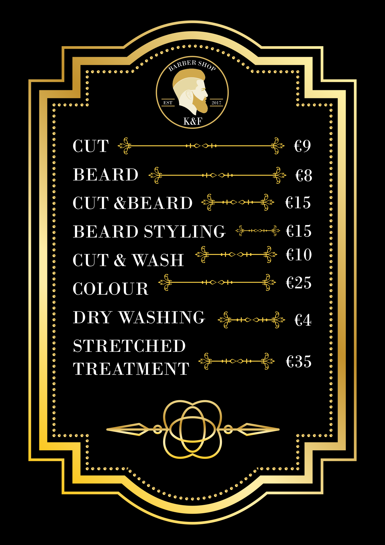
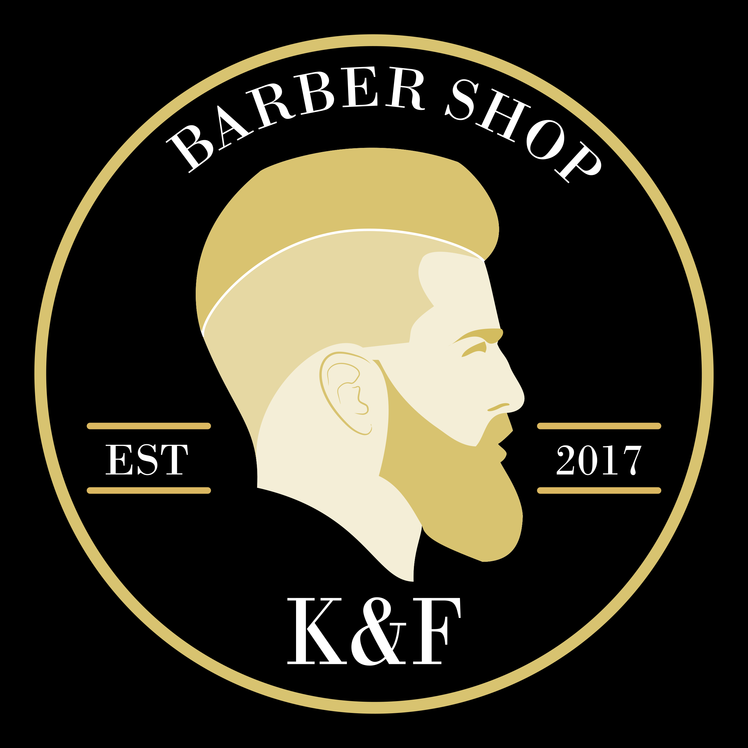
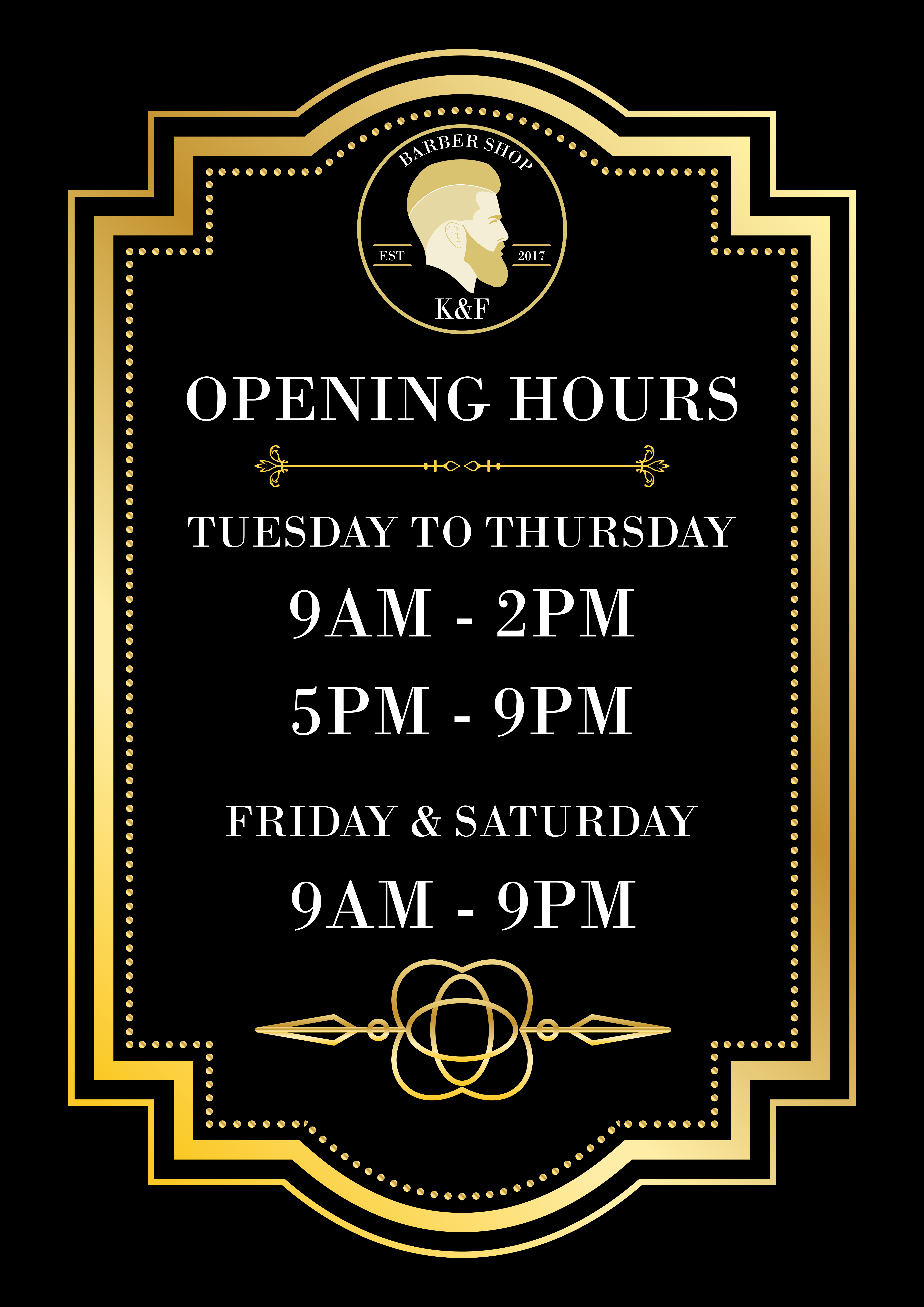
Hi , I just started doing some design work. Can you give me some advice what can I improve . This is a graphic for a barber showing his opening hours. Everthing is designed by me including the logo?
Thanks!!
Hi , I just started doing some design work. Can you give me some advice what can I improve . This is a graphic for a barber showing his opening hours. Everthing is designed by me including the logo?
Thanks!!
There is no shorter trend than a hairstyle.
Why saddle your client with a logo that will go out of style in a year?
Decide what this is. If it’s just a menu, is the logo really needed on there? If it’s a flyer, all I can say is, “hierarchy.”
Look at the size of the elements in the logo. At this size, they are illegible.
Check your type on an arc. The top line of the logo does not follow the outer circle.
On the menu, do you need the Euro mark? It’s very trendy these days not to have that in menus. It’s easier to follow a trend with something like a price menu that will likely be replaced relatively more often than a logo.
the hairstyle represent a classic hair style which complement the overall design and cant go out of trend that easily . It’s a menu . What does illegible means ? the euro sign is requested by the client
thanks for the feedback buddy
Illegible means the piece is difficult or impossible to read.
That thin, serif typeface get lost in the background. And I imagine it will print even worse than we see it here.
What is the intended print size? Your description mentioned it was supposed to show his hours of operation, where might that be?
Here in the US, the “Lumbersexual” hairstyle is a current retro fad.
It will go out of style again not too far in the future.
Illegible = can’t read it.
The very thin strokes in your typography make it difficult to read without enlarging the menu.
Does your client want a menu that looks as thought it came out of the 1890s? If so — which is entirely possible if the entire shop has that look — you’ve succeeded.
Okay, here goes:
– PrintDriver is absolutely correct about incorporating a trendy hair style as the key part of the logo.
– PrintDriver is correct about the “barber shop” type not being on the same arc as the circle.
– As Biggs pointed out, this doesn’t show the hours of operation. Your original post said the purpose os to show the hours.
– Leading and paragraph spacing needs work.
– There’s at least one type.
– The gradient gold and flourishes on the black background give one feeling. The trendy haircut in the logo gives another feeling. I don’t think the two are meshing.
– You have some alignment issues with the type and the flourishes you’re using as leaders. Also, the baseline of the prices don’t consistently line up with the baseline of the services.
– The menu of services is ostensibly the most important thing on this piece, but the menu is overwhelmed by all of the other elements.
Hi guys thank you all for the feedback
here is the complete work , btw he told me the style is perfect so if he is happy im happy
The only thing that I disagree is that the hairstyle fits the old fashioned styled poster
1890s hairstyles
2018 hair styles
You figure it out.
I do agree with the others that your entire approach to this menu is exceedingly trendy in that it harkens back to the 1890s or early 20th Century, which for some mysterious reason has come into vogue lately.
The gold on black, the hipsterish logo with the EST. date, the typeface, the embellishments and, yes, the haircut of the guy in the logo. It’s a retro, in-today, out-of-style tomorrow look.
That said, I’m not saying this kind of thing is bad. You just need to be fully aware of what you’ve designed and whether or not it’s appropriate for the client and the client’s customers.
You said the client is very happy with it, and that’s good. If the barbershop caters to trend-conscious customers and is decked out with this kind of look, that’s great. On the other hand, if it’s a guy who cuts hair in a 1990s strip mall shop with fluorescent lighting, vinyl seat covers and with hip-hop music playing in the background, you’ve missed the mark.
This is definitely a trend that I’ve noticed, at least around here. Hipster barber shops with this style, and they serve you a beer as you walk in the door and have pinball/arcade machines. They often have beard oil on display and have “subscription” services that allow you to get as many touch-ups as you want throughout the month. Each haircut is like $45, and I’m not sure who actually goes to the barber shop and makes a day of it
I get you’re going for an old / classic look. I think it doesn’t work with the trendy hairstyle and detailed artwork in the logo. You need to match the logo style to the rest. Also, the horizontal arrows are a bit too strong and look weird that they don’t align on the right. Also, the gold border is a bit overwhelming. Generally leave a bit more white space for text and prices in the design.