Rant/
When the Mac launched, people commented that they will never replace the Linotronic or Compugraphic systems and pointed out the limitations of Desktop Publishing.
“Desktop Publishing” was hint number 1 that the Graphic Design profession was in trouble.
When illustration tools arrived, people commented that this will never work, as too many bezier knots would stall RIPs.
They did and still do. If someone sends a clipping path that was created in photoshop by exporting a 1-pixel translation, and a printer is silly enough to use it, that will still bring a rip to a crawl. Even better, trying to use said path to a CNC file for a die-line or as a path for cutting vinyl. Even a vinyl plotter with a huge buffer can be choked by a large node count (we have to employ a workaround for text heavy vinyl or intricate art even today.)
Besides, time is money. Slow the rip? Slow the plotter? Slow the CNC run speed? Add $$$, one way or the other.
When unflattened transparency was introduced, people commented that this shouldn’t be used as most PostScript RIPs could handled it well [sic] or pointed out stitching issues.
Transparency still causes issues because Adobe, Quark and most rips refuse to believe that Spot colors can be transparent in Digital Print. Not only don’t they believe it, they create errors when encountering it (white boxes and dropped design elements being common.) It still shouldn’t be used when creating logos, at least not in the initial lock-up. Adobe’s bevel and extrude function in Illustrator still produces stitch lines on flattening that do enlarge and do show in print.
When digital printing arrived, people pointed out that it would never come close to the quality of offset or Intaglio.
If digital quality is good enough for you for all things, that’s fine. For a 3-spot job with any quantity involved, I’d still take an offset print over digital any day of the week. But eventually people will buy what is cheap, and quality be damned.
When digital photography arrived, people pointed out that resolution would never be like film.
That depends on how you define “film.” Digital cameras were pretty much blowing 400-speed Kodachrome out of the water while still under 5mp, but not the slower 100 or 200-speed films. It’s all about the film grain. Very few cameras (and those few are mostly high-end, slow-scan camera-backs) can approach the quality of slow-speed 4" color chromes. Even then, how good the digital photo is depends entirely on what the photographer does to it in digital post, and the color profile they use.
When RGB workflows arrived, people commented that print is CMYK anyhow, so that there would be issues.
RGB workflows have existed since forever. They are starting to become fashionable today because of - lazy. You can keep your in-house workflow all RGB where you are going to digital, offset, newspaper or web (and web is the real, bottomline argument for an in-house RGB workflow.) It’s not about YOUR workflow, it is about getting something good-looking out of the PRINTER’S workflow. Today’s RGB workflows have you totally relying on the skill and care of the printer for profiling of your files. It doesn’t require anyone to actually know what they need to know for a good looking output as they are now relying on the printer to properly profile your files based on their output profiles. There is no opportunity to tweak an image for contrast or color balance after the conversion is made. You get what you get.
If you go this route, if a printer offers you Job Options, BE DARNED SURE YOU USE THEM! If they don’t offer them, follow their spec sheet, which should tell you what pre-canned profile to use in your software that will produce the best result in their workflow on export to PDF. If they don’t have a spec sheet, call them. If they don’t have an answer, re-evaluate that printer as a resource. I’m not kidding. If you are relying on a printer for color management, and they can’t or won’t answer questions on profiling, do you want to trust them? While the answer may sometimes be that their profiling is proprietary, or even if they want native files, they should at least have a file hand-off profile that works best in their workflow. The printer’s preferred handoff profile might still be an RGB file, because the rip software is usually set to ignore embedded profiles in favor of the machine/media profile anyway, and for that you want the most color information available for that conversion.
Sure you can work all your photos in RGB, but considering that most camera and stock images are provided in the smallest RGB possible (sRGB) then you might wonder what this gains you. Not much. The reason to use RGB imagery is to have ALL of the possible color data available for the eventual conversion to CMYK (and there will be a conversion, with a very, very few exceptions.) The largest RGB gamut profile is Prophoto RGB. Followed by Adobe RGB, with sRGB being the smallest. sRGB is actually fairly equivalent to a SWOP CMYK gamut, so you aren’t gaining much at all there. In fact, a significant portion of the CMYK gamut lies outside of the sRGB gamut. You’ve lost that info for the conversion. Since many machine/media profiles have extended CMYK gamuts, you will lose even more with an sRGB image.
To see this visually:
Gamut - Wikipedia
Prophoto RGB has pretty much the largest color gamut available. That would give you the most information when doing the final conversion to profile for print. When we scan old-fashioned film, that is the profile we use. But most digital cameras today that shoot RAW only allow you the choice of Adobe RGB or sRGB on saving (even though RAW will convert to ProPhoto in post.) If given that choice, always opt for Adobe RGB. For the largest gamut possible, it is best to post process camera-RAW data outside of the camera. Once you dumb down a photo to a smaller color gamut, you can never get that color information back. There is nothing gained in converting existing CMYK photos back to any kind of RGB profile. Or once you take a camera-RAW file and make it sRGB in-camera, that color info has been dumbed down considerably.
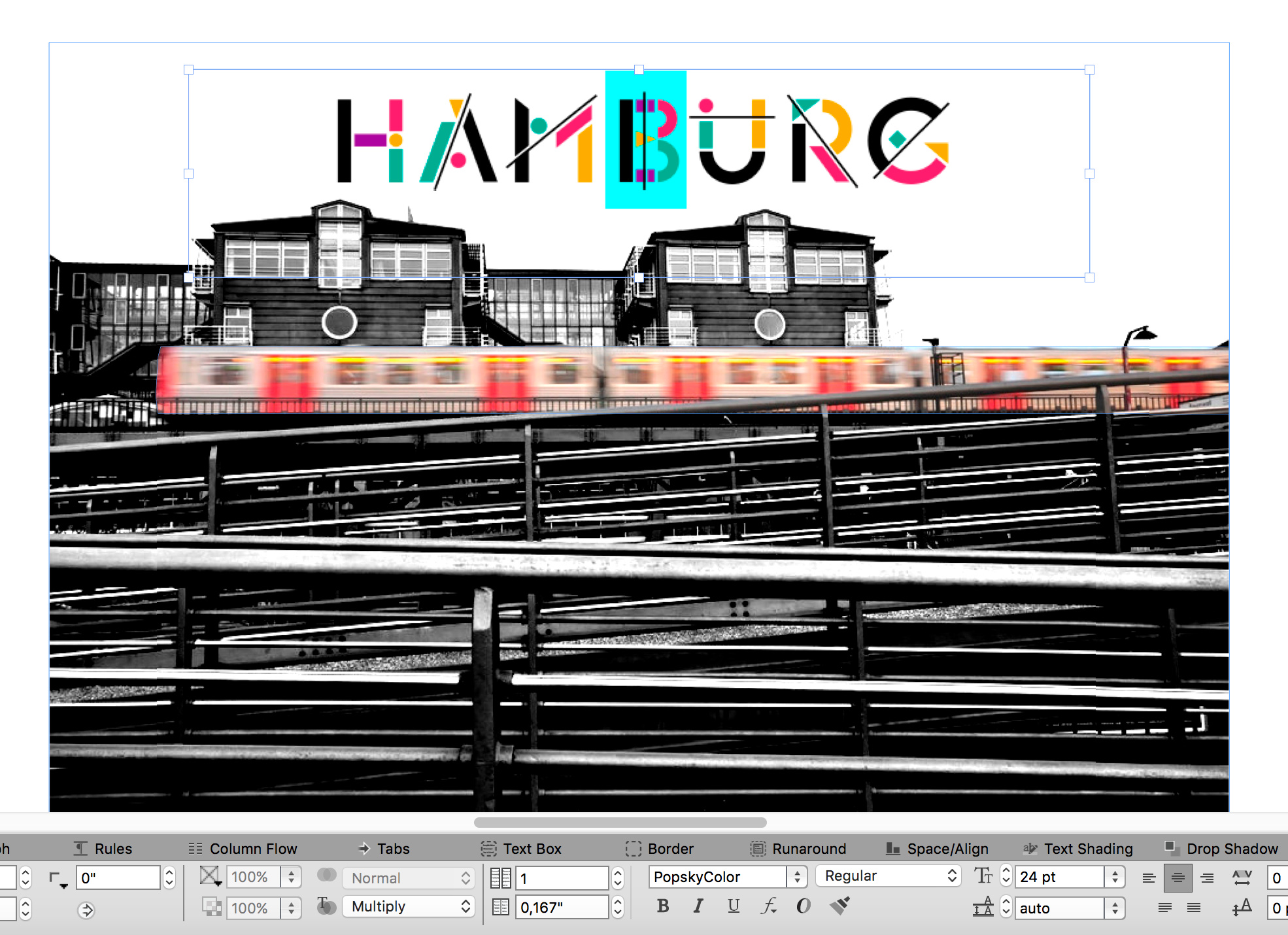
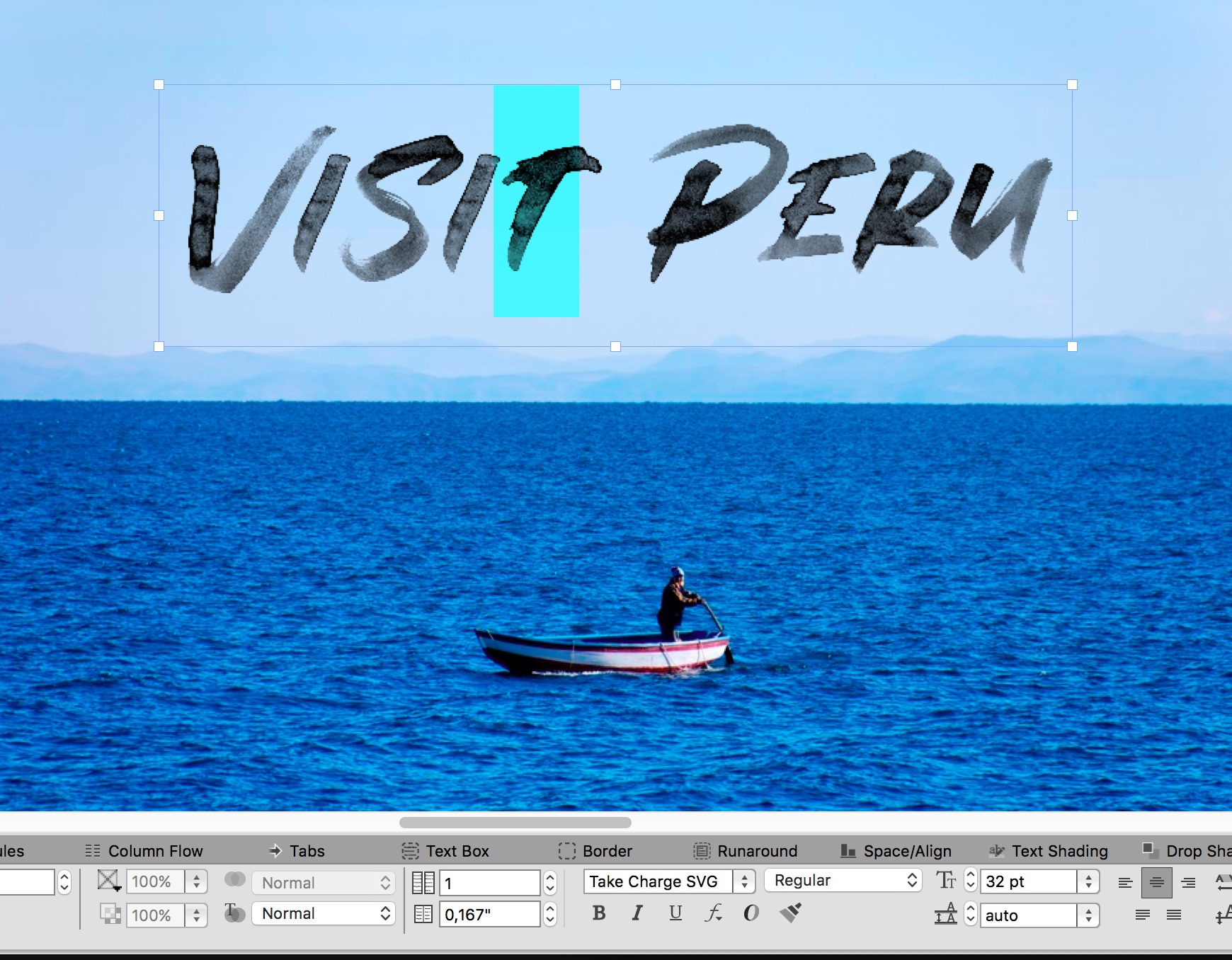
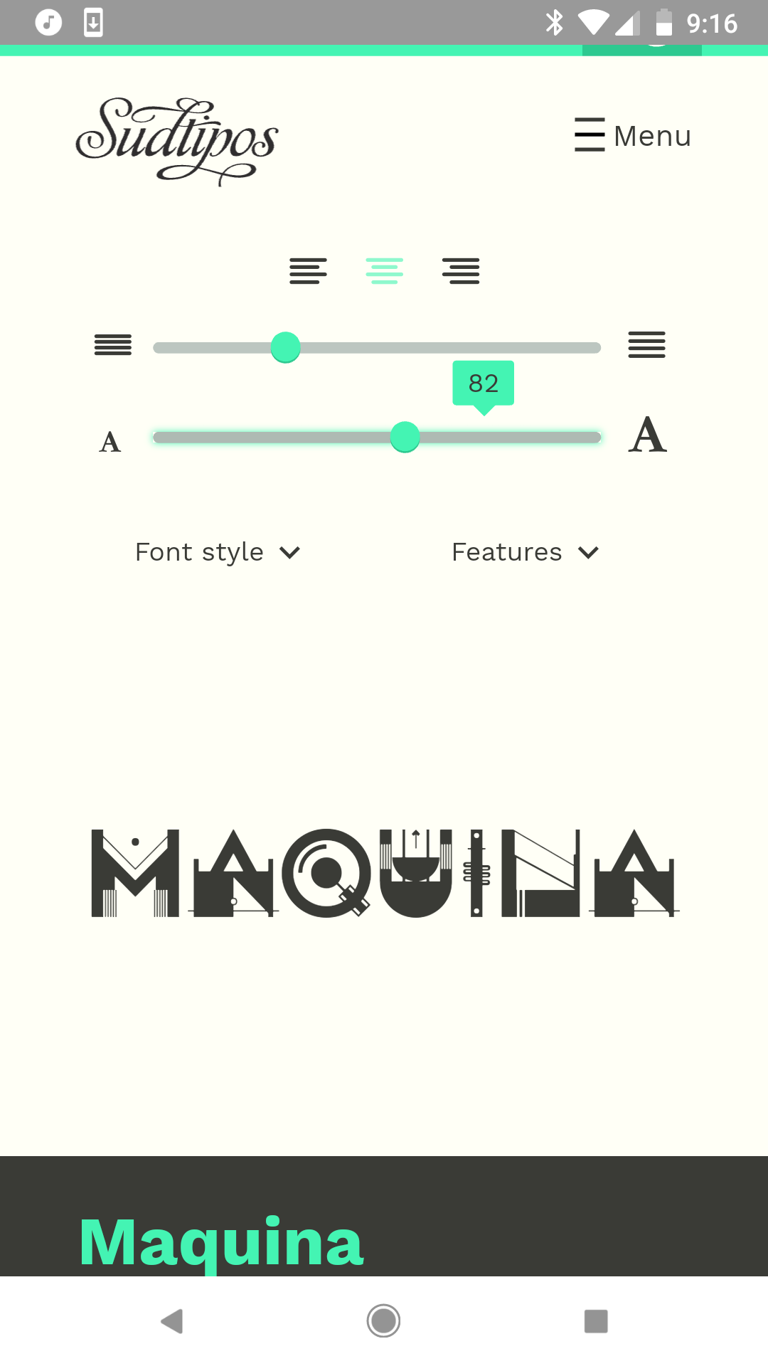
Where profiles pertain to RGB “spot colors” as used in these fonts or any other color swatch used, the conversion is simply based on the numbers, with the same gamut compression used on these that is used on any RGB element in the file. With the same possibly dramatic results. The farther out the RGB value is, the more change there will be on conversion.
And so on.
Yes, technology evolves. It also devolves. It can do both at the same time.
I’ve been using an RGB workflow for a portion of my work for the last 20 years and it has expanded to a good 75% of it in the last 5 years due to the inadvertent embracing of the “new” RGB workflow. This has been a good thing when it is done properly.
I have nothing against these new typefaces. Just like I have nothing against printing text-heavy layouts done in Photoslop. Just like I have nothing against files with in-file photo-editing that embeds the image. There’s a whole lot of bad out there brought on by a combination of low skill and Easy Button design.
I’ll print whatever you send.
If the output is “good enough” that’s on you, though the machines are capable of doing better.
GIGO (Garbage In, Garbage Out.)
I can guarantee, some of those color typefaces are going to behave just as poorly as, or worse than, the Freeware typefaces out there. After 20+ years in this industry, we are still getting about a 25% fail rate getting freeware stuff through the rips. Once you start adding raster effects and transparency to typefaces…well….
Don’t expect miracles on print output.
Get a Proof.
/rant