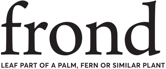
**Disclaimer: logo and tagline has been changed under strict NDA guidelines for this client. Match the font, spacing, etc to the original for critique. Please be honest and provided reasons for why/how it works and doesn’t work. Thank you!
A beauty brand for a masstige client. The customer is a thrifty 26-45 with focus on older millennials that differentiates by what is new & different and natural/organic.
The logo is primarily design as a logotype with no symbol or icons. Clean, modern with pairings of both serif and san-serif typefaces.
Frond is
● Approachable
● Cheerful
● Beautiful
● Quality
● Feminine
● Natural
● Eco friendly
● Trendy
● Fun
● Transparent
● Open minded
Brand Purpose
With a mission to inspire people to make a commitment to healthy living, frond makes it easy to make a more thoughtful, better choice. Inspired by ancient beauty rituals, frond makes a cleaner lifestyle attainable for all.
Brand Positioning
For older millennials, frond is the best value for modern, high performance, naturally-inspired products in health and beauty. Formulated with natural ingredients sourced from around the world, frond makes it easy to make a more thoughtful, caring choice.