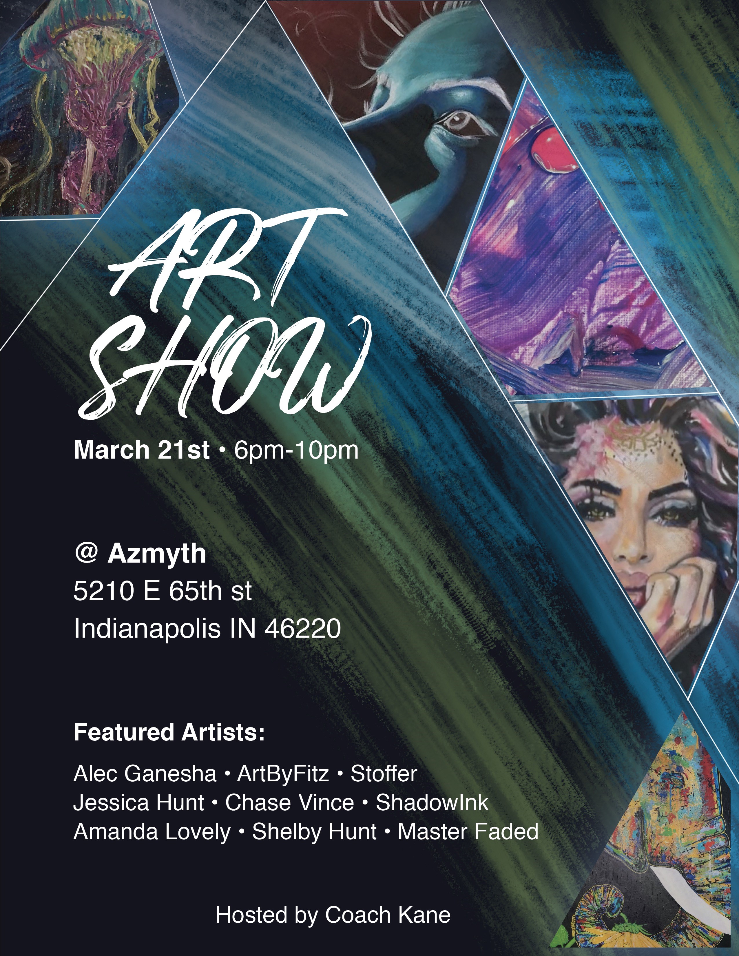
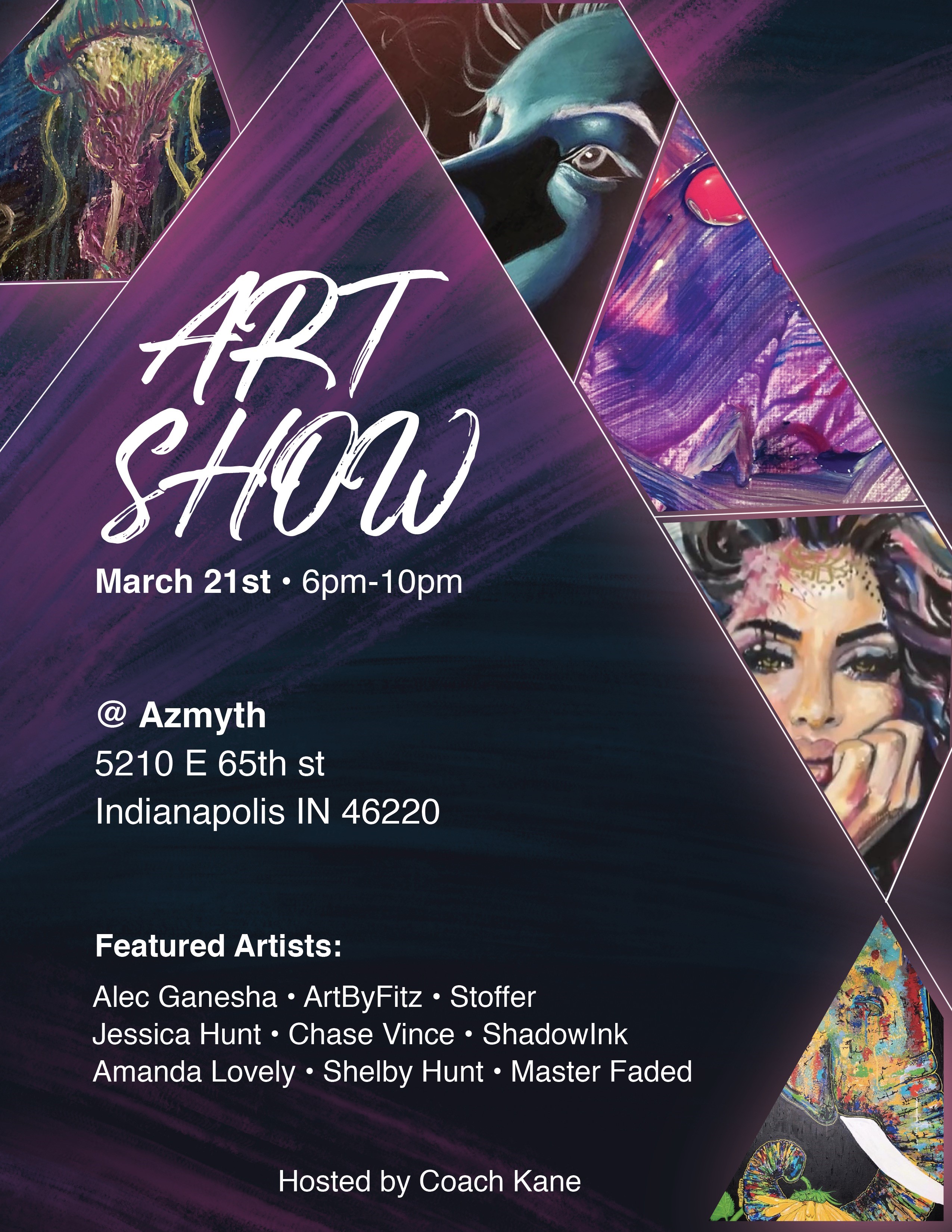
I am part of an art show that is coming up and they’ve asked me to create the flyers for it.
There are 9 artists in the show, I made the two colors so they would be able to choose which one they wanted to post. The art is actual art from people in the show.
I haven’t posted any work for a critique yet so I just wanted to know what you guys think.
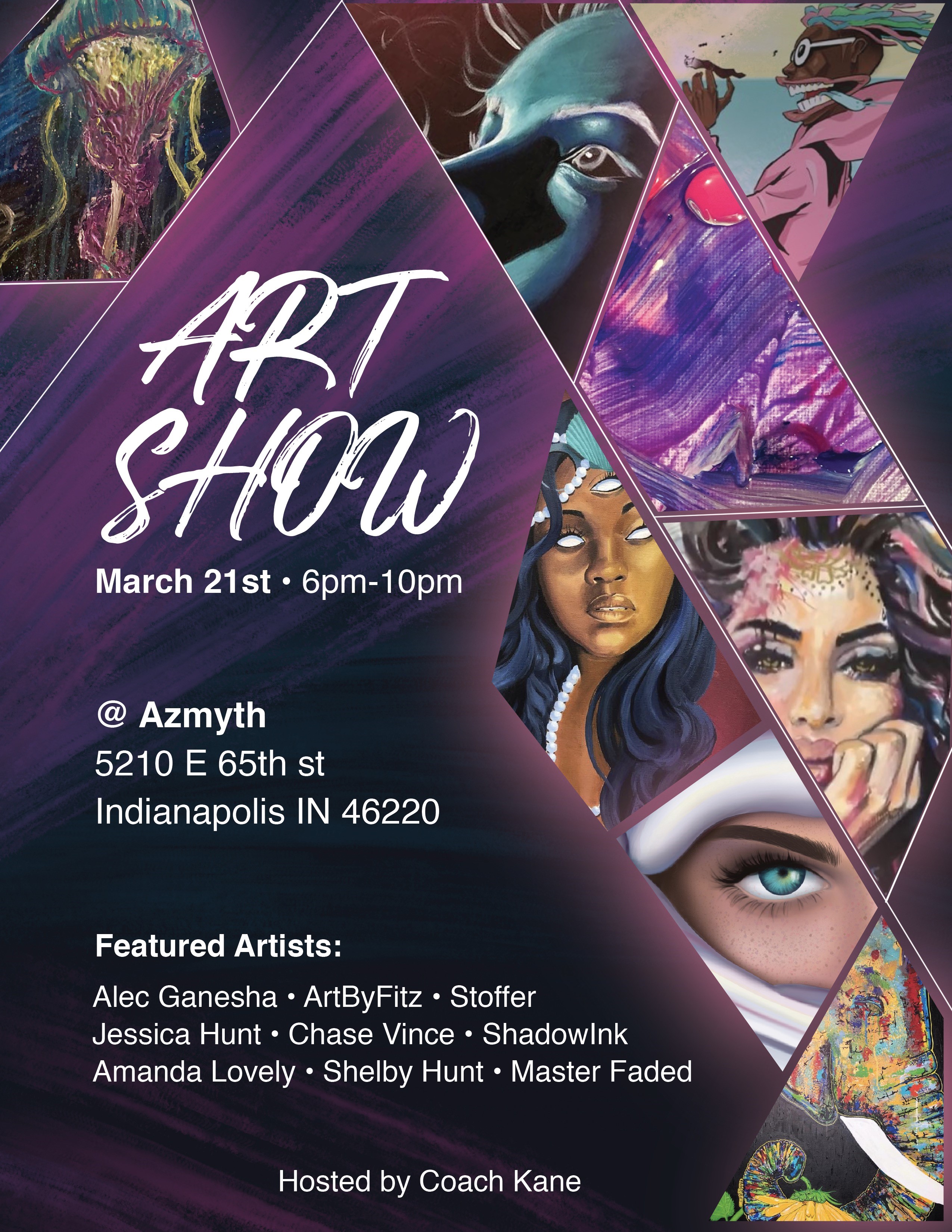
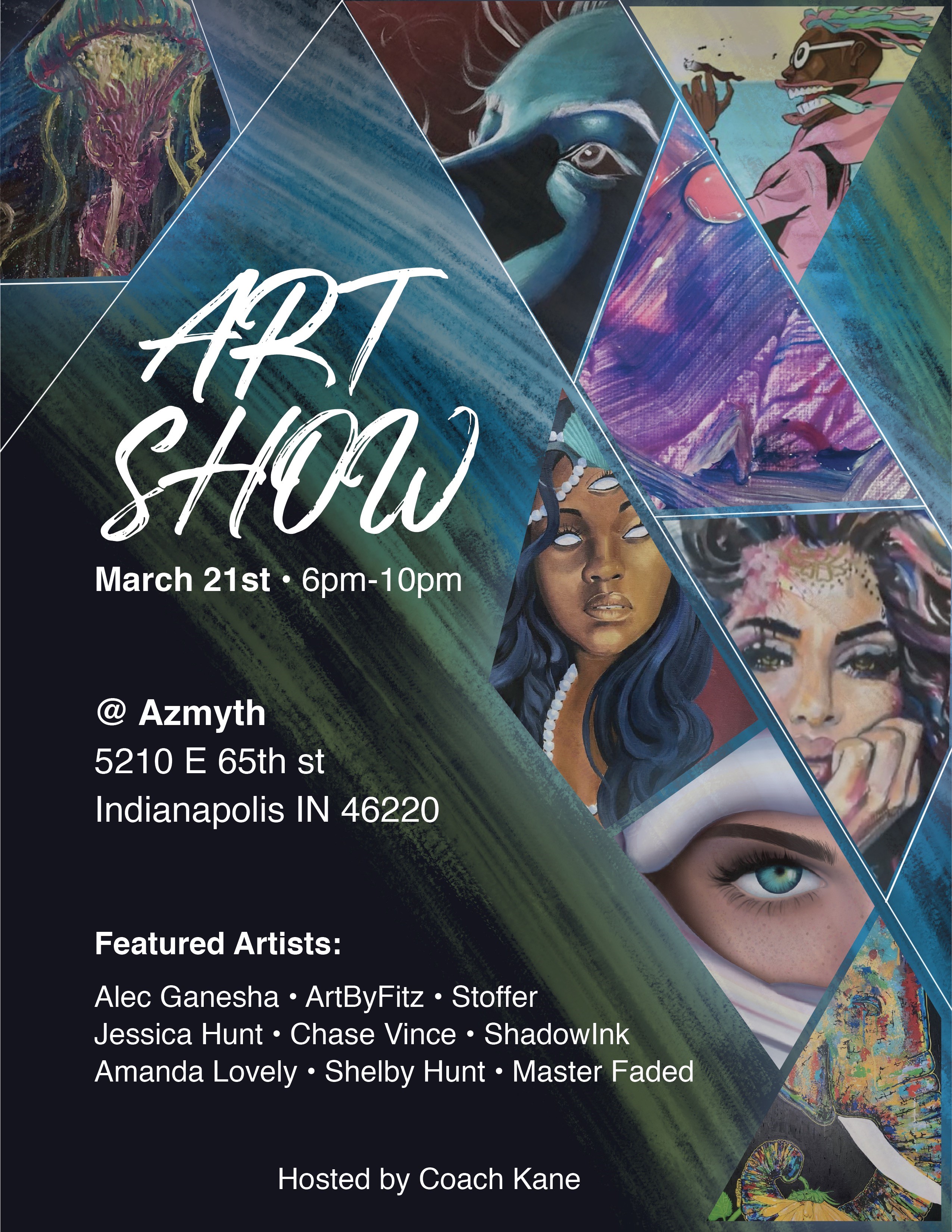
Ya snooze, ya lose… if they don’t send their work by your deadline, they don’t get to have it on the poster.
I like the header font you chose, and the triangle format.
But - keep in mind that this poster has a job to do. It needs to get viewers’ attention quickly. So make decisions based on the viewers. A professor of mine once said, “First, make it work. Then, make it pretty.”
Visual hierarchy means deciding which elements are more important than others. so their font sizes should be larger. I’d also look for another second font that is more interesting.
Consider changing that streaky designer triangle from color to black, or maybe a subtle dark, dark gradient. The color is drowning out and competing with the art pieces, and making them less important. Readability at the top would be better too.
The other thing I’d do is enlarge the art samples. If the poster is about an art show, the poster should show art samples as very important. It would be more interesting to art lovers, and the artists will love it.
Before you finalize it, print it out on whatever size paper it will be on, and hang it up. Then walk away, then walk toward it and test how easily you can read it and how far you are when you first notice it. The words “Art Show” should be as large as possible while still fitting in the design. And though I like the font, it may not be readable enough. You’ll know when you do this test.
Yes, I agree, we should always print and revise! That was pushed very hard in school
I think a lot of the artists might share it on a social media platform. What do you think of the readability when it comes from a close up digital standpoint?
Does the art show have a theme? Is it all students? Local artists? I think the title needs a subtitle to help promote the WHY. For example - Art Show: Unversity Student Exhibition… or Art Show: Brooklyn’s Oil Painting Masters.
A readable poster will work as either a print or digital file.
Err on the side of fonts too big, rather than too small. Make it easy to read for those whose vision may have diminished, ahem. Because viewers with good eyes won’t complain that it’s too easy to read.
just be careful and consistent with the spacing around the objects regarding the paper edge and the white lines. I see some that sit on the edge of the paper/graphic, a few degrees away and a large degree away if I was going clockwise from the top.