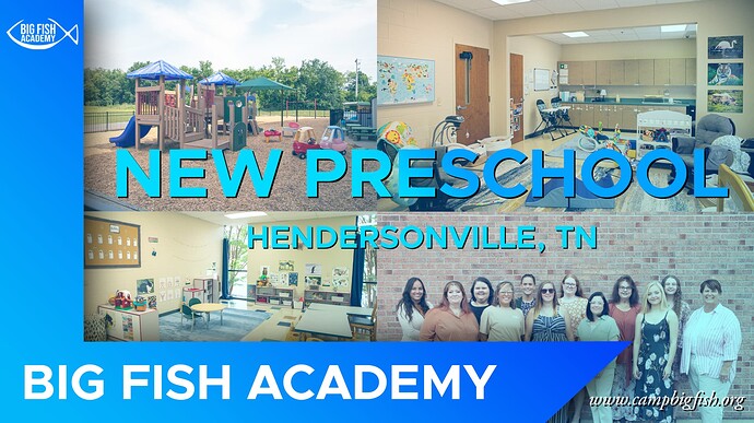
I have been teaching myself graphic design for the past 2 years, and feel that I am fairly good at most of what I do (usually football or basketball graphics), but am beginning to create other things as well. Does anyone have any feedback on what could have been better in this graphic made for social media?
Not trying to knock you down, but the problem with teaching yourself is that you don’t even know what it is you need to be taught, so you (I assume) watch tutorials and try to learn whatever you think you need.
I know that may come across harsh. That’s not the intent. It’s to point out that a structured education will help you grow and develop.
My first question is if you were scrolling through whichever feed on social media, would this image make you stop and engage with it? Why or why not? This may be part of a post with text that includes a call to action, but if not, what is the expected action by the viewer? Is it general awareness, is it to enroll, is it to be there for an open house?
There’s no hierarchy. My eye is mainly drawn to big fish academy in the bottom corner, but after that it just bounces all over the place, which isn’t helped by the overly busy photos in the background.
I know it is trying to show off the preschool, but with the photos being washed out, it just becomes visual noise, IMO. If multiple photos are needed, perhaps it should be spread out as a campaign where different images are used in different follow up posts to reinforce the message (which at the moment just lets me know there is a new preschool.) Even if I am the target for a new preschool why should I care or show preference to this one?
The text over the photos doesn’t have enough contrast, between the mainly light blue and the thin outline it’s “hard” to read. Yes, it can be read, but you have to make some effort to do so. The logo in the top left is barely visible, especially on mobile. I almost missed the url which is also practically unreadable. I had to look a few times to make it out.
The big blue L shape with the angle seems random and doesn’t really benefit the layout, especially with the drop shadow.
It looks like you just winged it on the layout. 4 photos? Hmm, maybe just 2x2 in the background. Fade them back so I can put some text over it. Make a shape for the logo and the name. Slap some text over the photos. Hmm, hard to read that, maybe add a slight drop shadow. Maybe a gradient will help it? Oh, and I’ll put the url down in the corner. Another quick comment about the url, but IMO, www is not needed. Maybe when the internet was in its infancy, but if I type the url without www into a browser it works, so drop the www.
Did you have more concepts or ideas, more sketches showing some other approaches you might take?
Thanks so much. I’m still in high school, and my school has no graphic design course offerings, so I’m currently waiting until college for a more formal education. If there is anything online that you could recommend that would be great! I only posted this on here because I knew it was basically terrible. In the past I’ve made a lot of sports graphics before, and I find that I understand those a lot better. You can look at evanlynchmedia on instagram if you want.
That changes things since you are in high school. If it is something you want to pursue after high school, then that would be great to move forward with a more formal college education.
I did check on your instagram, I saw one design for Univ. of Alabama that was pretty good for someone still in high school.
Since you are still in high school, the best approach, IMO, is to sort of create a mood board. However you go about doing that is up to you. You want to throw pics you find online or in social into a google slide deck, fine or just save a bunch of pics on your computer. Whatever, doesn’t matter.
Bottom line is search for things like preschool digital ad, preschool social media posts, or even vaguely related things such as child care, montessori, kindergarten, whatever. Just collecting those screenshots, images, downloads all in one place helps you to sort of get a sense of what works and what doesn’t and it may inspire you to try things you maybe hadn’t considered.
I will also add that sketching things out on actual paper may seem like a waste of time or not be worth it, but even very rough sketches (seriously, they don’t have to be fine art) helps you to quickly work through layout ideas and concepts without wasting so much time on the computer trying so hard to force something to work.
Do as many sketches as you can, but at a minimum I’d shoot for 25 or so. Don’t stress about the sketches being super accurate (like drawing the perfect font) but you can at least write the text out as serif or sans serif, bold or not, italicized or not, condensed or expanded or regular, handwritten or more formal, all caps or not, etc.
With those quick sketches it should help you find at least 2 or 3 ideas that may work well and then you should go to the computer and try to make that idea come to life. It really does free you up and it may even make you think up ideas where you might not know how to pull it off on the computer, but then if the idea works you can explore and look up tutorials to help you pull that idea off. Does that make sense?
I did feel bad when you said you knew your graphic was basically terrible. I shouldn’t admit this, but I have kids including a son in high school. And any time my kids say that they drew something bad, or screwed up something I remind them that the only way to get better at anything is to keep practicing it and to not beat yourself up over it. No one is perfect at anything without practice. Heck, I’m definitely not perfect either.
Keep us updated, based on your sports post I think you’ll be able to come up with something that works pretty well.
All the text that’s positioned in front of the photos has legibility issues.
And, the photo subjects are overly obscured by the text and other elements you’ve place in front of them.
Both issues feed on each other, and are the result of decorating rather than communicating. The job is to communicate effectively. You can easily rethink this layout to get all the text onto solid-filled background, and display all 4 photos unobscured. In this stage of your development, you’ll think it’s “boring,” but that’s the challenge all designers face: how to make it interesting and eye-catching without compromising effective communication of the message. You must never, ever, just decorate. First communicate optimally, then apply design decisions that only enhance communication of the message, and never hamper it.
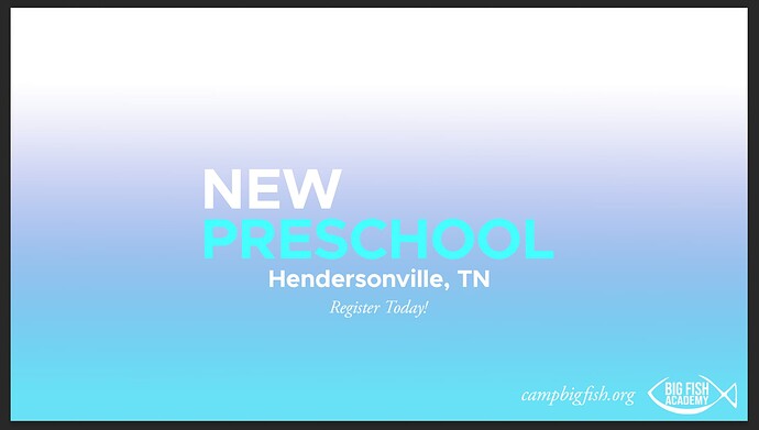
I have come up with this basic layout for the text:
How would you recommend going about adding in the 4 images to the empty space? What other changes need to be made with the layout as a whole?
For someone still in high school with no formal training and little experience, it’s far from terrible. For that matter, it shows a good deal of potential.
I agree entirely with everything @CraigB said, so I won’t repeat it. He spelled out the problems better than I could have done.
I don’t know of any good online course for graphic design. There are plenty of how-to videos on YouTube, but they’re typically focused on using software and not on how to think, see, analyze, and solve problems like a designer.
Then again, I haven’t looked for free online design courses. I’m a bit biased since I graduated from a formal university design program and have difficulty imagining how design could be learned without a structured, formal design education and the interaction and ongoing critiques from instructors and fellow students.
I personally would push back on 4 pictures. IMO, one of the classroom pictures and the playground picture should suffice.
I think the picture of the preschool workers doesn’t really add anything. That may just be me, but any viewer of the post will know that there are instructors. Showing them the instructors isn’t very beneficial. Instead it seems as the intent is to show off the facilities and how everything is new, modern and up to date. That to me is more of a selling point than the instructors.
So, if you can narrow it down to two pictures, that should give you more design options.
I will add though, while showing the facilities are nice, at the heart of any preschool, most parents want to see happy, engaged, active kids. Even at a subconscious level by seeing smiling, happy kids they will hopefully think, “that could be my kid who is smiling and happy being at that preschool!”
A few other options are that one again, this could be a mini campaign of multiple posts. You can create 2 or 3 similar posts using different images that they can occasionally post in order to have some variety. Or another option is to do a simple animation (by animation I don’t mean things have to be moving or bouncing around necessarily, but perhaps something that simply fades between the images.) Once again though you should look at other options that are out there.
Did you put together any mood boards or sketch out ideas?
Also, I think the Register today is pretty small and this still doesn’t have an engaging message. At least having a call to action to ask the viewer to register their kid(s) is a step in the right direction.
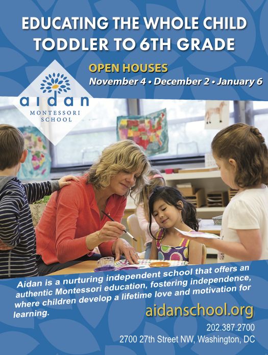
I mentioned the mood board because it really would help, I spent just a few minutes and grabbed a few images that I thought were a little more inspiring.
This example has a more engaging headline, the image shows a happy child, and the logo and call to action are very clear.
This one is similar, but probably too copy heavy for a social media post, but a clear headline and an implied call to action with the open house dates listed. Logo is prominent as is website, location and phone number.
Not perfect, I’m not sure about the repeating of the school name. But it does have a decent headline. The implied call to action with admission open is less strong, but it does show multiple images.
But that is where a moodbaord comes in, by looking at what is out there and seeing what works and what doesn’t it can really help you out. Such as noticing how two of these have subtle patterned backgrounds. Maybe that’s good, maybe it’s not, is it worth exploring? possibly. Most of these use vibrant saturated color, they all showcase smiling, happy kids. Some use more organic shapes and less “flat” blocky designs.
Then with that mood board you can start playing with sketches and ideas that use the best of what works.
I can’t tell you exactly how to solve the problem because there isn’t one answer and to improve on your own, doing the mood boards and studying what works and what doesn’t will be more beneficial to you in the long run.
I am a new student in design and I have learned a lot. One thing I would suggest is that it is more pleasing to view a design clockwise rather than counter clockwise. You would like the name Big Fish Academy to be the most important information so put it at the top. A viewer would start on the left and then go to the top right. The next most important item would have a smaller type. NEW PRESCHOOL may be of lesser importance and so would have even smaller type.
There are numerous eye-tracking studies that show how people look at and read printed materials. Here’s one study dealing specifically with print ads, but there are many others that suggest the sequence in which people view and respond to ads depends on numerous variables. It’s not a simple matter of people looking at things from left to right or from top to bottom.
The most important information depends on what’s being advertised, the audience being targeted, and what might catch that audience’s attention in a way that optimizes the chances of them following through on whatever the goal of the ad might be.
For example, if the primary goal of an ad is to create brand awareness, I agree the name of the advertiser should be prominent. However, if the primary goal of the ad is to inform customers about an event, the event might be the most important information.
Again, there are way too many variables for straightforward rules of thumb to be of much use.


