Hi GDF
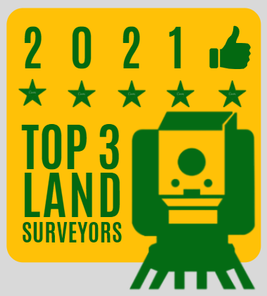
so I have made a logo that I intend on “awarding” the top three local businesses (based on a rating system). Just trying to get some feedback if anyone has any to make it great or burn it entirely.

Hi GDF
so I have made a logo that I intend on “awarding” the top three local businesses (based on a rating system). Just trying to get some feedback if anyone has any to make it great or burn it entirely.

I’d say there’s enough gone wrong here to start over. The number of a year will never work tracked out that far. The 5 stars (and the thumbs-up) are gratuitous decoration. If that’s supposed to be a transit, it looks a lot more like a box camera.
fair enough, thanks for the feedback
The hierarchy is all wrong
It should be
Top 3 Land Surveyors
then the year
And Land Surveryors should have equal importance.
The iconography doesn’t have to be literal.
Most top 3 awards don’t have one
https://www.google.com/search?q=top+3+awards&rlz=1C1CHBF_enIE954IE954&sxsrf=ALeKk03wnITfcl9D21WcxS-l1ezeFfiMgg:1627474116928&source=lnms&tbm=isch&sa=X&ved=2ahUKEwjzjvvE3YXyAhWETxUIHZpRAFsQ_AUoAXoECAEQAw&biw=1218&bih=634
thanks for that helpful advice, it makes sense what you are saying
What’s the award for and who’s gonna care?
Is it supposed to be appealing to a certain demographic?
Is it supposed to be something they put on a wall and point at when clients visit?
Awards for the sake of awards mean nothing.
The point of it is to try and generate some backlinks for my website which is in the same niche as land surveyors, so the award is a bit of linkbait for businesses to link to me from their website.
No one other than the business owner might care, but I was trying to do something that would help add to small businesses social proof when people come across the award logo with something that looks authoritative…
So the award is to benefit you and your clickbait.
Why do I find that even more appalling than an actual low profile award for any kind of achievement.
The web sure do suck more and more each day. 
If it’s not an official award nobody is gonna care