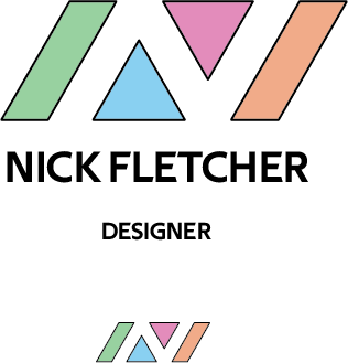
So I wanted to make a logo that I could use on social media as a freelance graphic designer and as a way to continue practicing logo design. I went with a logo consisting of a contrast of sharp edges with pastel colors to give a balance of masculine and feminine aspects to the logo. I use white space to form the first initial of my name. Let me know what you think and all of the areas I could improve on. Thank you.
What’s your reasoning for the thin, black outlines? Do they add something important to the composition or are they mostly an attempt to make up for something that isn’t there without them?
Your logic for sharp being masculine and pastel being feminine might hold true in some cases, but in this case, I think the combination just cancels each other out. It’s difficult to evoke the emotional qualities of both simultaneously, and what is the purpose for doing so anyway?
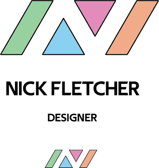
Yeah, it actually looks better without the outline. It was more of a case of leaving in too much that didn’t really add anything to the logo. I had a feeling I should take it out, but left it in for some reason.
The rationale for wanting to incorporate a combination of masculine and feminine was to show a sense of balance since I enjoy designing both more masculine and more feminine logos depending on what fits best for a brand.
Ah I see, yeah I just didn’t take the strokes out that I was using to compare to how the colors outline the N, but it actually looks better without the stroke. But yeah, the logos seem like they should be stronger. I’ll go back to the drawing board with this to try to find a logo that better reflect “graphic designer”.
Nick, it might help if we knew your level of experience with this kind of thing. I’m getting the impression you don’t have much formal training, yet you’re attempting make a logo for yourself claiming to be a designer.
There’s just not a whole lot that right about either of the creations you’ve shown us. As Steve said, sorry. If you’re a beginner, that’s fine — we all started at the beginning. Have you taken classes? Are you a student?
Hello, yes the logo is simply for practice working on the concept of being a designer rather than something I expect to actually use.
I am a beginner who wants to transition from a teaching job into graphic design, I have a degree in psychology, and no funds to go back to college so I’ve been using online resources to try to learn about design.
Thank you for the backstory. It makes more sense now.
In the U.S., graphic design is a difficult field to break into. Most beginning jobs require a Bachelor’s degree in design and a year or two of intern work. For some reason, graphic design became a cool field over the last few years and there’s a glut of design graduates out there looking for work. I’ve been a designer and art director for 30-some years, and I’ve never seen it more competitive than now. I don’t think we’ve advertised for a job in the past several years without getting at least a 100 applicants.
As for logos, in my opinion, they’re the toughest design work there is, yet lots of beginners want to start there. Logos seem rather simple and straight-forward, but simplicity requires the kind of perfection that isn’t necessary with more complex projects. Simple is much harder than it might seem.
Thanks for letting me know. Yeah I’ve been looking into going into a more personally rewarding job as my current one doesn’t pay well enough to make a living and isn’t personally rewarding for me. I use to make posters for friends and Internet forums when I was younger and other designers have told me I wouldn’t need another degree to become a graphic designer so since it was something I already enjoyed doing I’ve been motivated to transition into it through reading and tutorials. I’m also now enrolled in an online course to get a more structured/in-depth education on it.