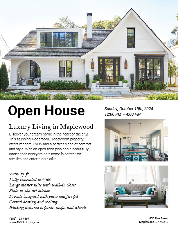
Good for you for putting this out there for critique. Unfortunately, it has some problems.
Ask yourself, what is the most important information to convey? For an open house flier, the address is pretty important, but you have the address as the smallest item on the page. I would think the price and listing agent would be pretty important, too. Bottom line, you have a hierarchy and content problem that will require reworking the layout. Aside from that, I am not crazy about the typography. I wouldn’t mix different sans serif fonts like you’ve done. Last note, I would not say this design has a “luxury living” feel to it.
Try again. Think about the information that needs to be there and what is most important, and try to convey “luxury” through the type.
Thank you for your critique!
You’ve lined up the various elements. You’ve shown restraint in your decisions, and it looks pretty good.
However, I agree with everything Steve said. In addition, I’m having trouble critiquing your work because I don’t know the context of what you were working with.
It’s easy to grab a poorly designed flyer and improve it by making a few good design decisions and finding a few good photos on the internet to go with them. For a beginner, that’s not a bad introduction to graphic design, but I have no way of knowing if that was the case.
For all I know, you shot the photos yourself, wrote the copy, and did so under the guidance of a realtor.
There’s a giant chasm between the two scenarios I mentioned, and in the real world of graphic design, you’re much more likely to encounter something more akin to the second situation than the first.
I am unsure what context to provide? I don’t have a real client so I made my own fake brief, got some some pictures and made the design.
They’re not called “Master suites” any more…
Congrats for putting yourself out there, asking for advice and having the initiative to create your own brief for self-improvement! Most people don’t do that, so you’re already winning in that regard.
I think the feedback so far has been sound, mainly in my eyes the selection of typefaces are not conveying luxury. Try a typeface like Didot perhaps?
I would also add that, since this is a self-initiated brief—find images of homes that look more luxury than the ones you’ve used or, use these images and update the information and tone using typefaces that suit its aesthetic. You can also just look up open house ads that already exist and use that information for better, real world study.
Remember: Contrast and hierarchy are the catalysts for an enjoyable viewing experience, let alone when you can add color and grid to the tools you’re already using.
Designers to study for typographic composition: Armin Hofmann, Walter Breker, Josef Muller Brockmann, Emil Ruder to name a few. Thank me later ![]()
I’d like to share my opinion about this brochure too.
First, the composition of elements creates an odd reading flow. It is easier to read the brochure by starting with the main image and then going through the columns. It would be more pleasant to place the secondary images next to the main one; then, I’d arrange the rest of the text around the space below (with a little blank space to ensure easy reading).
Furthermore, the unequal spaces between the design elements denote a lack of harmony. For the next project, be sure to set a grid. By doing this, you will have default metrics for the separation and will struggle less with layout creation.
Thank you for your critique!
Thank you!
