I’m creating text and putting them on watch dials. I’d like to create a small graphics logo for my small company and put that on some of my watch dials.
My questions are:
What would be the best graphics file type to do this? .png, .jpg, ???
The area available on my dial is about 0.75 inches wide by 0.50 inches high. My HP color laser printer has a resolution I can set for printing of 2400. In my graphics program what resolution should I be using? 2400? or some other value?
What graphics style should I be using? Raster or Vector?
So far I’ve had no luck creating an image that larger than the space available and then trying to resize it down. I thought it would be easier to work in a larger size and then shrink it down. The quality is terrible.
I created a simple test graphics which was a filled in circle. But the edges were pixelated and jagged. I’m sure it was because I didn’t have the right settings set up.
Definitely no JPEG since it’s a lossy format, which degrades the images. Possibly PNG if the artwork contains photo-like imagery, but I’d personally use TIFF or PSD at a high resolution. It doesn’t really matter, though. If it’s vector data only (lines, type, solid shapes, some gradients) a native vector file would be best, as in Adobe Illustrator (.ai).
I don’t know enough about your HP laser printer, but the fact that you’re using a laser jet printer suggests you’re not aiming for ultra-high quality, so much of what I have to say might be irrelevant. There’s not any specific program other than what will save to the file formats I’ve already mentioned. If it were me, though, I’d likely be working in Illustrator while keeping things a simple and clean as possible.
Same answer as the first answer.
There’s nothing wrong with working larger, but you need to consider that it will be ultimately be much smaller and needs to be legible and readable at that size. It sounds as though you made something you like that looks good larger, but failed to consider it’s final size. You need to adjust your thinking to something more appropriate for the final dimensions.
I’m using a color laser printer because I have to print the image onto a decal type of paper to transfer the image to the watch dial. I print to a PDF file (where I set the resolution to 2400) and then the PDF file opens the image in my browser and then I print from the browser. I do this because the PDF file allows me to reverse the X axis which flips the image so I can apply it onto the dial in the correct orientation.
But it sounds like I need to be using a graphics program that allows me to flip the image inside that instead of trying to do it when I print.
It also sounds like if I want to increase my resolution I have to buy a higher resolution color printer correct?
Are the inks in your HP laser printer light fast? If so, for how long? Is the logo going to fade and look like crap in a year? Two years? Is a laser printed sticker the image you want to portray for your brand?
A little Google research tells me that many commercial watch dials are pad printed, which I wouldn’t have guessed. In any case, most every printing process that doesn’t involve short-run digital printing (like your laser printer) will be very costly.
A higher-resolution laser printer is probably a good option for you. The toner is more or less stable, and the detail will be OK. Even so, a watch dial demands some tiny and sharp printing. A commercial watch company would never do it this way, but I’m guessing that you’re aiming at an entirely different market.
Yes, I’m aware of pad printing for watch dials. Unfortunately for me, there are several problems with pad printing for me: (1) the system is expensive and requires having a metal etching plate made for the text/design you want to paint onto the dial. (2) pad printing is designed for making many copies of the same design on a dial. It’s not designed for one off printing.
A commercial watch company would never do it this way, but I’m guessing that you’re aiming at an entirely different market
Yes I am aware of that. My setup is driven purely by what I can afford. I guess the one thing I can at least look at is a laser printer that will give me higher resolution than what I have now (HP M255dw 600x 600 dpi).
UV printing on a watch dial? Or on something being stuck onto a watch dial?
That’s pretty darn tiny.
Laser print on a watch…?
I’m thinking back too, to the days my watch dial would fog over. That’ll be good for a print…
If the OP is selling these things, it’s another case of “Buyer Beware.” There are times when “Do It Yourself” just doesn’t cut it. If the ROI is too high to buy the equipment you need, then cut a deal with someone who has the equipment and can do it for you. Oh, the cost is too high? Then maybe the idea needs to be re-thought through
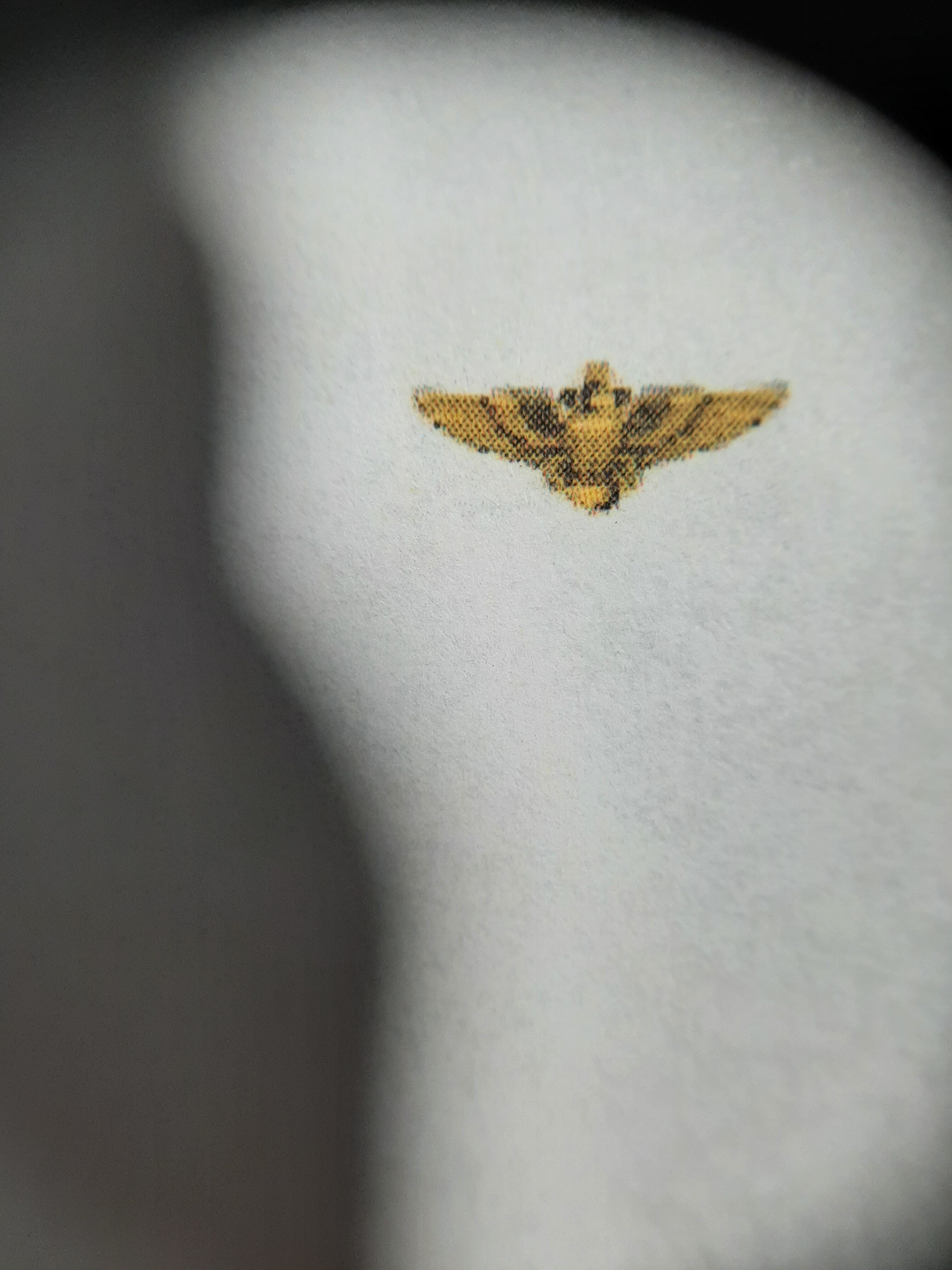
The biggest problem I see is the halftone pattern. Where did that come from? Is this something you scanned from a book? You didn’t intentionally add the halftone screen, did you?
If it were me, I’d redraw it as solid, 2-color, high-contrast vector art shapes — no shading.
If you’re referring to the black around the image, that’s just the lighting I’m using from my lamp. The image is on the white paper OK but it’s just not as detailed as it looks when I zoom in using Inkscape. The image zooms in fine and keeps the details, so I sized it to what I needed which is about 12mmx6mm. The problem, in looking just at the image, is I’m losing detail. I suspect it’s my low 600x600 dpi of my printer?
Are you a graphic designer? I assumed you were and answered accordingly. Your answer suggests that you misunderstood me, and you didn’t answer my question. Do you know what a halftone screen is?
I can explain in more detail, but I’m always cautious of over-explaining things to those who don’t need an explanation.
OK. The dots you see on the image appear to be from a halftone screen.
In most traditional printing, shading is produced by breaking the image down into little dots that can’t be seen from typical reading distances. For example, in black and white printed photos, only black ink is used. The grays are simulated by the use of halftone dodts, which at reading distance all blurs together with the white space around it to create the illusion of gray.
If you scan and enlarge an image printed on a printing press, you’ll see a regular pattern of those halftone dots. In digital printing, there will also be ink or toner dots that simulate the shading, but they’ll typically be irregular and smaller. Grab a magazine and a magnifying glass and carefully look at a photo in that magazine. You’ll see the kinds of halftone dots that you’re seeing in your image.
With that out of the way, it appears your image was scanned from something that had been previously printed on an offset printing press because those dots are showing up. Your 2400 dpi HP printer has good resolution, and it’s diligently printing the halftone dots that are contained within the artwork.
Unfortunately, there’s no way to fix this. You need to start out with the right artwork. It would be reasonably easy for someone familiar with Adobe Illustrator and with some illustration skills to redraw your image as only black and gold with very sharp edges separating the black from the gold. That artwork would print out quite sharply on your HP printer, and there would be no halftone dots.
I just saw your original and there’s no trace of a halftone, so I was wrong about that. Even so, a halftone is showing up in your other image. I don’t know why.