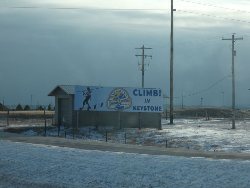
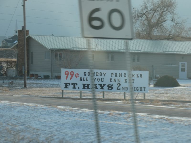
I was in the Black Hills last fall. We stayed in Rapid City, and I remember driving by on that stretch of highway. So as I understand it, these billboards are primarily for people like me: hungry tourists driving up Highway 16 on the way to visit Mount Rushmore.
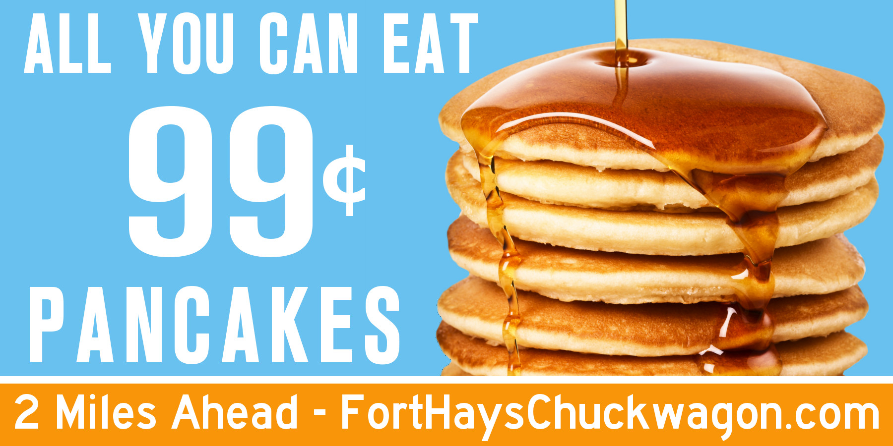
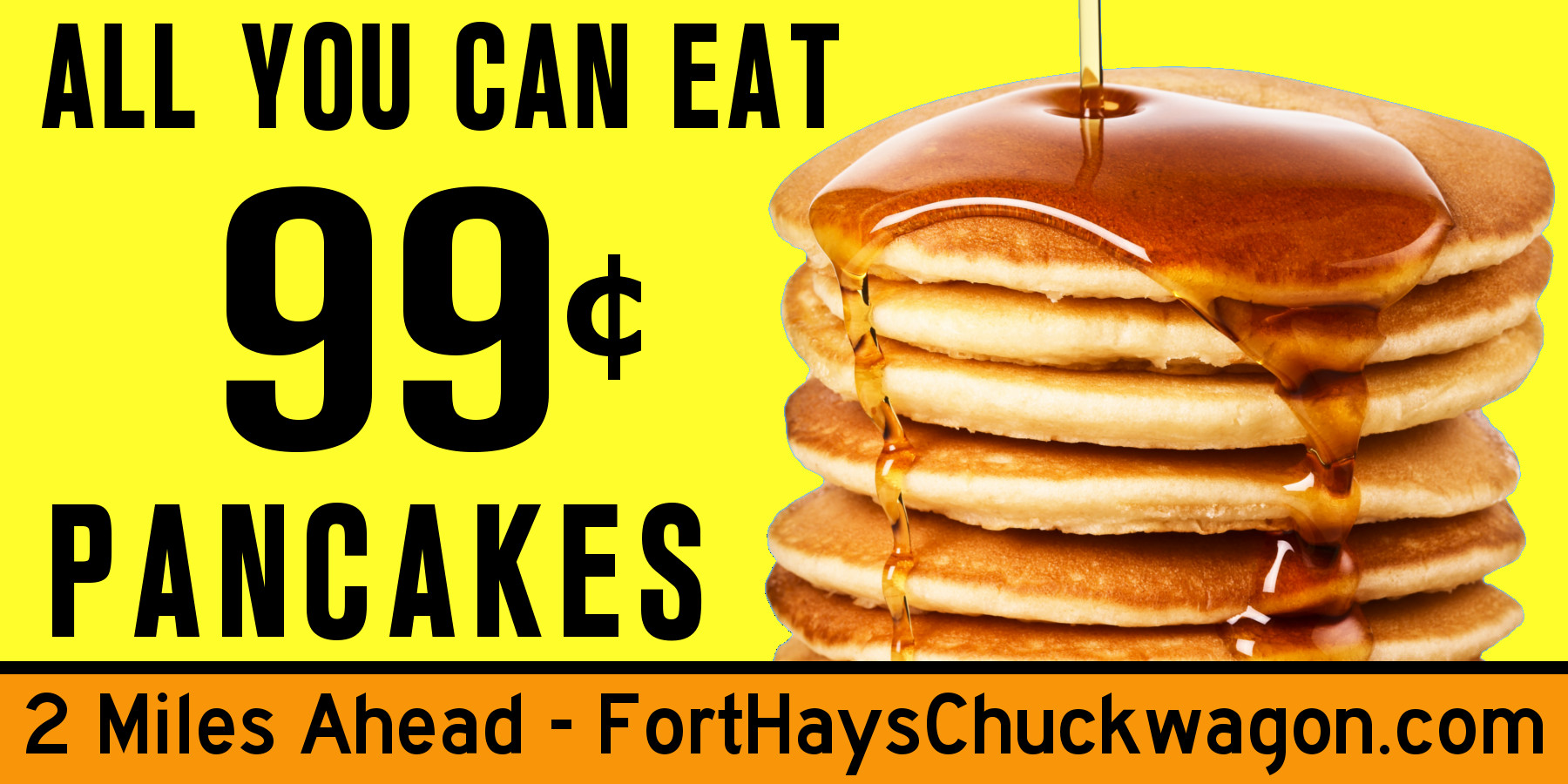
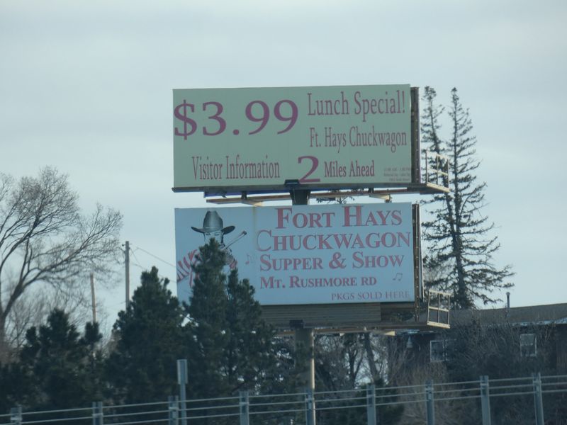
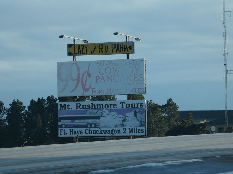
Unfortunately, I don’t remember your billboards, but a big stack of pancakes with syrup might have caught my attention. What I do remember is a sign for Reptile Gardens.
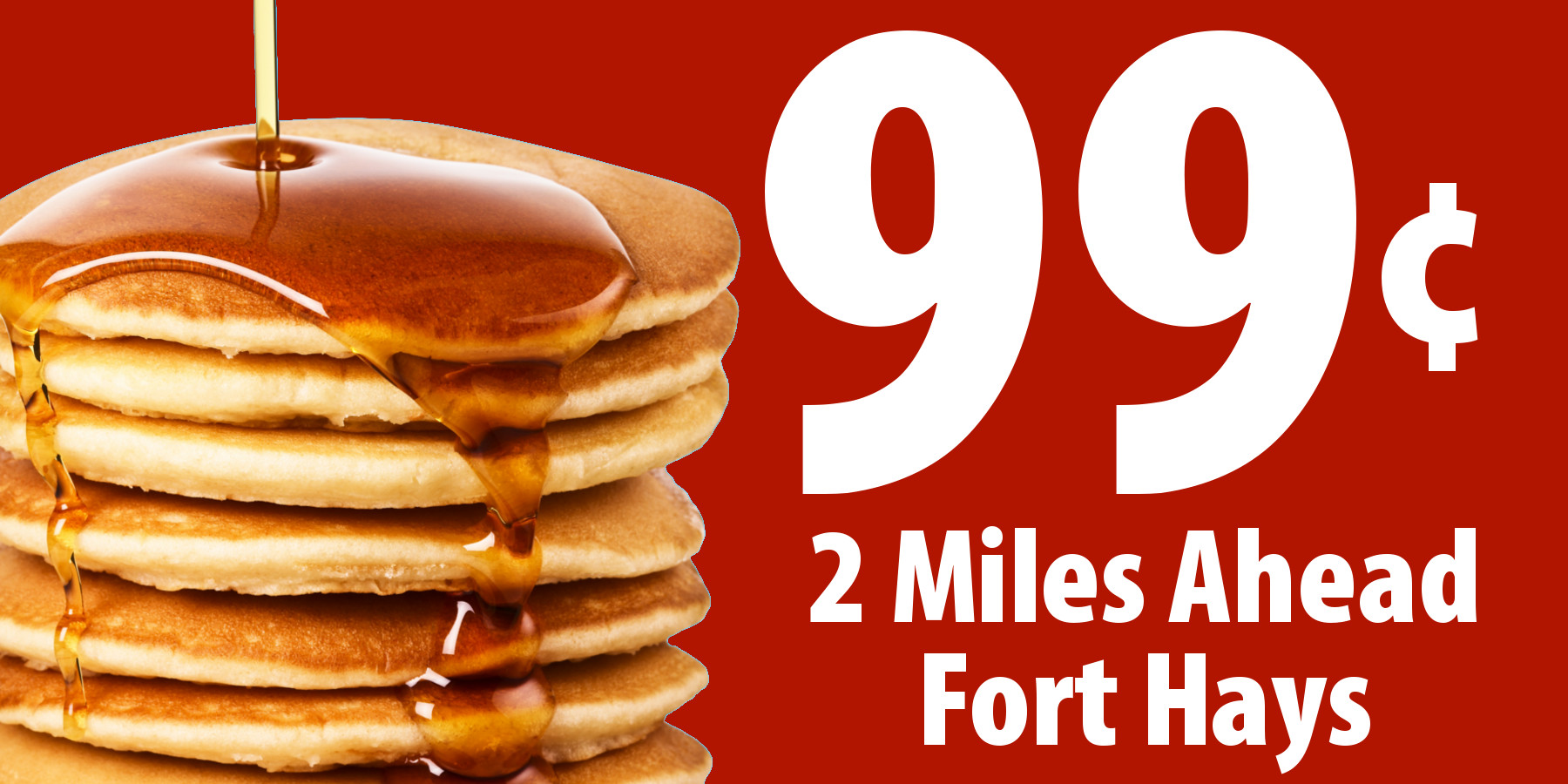
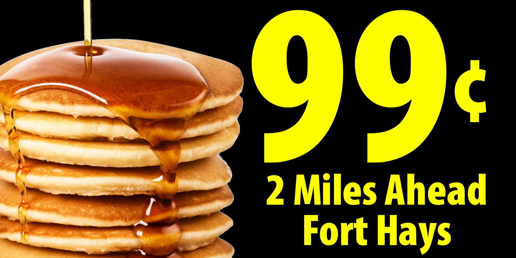
Anyway, these people you’re trying to attract are cruising down the highway, and you’ve got, what, three seconds to communicate a convincing and mouthwatering message. The big stack of delicious-looking pancakes take about one second of well-spent time, and now you have two seconds left before they get distracted by driving and signs about snakes and lizards. In other words, keep the text large and keep it bare-bones simple.
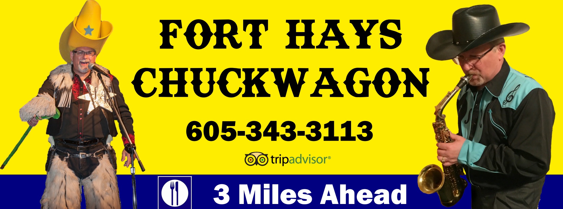
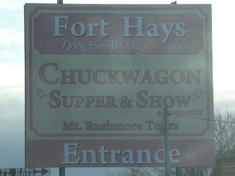
It’s unlikely anyone will remember the phone number, and even if they do, they’ve passed the turn off before they can call. Same with the web address. And why do you need to spell out pancakes? You already have a huge stack of them. Why do you need to say “All you can eat?” The stack is more than anyone could eat anyway.
If it were me, I’d keep it totally simple: the stack of pancakes, a big 99¢, the words “3 miles ahead” and the name of your restaurant. That’s it. That’s all you really need.
But… You have a whole collection of billboards of different sizes and placements along the highway, which provides a strategic opportunity. The first sign(s) could whet people’s appetites with the big pancake photo, and the subsequent signs could reel them in now that their mouths are watering by providing just a bit more information on where to get those pancakes.
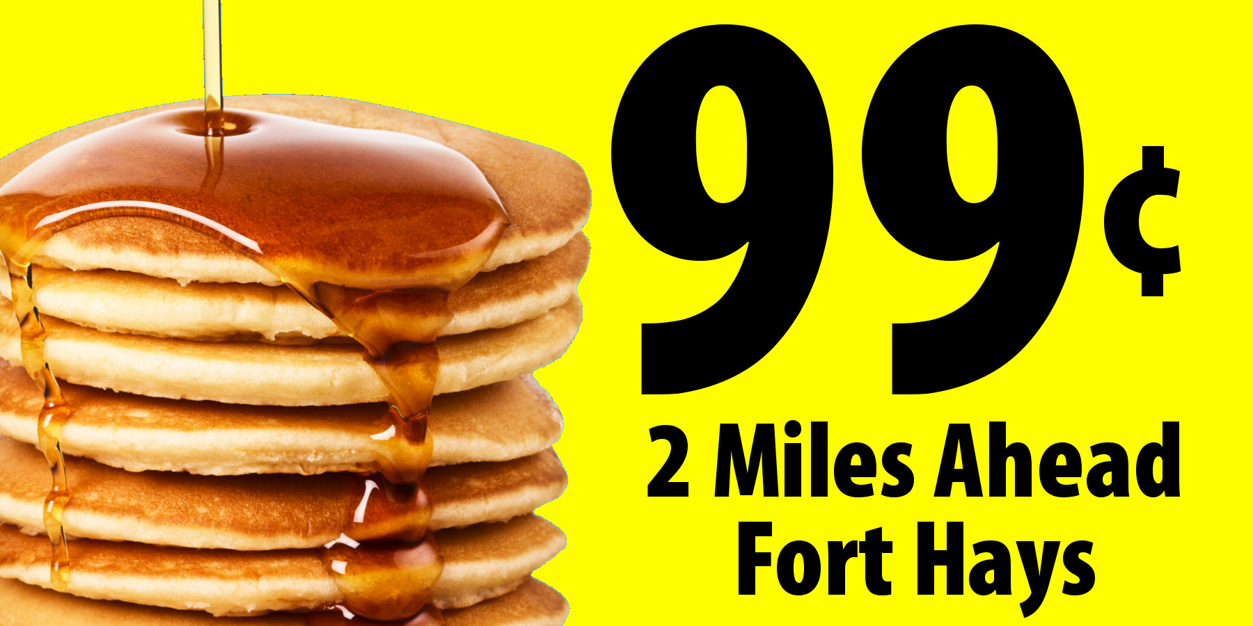
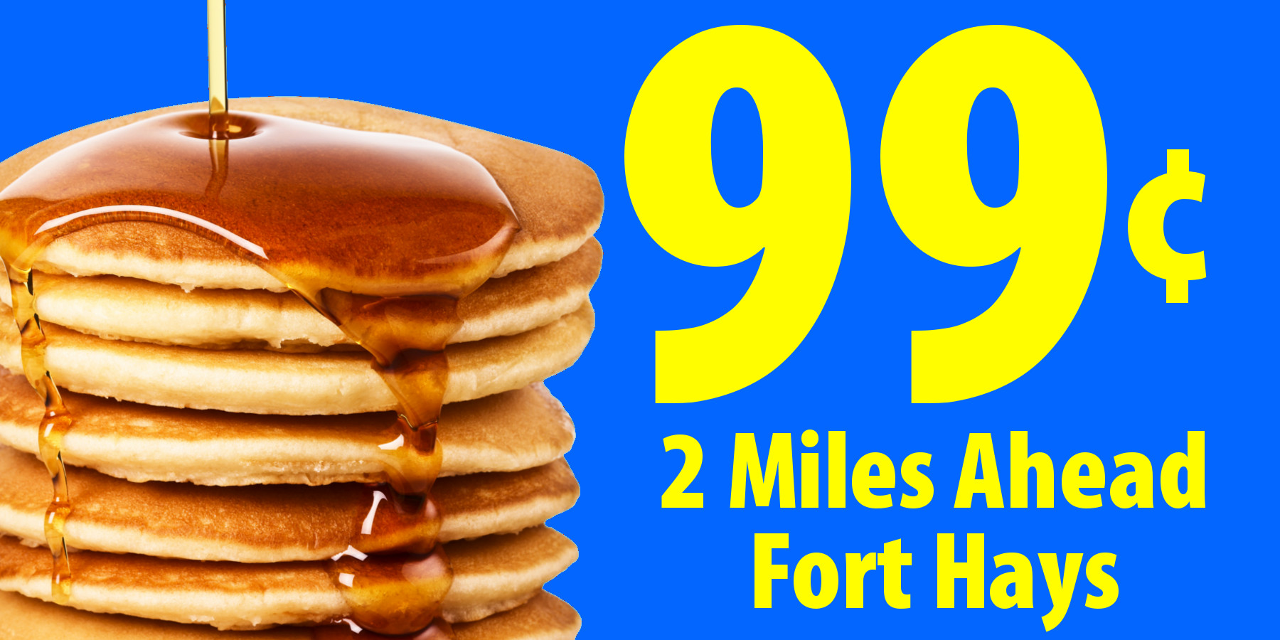
You need to think through this sequence of billboards in a strategic way and from the viewpoint of your target audience. The signs need the same color scheme, the same typeface, the same general layout and mostly the same imagery. If they’re all different, like they currently are, you lose the opportunity to build a sequence of recognition from one billboard to the next. In other words, each billboard should build upon the one that came before it by being instantly recognizable and supporting the same message.
As for colors, there’s a reason why so many fast food places use reds, yellows, oranges and browns. First, bright colors demand attention. Second, there’s something about those colors that seem appetizing in ways that, say, blue is not.