Billboard Critique

@DocPixel That’s something to consider - what color would you think, and would it overlay our graphics of the pancakes, etc? We are all in agreement over yellow.

As @Mr-B pointed out:

We’ve now got two designs we need to decide between. Anything can be modified/moved around. The main items of question are:

  1. Font - Western or Myriad - We are an old west town, a chuckwagon dinner theater, and also a bus tour company. The whole place is western, so do we go with a western font on billboards to match that, or have an easier to read font?

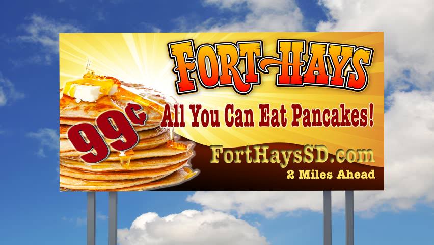
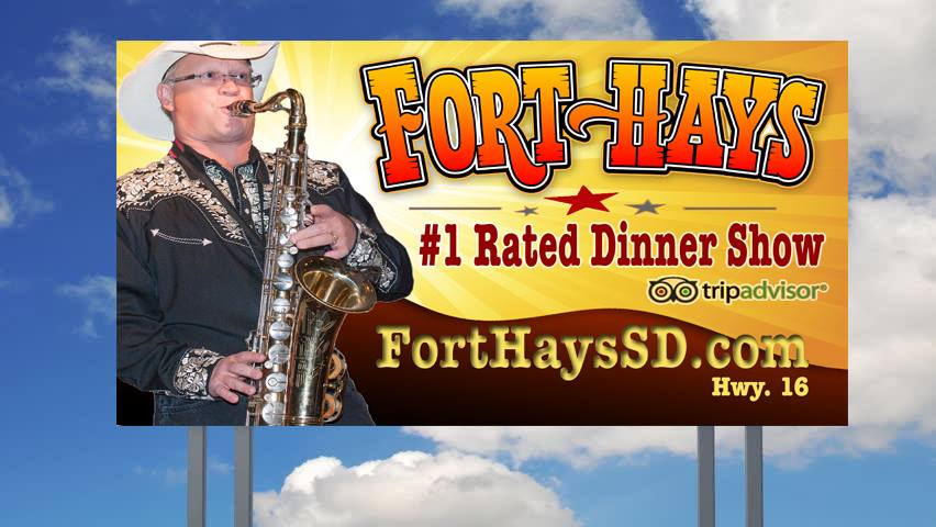
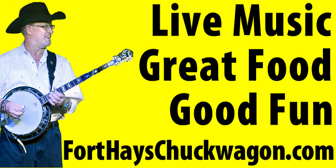
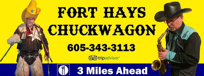
  2. Layout - One picture, two, tripadvisor, etc? The first one follows the simplistic theme of the yellow pancakes with minimal words. The second one has more graphics and info, and the western font.

On subsequent billboards, going forward, we could have one that simply says “Check us out on TripAdvisor” with our name, once again following that same pattern/layout as the others. This way, we wouldn’t have to clutter up one billboard with everything, and spread it out over several.

Here’s what we have:

I am extremely impressed with the very knowledgeable feedback. Thank you so much to everyone for all the professional and insightful comments.

Please don’t put a border around the perimeter of the billboard.
It will be subject to stretch or shrink, thus uneven when trimmed, and would make it difficult to install evenly all the way around.

Okay, I didn’t realize that. I was actually visualizing a border inside the outer edge, if that makes any difference.

Would it stretch because it’s vinyl?

When printing on a wide format billboard machine the stretch or shrink is in the way it feeds through the printer. That’s why your bleed will be in inches.
The vinyl itself, once printed doesn’t stretch at all. It’s got a heavy scrim mesh incorporated into it that makes it strong enough to stand up to wind.
But the one thing you don’t want to be doing as an installer is trying to level out and even up a border on a 20’ wind sail while 40’ up in the air.

Yeah, definitely no borders of any kind.

I would establish a visual motif and carry it through the entire series. Same colors, same font, brand ID in a common location, etc. Once a viewer sees their second one, they’ll start to look for the next, and it will be easy to spot via recognition. The pancakes layout is a good start. Stay consistent with that, and set them up as though they are all parts of the same, big communication, like a bullet list of your attractions. Keep it simple and direct.

Great visual of the installer, in my head… :smiley: Thanks, I enjoyed that!

I haven’t designed billboards, so I’m glad for the information.

The simplified pancake designs are really snappy and quick to read. The extra ones you posted are still too cluttered. I don’t think you need “good fun” at all.

If you want a western-looking typeface to match the character of your restaurant, I’d be inclined to use a heavy slab serif face of some kind, but it will be wider than the Myriad Condensed you used and will take up more horizontal space, but they’ll still look good. Slab serif faces tolerate a certain amount of condensing, but don’t overdo it.

For example, some free Google fonts:


or even the extra bold version of the following

Also, don’t spread your letters out like you’ve done. Push them together and tighten them up.

Don’t use capital letters to begin the words except for proper nouns and beginnings of sentences or sentence fragments. Capitol letters have a stiff, authoritative look, and you don’t want to command people to visiting your restaurant — you want to invite them with more friendly lowercase.

Layout - One picture, two, tripadvisor, etc? The first one follows the simplistic theme of the yellow pancakes with minimal words. The second one has more graphics and info, and the western font.
[/quote]

As Hotbutton mentioned, you really need to be stylistically consistent throughout all the billboards — same typeface, same colors. This doesn’t mean they can’t have different content, but they need to look like they all match.

Keep it simple and as minimal as possible. Less really is more on a billboard. If there’s something that can be left off, leave it off. For example, is it really necessary to have your URL if all you’re mostly trying to do is attract people going down the highway?

Keep anything you don’t want to bleed off the edge well away from the edges. As PrintDriver mentioned, the printed medium can be several inches off from the size of your billboard, and you don’t want words to inadvertently spill off the edge.

Talking of bleed, it’ll have to be done for the pancakes one too. All the text is too close to the edge right now.

Perhaps you could use Western-type font for Fort Hays and keep the rest in the 99 cent font (Is that Myriad Pro? Condensed? Not experienced enough to recognise fonts yet.) That way the name of the restaurant will stand out separately.

Well, I think we can agree that the simpler designs with less are all better. Before we get too far ahead, the third member of the team has just come up with these new designs. They look nice, but I see some contrasting/readability issues. Thanks for all your patience, trying to get this stuff narrowed down.

For clarification, there are three design members, each operating somewhat independently.
#1 - Myself, going for the simpler designs with Myriad Pro
#2 - The other yellow with the western font
#3 - The new billboards with the more official looking logos.

New designs from #3 are below:

Please critique these new ones, vs the old ones.

@PrintDriver - great explanations as always. I’ve learned a lot about billboards from you.

@HotButton - see the latest that our third member just came up with. Thank you for the insight, and a theme is exactly what we are trying to set them up with.

@Mr-B - Thank you for all of your help with selecting the best fonts and format for these billboards. I will further simplify, and add in a greater margin on the sides to give me bleed room. It is not absolutely necessary to have the URL, but I figure if the copilot/wife is sitting in the car as they’re driving, and want to look the website up, that might work the best. Then again, if they can look it up, they can also google it.

@schweta - Everything on the non-western version is Myriad Pro Heavy. Good idea on making the name western.

Putting on my moderator hat for a minute, were these billboards you’ve been showing us designed by an outside firm? If so, we’ve been running afoul of the forum rules, which read:

This has been a really good group discussion, but I originally thought we were critiquing something you put together in-house. If we’ve been critiquing the work of an outside designer or company, we’ve probably been pushing the boundaries of the forum rules beyond where they were meant to go.

Can you please clarify before we go much further?

@Mr-B These billboards are all being designed by employees of our company. All the billboards until the two most recent were designed by myself and #2, with the most recent set of two designed by our third employee/designer. Everyone works for our company, there is no one outside that is designing for us. We are all designing on our own, and bringing the ideas to the office.

Great. Internal crowdsourcing.

OK. Thanks for the clarification. I think we’re good if that’s the case. Thanks!

The last ones you posted looked a whole lot more elaborate and professional than the others, so I wondered.

Great. Yes, more professional and elaborate for sure. I myself just dabble in graphic design. Is this more professional theme going to work better? The one thing I noticed is, comparatively, there are a lot of words. In addition, there are some issues of contrast. What would you guys recommend to improve these latest billboards? Are the older ones still worth considering, or do we all like the newest fancy billboards?

Thanks for the patience and help.

Well, the earlier billboards were, in my opinion, simpler solutions to a problem that could be easily critiqued and talked about. I think everyone was mostly trying to give you suggestions to make what you had done better without overcomplicating things.

I haven’t been to your restaurant, but from the imagery of banjos and cowboys, I’m not sure the simpler, more modern approach is entirely what you want or what accurately conveys the personality of your restaurant.

Although they’re totally different, I’m sort of inclined to think you ought to use your last group with a few changes — most of which you’ve already identified.

Like I mentioned in an earlier post, print them out hang them on the wall and look at them from the other side of the room. Whatever isn’t readily readable from there will also not be readily readable from the highway.

The top of the pancakes sort of get lost in the white starburst. I’m wondering if the other stack of pancakes might work better (not sure, though). There’s too little contrast between the 99¢ and the pancakes.

The words “All You Can Eat” are being used as a compound adjective to modify the word “Pancakes,” so they really should be hyphenated, as in “All-You-Can-Eat Pancakes.” That’s an awkward grammar Nazi concern, of course, but you’ll have more than one former school teacher coming into your restaurant mentioning the goof.

Anyway, the line of type takes up too much horizontal space and awkwardly spills over the pancakes. I’m not too fond of the overly compressed typeface either, I’d be inclined to write, maybe, “Unlimited Pancakes,” instead. This avoids the compound modifier problem, and it will enable you to uncompress that overly compressed typeface a bit.

The internal shadow on the URL is not working, and I’d definitely get rid of it. I’m still iffy on the value of the URL to someone driving down the highway. Even if the passenger looks it up on his or her cellphone, they’ll be long past the turnoff.

To me, the directions to the restaurant are more critical if you’re trying to divert highway traffic for an impulse meal. If someone misses the turnoff, they’re not all that likely to turn around and come back (it’s happened to me before). On whatever sign is nearest the turnoff, instead of saying something mostly meaningless, like “Hwy. 16,” I’d probably say, “Next Turnoff” or “Next Exit.”

I do like the Fort Hayes logo. I’m a little concerned about it’s legibility on a billboard, though. I might be inclined to make the top of the letters fade into white instead of yellow to create a bit more definition between them and the yellow background.

I think the big saxophone player image is good. It really communicates what people will be getting themselves into if they decide to drop by for dinner. My main concern with this billboard, however (in addition to what I’ve already mentioned) is that it’s not entirely obvious that it’s a restaurant you’re promoting and not a concert venue or a night club. Then again, I guess it really depends on what you’re advertising and the nature of your business because, like I said, I’ve only driven by but not visited (maybe next time).
@Mr-B Thank you for all the time you have invested to help with this process. I would agree that the first ones were a bit simpler/easier to work with. This is something that we will have to get everyone in on and have a meeting to discuss it. Thank you once again.

1 Like

I haven’t had a chance to read through all this on my lunch break. but I wanted to say how great it was to read/then skim the thread. from the outset to now, the progress the designer has made and the critiques given here by all.

a few cents here…the simple ones (revised/middle ones) look good IF there are several billboards to get the restaurant name. I can clearly see the Awesome pancakes and 99¢ but then loose the restaurant name. (I was thinking Fort Hays is a location not a restaurant name)…maybe it is both??

the last ones designed by the other team member have a better look for one-offs. I am wondering if that top Western “Fort Hays” is the restaurant logo? if no real logo they should have one and possibly this to make the connection coming off the highway and looking for that type/logo.

I also wonder if you NEED a website. though great to have, IF you have Fort Hays All You Can Eat Pancakes & Fort Hays Dinner Show META TAGs and SEO for your website. I can find that Web Site easy enough.

Thinking of when we are planning a western/northern National Park vacation next year and how we’ve driven down I-95 on eastcoast on vacations and seeing billboards. not once did we say “hey did you catch that website? let’s look it over ahead of time” we generally just see the sign/deals/food/name and try and remember that. and the mileage/exit number. SEO is a big key. because on the road if we are hungry and don’t see any signs we start to look online at nearby locations. I know SEO isn’t part of this design but throwing it out there

1 Like

Great Critique @bjmramage - Fort Hays is a working old west town, film set, and supper show / restaurant. So, it is both a location and a name of the restaurant. SEO is definitely something to further work upon. We figured having Fort Hays and people being in South Daktota they’d be able to google “Fort Hays South Dakota” and find us pretty easily. Once again, I am agreeing that the space for the URL could be better put to use to make some text bigger, or otherwise. We own around a dozen billboards, and have them almost all consecutively.

@Mr-B The logo that is on the most recent billboards is not a logo that we use anymore. In terms of legibility, see the photo below. Unlimited Pancakes was one of my earliest ideas, because of the amount of characters and the fact that it’s one word. I understand your grammar issues with All You Can Eat, but as you said, someone will inevitably notice it. I agree on the URL. In addition, Highway 16 is a long highway, and next turnoff or 2 miles would work better. I printed all the ideas out on smaller sheets of paper, and hung them up on the wall. Take a look at the readability below, ignoring the top three full-size sheets: