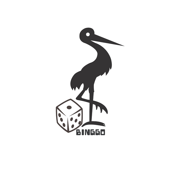
Judging from the looks of it, have you just combined a couple of pieces of clip art?
I think more information is needed to give you any meaningful feedback. What purpose does what you’ve made serve? What were you trying to accomplish? What does a crane or a heron or a stork (or whatever it is) have to do with dice and the word BINGGO? Something to do with gambling, maybe?
Or spelling Bingo wrong?
Just based on your image I would say:
-
BINGGO - the name of the company should be bigger in my opinion especially compared to the size of the other elements. Personally, if you want a dice in the image you could possibly replace the “O” in binggo with it.
-
If you want to go with the bird as the main image I could potentially see it being in a “B” form - the neck the top of the B and the foot being placed on top of the dice as the bottom.
-
The birds left foot need to be fixed looks more like a crab craw then a foot
-
I would use circles for the head and other curves on its body to give it a more professional polish
Cheers
With no introduction, brief or description, you’ve given us very little to go off of. The only clue is that this is posted in the critical pit, so I assume you’re looking for feedback.
A quick reverse image lookup shows that the dice is a pretty generic illustration form (having the leading corner fade out like that) and that the bird is available clip art. Depending on what this is, it could be a big mistake to use canned art. Aside from that, the overall composition and balance are off. SO I’d say back to the drawing board on this one.
And BINGGO was the companies’ name-o!
The company name looks disproportionately small in the logo. Size it down to fit into a business card and see if you can read it.
