Hello everyone,
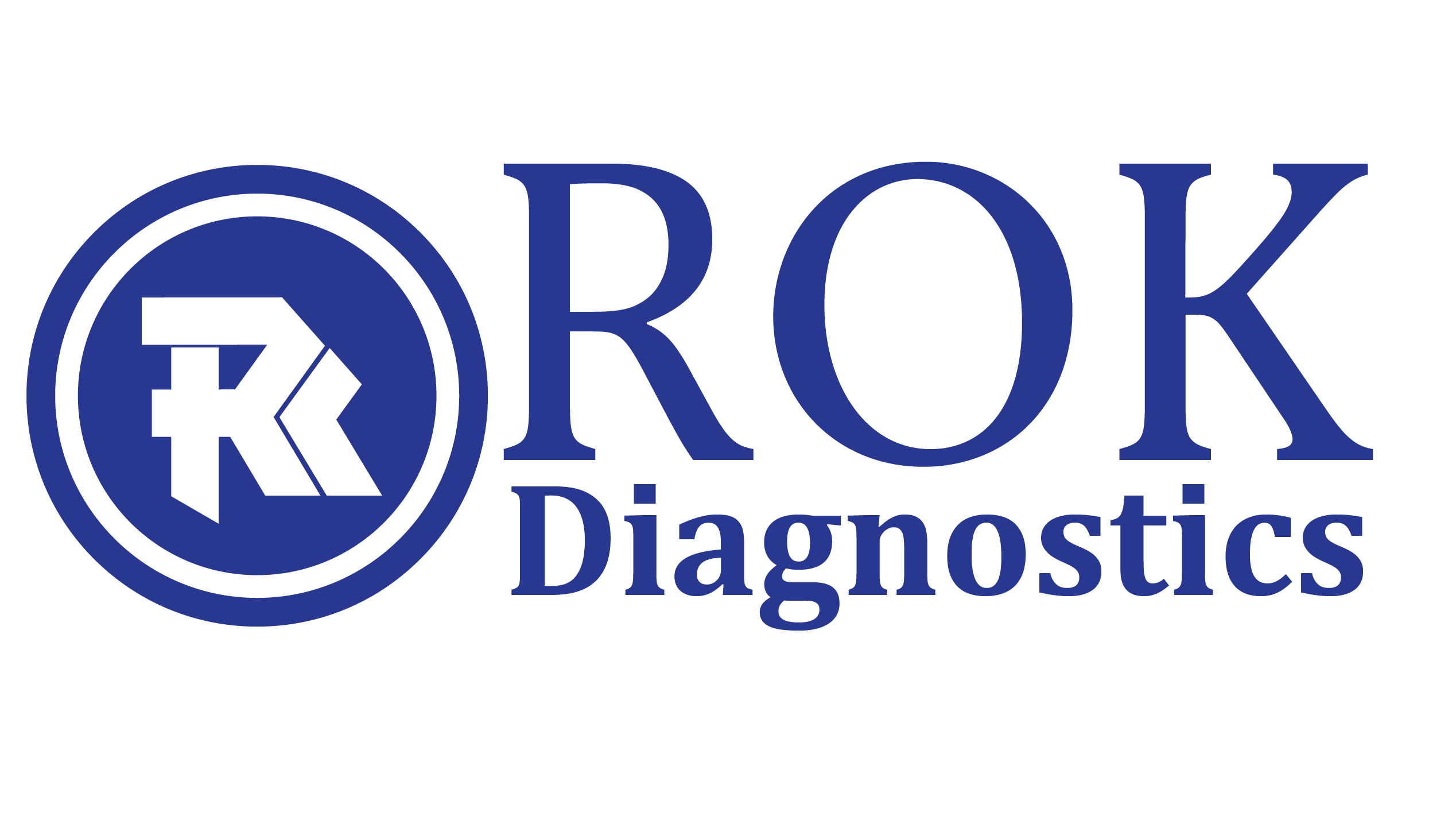
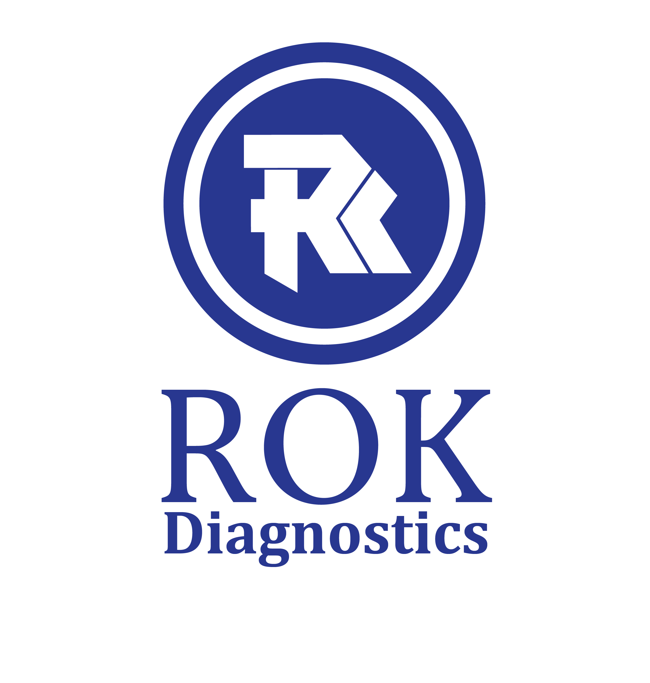
I am redesigning a personal logo and would like to go from the first, which is currently used, to the second or third. Just wondering if you think it’s a good idea and if there’s anything off about the logo in general.
Thanks for any feedback.
You haven’t given us many details to work off of. What does ROK Diagnostics do? Who is their target market? Etc., etc. I’ll share my thoughts since I don’t think they’ll change even if details are supplied.
To my eye, the symbol / monogram is dated looking and tough to read. Without the ROK type, I would not have looked at the monogram and come up with ROK. Maybe Rr, Rs or Rk, but definitely not ROK. The font or lettering you’re using for the symbol reminds me of a stereotypical heavy metal band from the 80s. Think “This Is Spinal Tap.”
Option 1 – The Two faces being used don’t mesh together particularly well, the kerning and leading need work, and the type is too close to the symbol.
Option 2 & 3 – To some degree, you’ve improved things, but that’s not saying this is ready to go. The proportion of the type to the symbol is off, the face is not working with the symbol, the kerning and leading both need work, and the ring around the symbol is too heavy.
On the positive side, I’d give you points for using one color and coming up with a logo that would work across a variety of mediums. Though that thin space between the R and K could be an issue.
Hello @Steve_O. Thanks a lot for your input. RoK is into biomedical laboratory analysis. While doing research, I didn’t find many examples of branding for this sort of company. Probably because advertising is usually unnecessary since these labs tend to be located in hospitals and have a dedicated clientele anyway, plus in many countries it’s actually illegal for them to advertise.
I did that first logo really fast maybe a year or two ago, but it always seemed off, so I’m back at it again, especially since the lab might get a bit more into research on ways of improving diagnostic techniques in Africa. That will change things a bit.
My main goal is to improve the logo. I’ll start by playing around with the the sizes and proportions like you said to see what I can get. Then I’ll look into that monogram. It’s when I sat down to break it apart yesterday that I realized that ‘RK’ font is off. I tried to use it to remake the type and saw it made the whole thing look like the logo of some type of rock band.
Thanks again.
At the risk of repeating much of what Steve said, which I entirely agree with, it could be better. Sorry.
It’s not terrible, but looks like something that might have been designed years ago. A logo inside a circle, although not necessarily bad, is, again, something much more common from a few decades back. The typography also looks seriously dated — at least for something that should look modern and a bit high-tech, like a research facility.
The relationship between the typography and the logo is awkward. They just don’t compliment each other and have completely different personalities. The logo also looks like it’s supposed to mean something, but I see no relationship to the ROK (or is it RoK?) name other than an R and a possible K hidden away in the composition. The thin line separating the R and the shape adjacent to it is way too thin. The line width not only does not match anything else in the composition, it will also tend to disappear at small sizes.
On a completely separate note, you’ve indicated this is for an actual company. We’ve mentioned the company’s name and here we are discussing the pros and cons of their logo. Are you concerned about what they will think when the company does a Google search and this discussion comes up?
Hello @Just-B. Thanks. Yeah, it’s back to the drawing board for me. As for the discussion being online, that would be very very far from being an issue.