Hi,
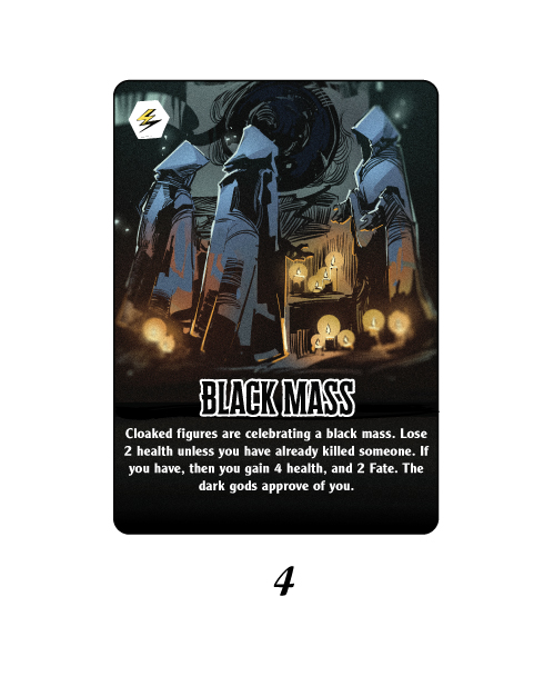
First post! I’m looking for feedback on a layout for cards I’m designing for a board game. I’d be very grateful for any feedback / advice you have.
Thanks in advance - Kris
Hi,
First post! I’m looking for feedback on a layout for cards I’m designing for a board game. I’d be very grateful for any feedback / advice you have.
Thanks in advance - Kris

Without knowing the context of the game and the other cards in the game, as far as feedback goes, I got nothing. For instance, if the rest of the cards are manga kittens, this may not fit in so well.
That said, I like your illustrative work. Your typography needs a little work. In all cases, drop the last word in the line (the one after the period) to the next line down. That’ll help your convoluted scoring to make more sense, and you don’t gain any more lines.
I’d say that the biggest concern is that the margins are very tight for the text at the bottom.Will Everything be white text on black at the bottom? What happens if you have a card that doesn’t have such a short title as “Black Mass” … perhaps something longer like , I don’t know, “Insubordinate Underlings”?
Of course - sorry, I should have given some more context. The game is a gothic horror board game set in Victorian times. There will be around 150 of these cards, all with a fairly similar type of illustration. Really what I’m looking for is a standard(ish) template to organise the:
Card Title
Card instructions
Card Type (represented by the symbol in the top right)
I’d love to hear any suggestions you might have in terms of better fonts for this.
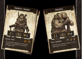
Here are some more examples:

Thanks, Craig. It might well be that I need to reduce the overall size of the card title text to make sure they’re all consistent. In terms of the description text, I can reduce the space the text takes up by making the image larger and pulling the text down a little bit.
But yes, the plan is to keep it white on black, or rather light grey on black, which I’ve read aids readability?
The illustration style is nice. But, even on shorter text, for consistency, I’d keep the text starting at the same position. As an example, hidden passage in your shared image is lower on the card since the copy is shorter, Especially in a game, my eye wants to consistently look to the same spot for information. it just looks “off”.
I dod wonder about “framing”. I did a quick search and found these examples to illustrate what I mean.
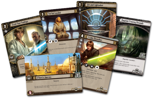
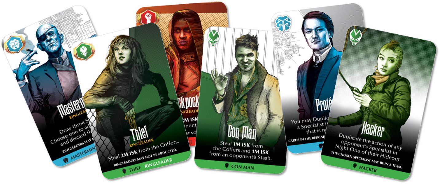
While you do have consistency, its missing perhaps some of the personality. Even the example I posted above which is “similar” to yours (the middle option), the use of color-and color bars brings in some of that personality. I’m not saying you need to go to an extreme, but I wonder if you could figure out a over arching card design, element, treatment, etc. that makes it “obvious” that it stylistically applies to the larger game. Does that make sense?
That makes a lot of sense. Thanks a lot for taking the time to put this together! I kindof wish I hadn’t seen the middle one to be honest - that’s definitely something I’d love to try and replicate and I think it would work well.
I want to try and find a style that really maximised the imagery (which I think is really strong), which is why I’ve shied away from a traditional frame. A couple of those only have around 50% of the image on display. That’s why I was looking for something a little more minimal.
I want to try and improve the fonts I’m using too.
Thanks again though Craig - you’re a star!
Best of luck. The illustrations certainly are strong and I think with the right overall design the end product is going to look pretty great.