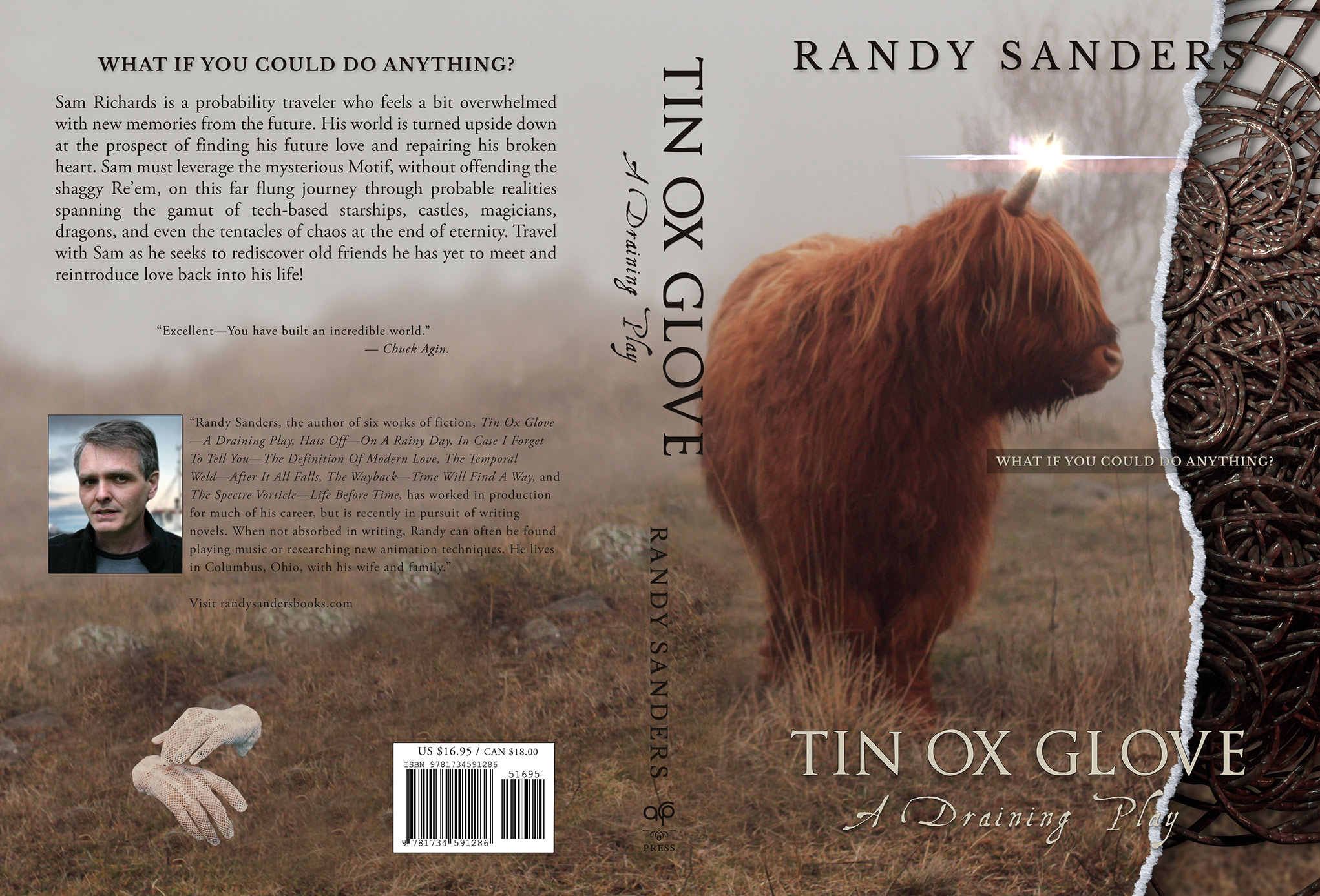
I’m looking for some feedback on this print book cover.
I’m new to book cover design, but I have been doing motion design for years.
Are there any glaring “gotchas” that I am overlooking, that an experienced designer might be willing to offer up?
However, there are things that, if it were me, I’d do differently
The text about the author is a little hard to read since it’s printed over a fairly dark background. If it were me, I’d probably play around with lightening or darkening the background and/or reversing the type to create more contrast and improve legibility. The same problem exists on the spine with the author’s name and the logo.
There’s a similar problem with the “What if you could do anything?” text on the front cover. It’s readable, but the portion of the type that extends over the torn paper is a little awkward.
Speaking of torn paper, if that’s the effect you want, I’d try tearing and scanning some real paper to get the effect rather than what you’ve done, which doesn’t look natural or convincing upon close inspection. There’s also stock art for this effect.
Finally, the disembodied gloved hands floating in the air are just a little weird and creepy.
The type over the torn edge graphic is a big hangup for me. The S in SANDERS gets lost, the DO is hard to read, I don’t care for the edge splitting the V, and Play is tough to read.