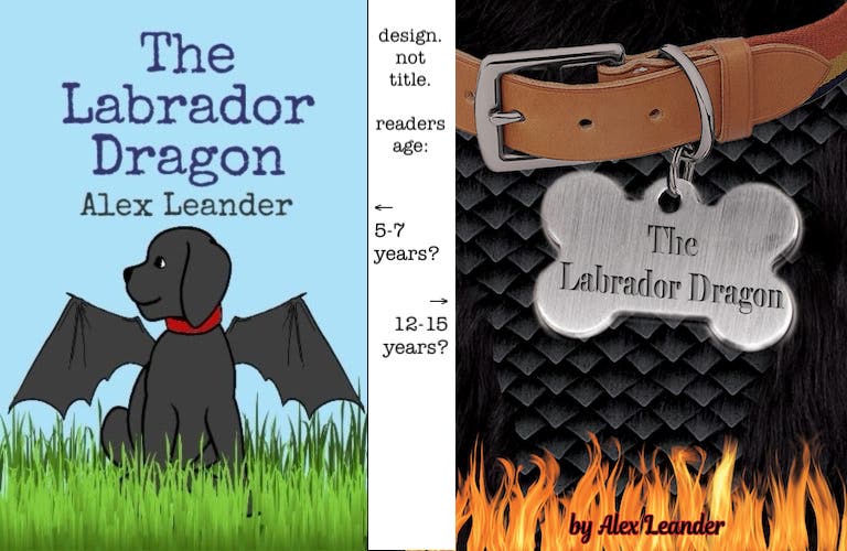
I’ve just finished my first semester of graphic design! My final project in computer graphics was to redesign a book cover, so I went with a book my MIL wrote. I really like how it came out and it is turned in (though not graded), but I’m always open to learning and have a thick skin, so I thought I’d post it here and see what you all think and what I can look to improve on in the future. Thank you in advance for your insight!
I should add that this is a middle grade book, so more for kids.
Usually a dogs name goes on the dog tag - is the dogs name “The Labrador Dragon”?
If the dragon looks like a Labrador puppy then what’s the point of it being a dragon, why can’t it be a fire breathing labrador???
Is Anna the Labrador Dragon? Or is Anna the one adopting the puppy/dragon?
The to the graphics
I don’t like the dragon scales - I’ve done martial arts for most of my adult life and I actually draw many dragons in Certificates for students - unique hand drawn and I vectorise them in Illustrator.
The dragons scales here look quite harsh - and black for some reason, don’t recall seeing too many black dragons - but sure why not - they’re fictional, they can be any colour you like…
Overall
It’s a nice looking cover for a child. It’s playful, the tag and the collar.
But then flames on a childs book.
I’m not sure I’ve ever seen that before - I could be wrong. But surely it would be an encouragement for kids to play with fire…
I know from teaching kids that you cannot say or do anything to them.
I almost let a joke out in class one day when one of the kids farted, and I said the next time I’ll put a match to it. But I was stopped short on the ‘mat…’ by a parent who reminded me using those words that a child might actually try light their fart on fire.
It was a stark reminder to be mindful of who the audience is.
I don’t see a lot of flames on kids dragon novels.
I like the cover. The collar, dragon scales and fur are fun. Not sure the fire is needed and sort of draws attention away from the upper part of the design with its bright contrast. Dragon scales can look however you want them to look. No dragons around to argue. I actually edited a fan-fic for someone not too long ago about a dragon with black iridescent scales…
The back however…
The copy is very poorly written. And as Smurf noted, hangs on an unfinished sentence. It speaks bad things about the content of the book if the back blurb is unreadable. The stark, white block photo bugs me too. A more subtle solution, maybe even toning that background a bit might have been better.
The reversed flames are lazy too, though with your center justification I can see why you maybe thought doing that was appropriate.
That’s what I was alluding to too or actually said it - any way I do remember seeing black dragons now - just needed to rebrainify myself for a minute.
I think what it really is about the scales is that I don’t like the texture of them.
But strong personal preference I guess.
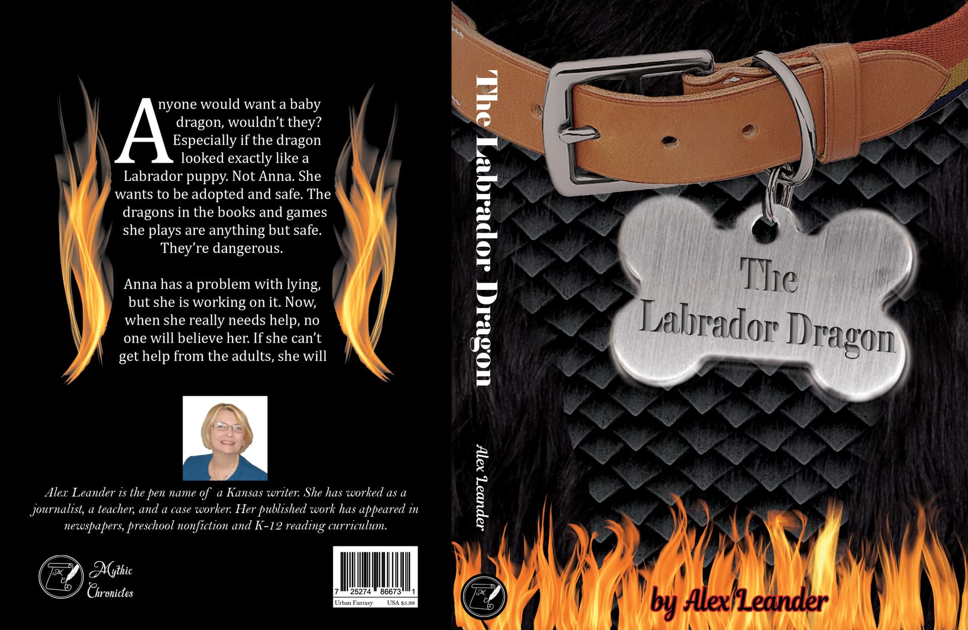
The name of the book is The Labrador Dragon. Its name is Wyvern. I just thought it would be cute to put the name of the book on the tag. The dragon only looks like a puppy until it gets older. Anna is a 10-year-old girl who found the ‘puppy’.
I put the flames on the book because the puppy does breathe fire and there are a couple instances of fires in the book, but I do see how that could be potentially problematic.
I addressed the flames in a comment to Smurf. But to address the back cover… I used the copy that was on the existing book. I agree that it needs to be redone and have been playing with the idea or rewriting it myself, but I don’t know if that would offend the author (and since she’s my MIL, I’m not sure how well that would go over…)
To the photo, I completely agree, I was just short on time and didn’t know what to do with it. I will try to find a way to tone it down without just filling it with a solid color.
The flames are because one required element for grading was that we use a text wrap. Again, being short on both time and ideas threw the flames on to fulfill the text wrap requirement.
I really appreciate all of the feedback, as my MIL actually does want to use the new cover for a sequel she’s working on, so I’ll be reworking it to her size requirements as well as refining the design. I’ll post again when I’ve worked on it more. Thank you so much for your help!
Just addressing an aspect of the mechanics, the type you set on the tag is not skewed to the correct angles. Look at the direction of the grain in the metal and try to match it. Right now they’re in conflict.
The back copy is messed up for sure. I’m not sure where you got it. But, according to Amazon this is how it should read:
Anna is an orphan. As if having red hair and freckles didn’t make it hard enough to get adopted, now she has found a dragon cub.
Any kid would want a baby dragon, wouldn’t they, especially if the dragon looks like a cuddly puppy? Not Anna. She wants nice safe home.
The dragons in the books and games she plays are anything but safe. They’re dangerous.
Anna has a problem with lying but she is working on it. Now, when she really needs help, no one believes her. If she can’t get help from the adults, she will to have to fix things herself.
Yours is a bit garbled and cut off. That in itself might get it sent back to you from the Professor.
Part of being a designer is attention to detail.
Your back cover text is missing the end of the last sentence.
"If she can’t get help from the adults, she will to have to fix things herself."
If that’s what’s on the book, I’m sorry someone else failed your MIL.
That’s a direct quote from the book…
There is a typo in that screen cut on Amazon that’s from a view inside the book.