Hi everyone, I’d like some crits on this, thank you!
Love the minimalism. Nice, clean type.
Couple of criticisms, though.
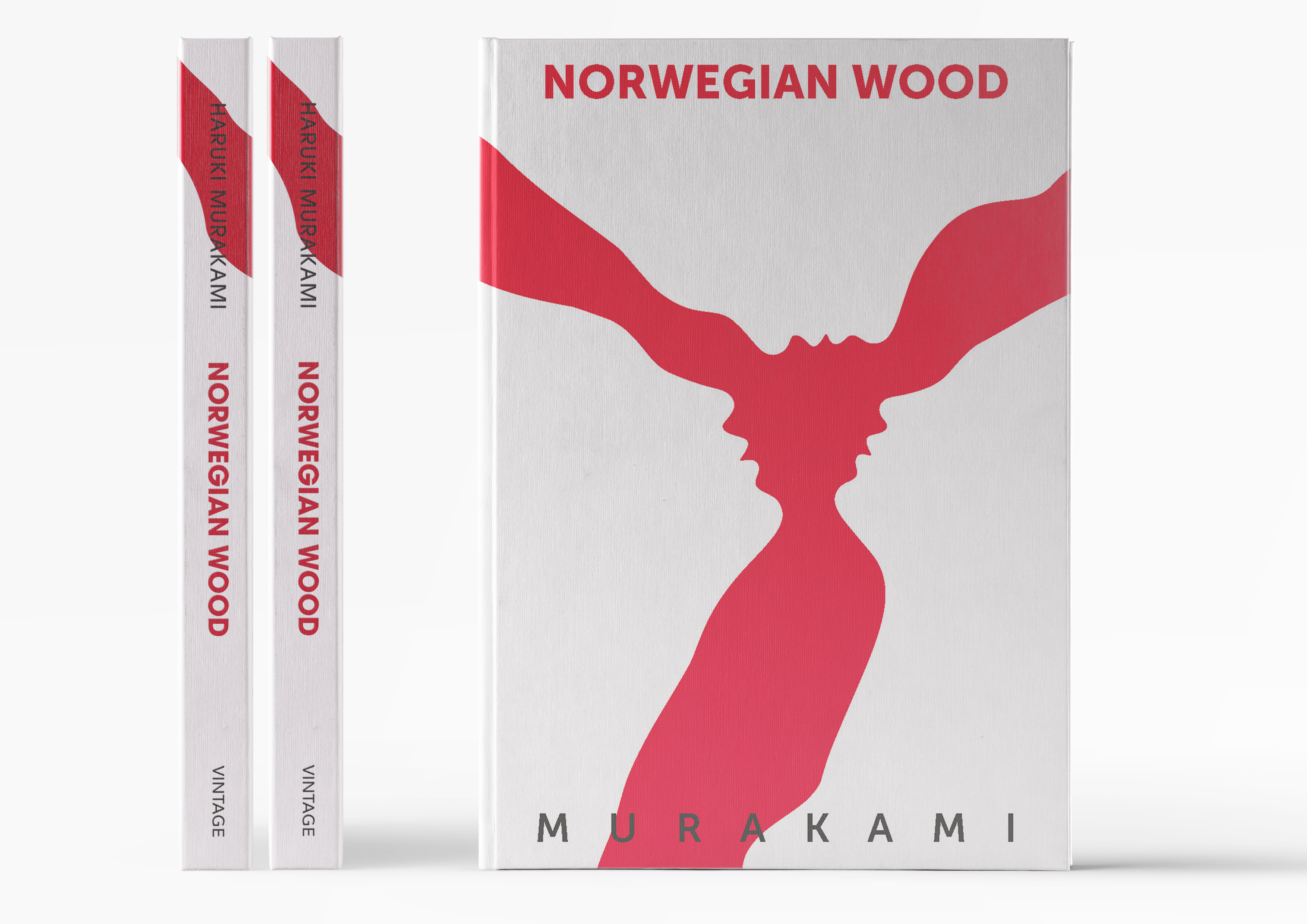
Firstly, the main graphic device is a little overused, although, I have never seen it used with three faces before, so if this has some bearing to text, then, I’ll shut my mouth.
On a technical level. It looks as though you have centred the text on the overall book dimensions and not allowed for the hinge. It is usually better to accommodate this and shunt to the right a bit, so the cover looks visually centred, in much the same way you allow for the gutter on the inside pages.
Other tiny things; I’d have probably overprinted the author name on the red at the bottom. As it is, it wobbles a little bit. Finally, the kerning on the title could have had a little more time spent. That said, I am OCD nitpicking here, as I am sure my kerning could be picked up on, especially when you get those, ‘can we have it in half an hour?’ kind of briefs.
Anyway, overall; good to see a clean cover with nice type instead of the more oft-seen, every possible space filled up and drop-shadowed type, school of book cover design.
Good job.
2 Likes
I think its too simple, also I prefer book cover designs that are easy to recognize.
I can see the face but it took me some time to realize it.
At a glance the design looks very common like some vinyl art or some paint splatter.
My reaction to this cover is, “I don’t know.”
On the one hand, there are some things here that I really, really like. The minimalism, the type, and the color palette all appeal to me. It certainly grabs the eye. On the other hand, the elongated necks and foreheads create some weird spaces. Do the positives outweigh the negative? Well, I don’t know. I suppose the bottom line for me is that this is good, but, if you could get the illustration right, it would be outstanding.
What font did you use?
Thank you so much, this is very helpful!
1 Like
At first glance it looks like a rumpled tie knot, or a battered P-51 propeller.
Black type over red simply does not work, especially along the spine.
The minimal look is a nice touch, though.
1 Like
Museo Sans with ITC Avant Garde Gothic Pro on the spine (just seemed to look better because ITC letters are wider and I thought I could get away with it ![]() )
)
What you said about the necks is an interesting point tho, thanks
1 Like
Not to sure about the relation of simplicity vs easy recognisable and for the delay in ''seeing the faces or how Eriskay says :
that was the intention, a tie knot, faces and some have pointed out that it also resembles a medical representation of the female reproductive system, I tried to make it very interpretable, the book is a story about a man caught between two women, its very sexual and a bit sick at some points leaning too much on depression and suicide.
Thanks for the feedback!
1 Like
I think it’s a powerful visual metaphor, and knowing the content of the story makes it that much stronger. This will be a fridge logic kind of thing where after people read it, they’ll realize what the meaning of the cover was all along.
I think the type placement needs some help. Maybe they don’t have to be top+bottom, like try putting title and author either both on top or both on bottom? Or even attempt to left align them and not have them so large? Could be good.
1 Like
Thanks, thats exactly the point, ‘‘to get the cover after you read the book’’.
Type wise, I’m starting to believe as well that there are some problems, thanks for the feedback !
I like the visual simplicity and the striking contrast between the red and the white. It would stand out on a shelf with other books, which is typically good.
I see the red shape first before noticing that the negative space holds the recognizable information. I’m not so sure, though, that the red shape itself makes sense.
Another thing that makes me unsure is that I know nothing about the book itself, so I have no idea whether the simplicity, faces and general emotional quality of the cover fit the subject matter.
That’s something that kinda bugged me as well, it can carry some meaning but it’s not strong enough.
For the subject to give a crude description, it’s suicide, sex and depression bordered with madness and sprinkled with funny moments.
Thanks ![]()
The design doesn’t follow design rules but guess what? Those rules are just there as a starting point. I really think the 3 face work because it’s a story about a love triangle. That is an excellent portrayal of the story. Since the image almost acts as a negative space optical illusion, it makes the viewer see 1 or 2 faces comfortably at a time - increasing the tension. That (imo) enhances the uncomfortable situation and represents the id, ego, superego very similarly to how the selfishness and selflessness are reflected in the book.
Great Beatles song too.
1 Like
I think someone has read the book ![]()
Thank you for the feedback, I will make adjustments and re-post to see opinions ![]()