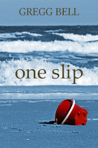
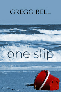
I’m an indie writer doing my own covers in Photoshop Elements 2019. So this cover will be on Amazon. I’ll also do a paperback. My confidence has been a little thrown by people saying they don’t like the fonts, so here are two versions. Also someone said the text looks kind of slapped on. I kind of agree but don’t know how to make it look more organic, so if anybody has any suggestions of specific fonts or how to make the text look more organic I’d appreciate it. And doing things on a shoestring budget, free fonts are always the preference. The book is in the literary fiction genre. I’ll be grateful for any feedback regarding anything. Thanks very much. Here’s the blurb:
Connie Silverstein just made the biggest mistake of her life.
She’s taken a good friend’s four-year-old son to the beach, and he’s been sucked out in a rip current and suffered brain damage.
Connie’s desperate to help the boy recover, but his mother is bitter and shuts her out. Traumatized that his injury happened while he was in her care, Connie can’t forgive herself and is consumed by guilt. Friends and family assure her that accidents happen to everyone and she shouldn’t be so hard on herself.
But only Connie knows the terrible secret that what happened wasn’t an accident.
I have to agree with the type being “slapped on” there. Perhaps both lines of type can be located in the same area, either in the sky, or perhaps the sand. The title nice and large, like you have it, but the author’s name considerably smaller, either right on top, or directly below. Either right or left justified in a stylish way.
As far as typeface goes, I normally gravitate towards sans serif typefaces. But in this case the serif type speaks more to the content’s serious nature. The sans has a lighthearted feel.
I wouldn’t say it’s as much slapped on as it is restrained and low-keyed, which is sort of like the photo itself. If that’s the emotional flavor you want it to have and if that emotional quality matches the writing, well, that’s fine. You set the title in all lowercase, so I’m assuming that is your intention.
Even so, I think the type needs a bit of work. I don’t dislike either typeface, but I think the type needs a bit more energy (even if you want it to look restrained). I mean, you don’t want it to appear so low-keyed that it looks boring.
You might try reversing your name out of the background (making it white). There are lots of things that could be done with the book title, but showing you those things in words (rather than images) is difficult.
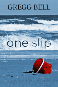
The cover is okay, and by that, I mean it’s just okay. Given that you might only have a split second to grab a potential reader’s attention, I’d say the cover should be fantastic instead of just okay. The feedback about the text being slapped on is accurate. You also have three things (author’s name, book title, and red bucket) that all have a similar visual weight that are all competing against each other. The red on the bucket is too intense and needs to be dialed back a bit. I know you said you’re on a shoestring budget, but I think it would be worth hiring a professional designer for the cover to maximize the impact and maximize sales.
The Author’s name and book title are competing too much. I’d bump the author’s name down a few points, and the colour of the text isn’t to appealing. Unless you really know what you’re doing design wise, I’d stick with black or white (reversed) text.
As for the visual, there isn’t much emotion. I get the idea of a toned down background with a bright red bucket, but it reads of something forgotten and not “accident” or “trauma” or [insert emotion]. I can see a half crumbled sandcastle/sandcastle being washed away by the tide communicating your message greater.
I see two problems with the image. (1) It’s a snapshot, not compelling. (2) The text doesn’t look good against it. The image is the first thing that gets our attention, so I suggest you rethink it.
You can find affordable, better stock images. These provide room for the text, without competing with the image.
You can download test versions for free, then pay a small amount for the one you choose.
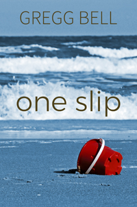
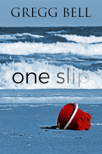
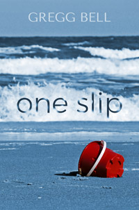
Thanks very much for all the feedback. I did try several of the suggestions. The white for my name seemed to draw too much attention. But I did a couple of new ones that I was hoping showed a little bit more of a dangerous vibe. And I also tried a slightly different font for my name.
I agree with the response that the title, the author name and the bucket are all competing for prominence which means the message is muddied. I think the author name needs to be reduced significantly (about half the size of the book title) and possibly even moved to the bottom of the image. The book title could do with bumping up in size.
I’m guessing that because you’re the author you want to shout it loudly - I can understand that - but a quick Google Image search on book covers shows the convention of the book title being the loudest and most important thing.
Famous, best-selling authors typically get prominent space on book covers because their names are recognized and have shelf appeal. With an “indie writer,” I doubt that reasoning applies.
I’d make the author’s name smaller and clearly subordinate to the title. As I mentioned earlier, I’d also make the author’s name reversed out of the background (maybe a 60–70% transparency). And I’d make the title of the book much larger and more deliberate — either two stacked lines or a very condensed sans serif.
I’d also crop the photo tighter to make the bucket larger and the empty sand at the bottom smaller.
I do like the notion of the waves washing over the title.
Of course, not having comped it up, I’m guessing how all this would look.
@Julia Thanks Julia. I reduced my name. I am hesitant to increase the size of the title, though, because it stands out well against the whitecaps.
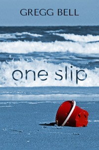
@Just-B Thanks Just-B. I reduced my name and changed the font. I tried to figure out how to reverse it out of the background but couldn’t. If you have a link or something I’d like to try it. I guess I am kind of wedded to both title words being on one line because they stand out against the waves. (Although I’m not totally wedded to anything.) I also tried your suggestion of enlarging the bucket.
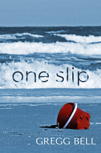
This one I changed the font on my name, reduced its size and made the waves splash on the “one” as well as the “slip.”
That’s not exactly what I meant. I was trying to suggest just cropping in a bit tighter, but you’ve taken it too far and crowded the bucket into the corner while making the space at the top (the sky) too large. It’s as though you’ve created the opposite problem to what you had before.
Honestly, I think the heart of the problem is the photo itself. The empty abandoned bucket is a great idea with its implied story, but the photo as a whole is a bit lacking and imposing awkward compositional constraint on the rest of the layout.
If it were me, I’d begin playing around with the typography and the layout. Rather than running with a straight photo, I’d likely be a bit more imaginative, work with the photo a bit to change some proportions and play around a bit with all the elements, but all this would be a matter of experimentation.
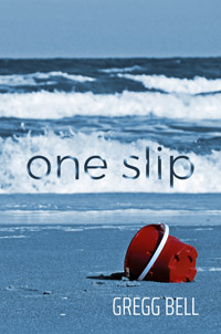
Thanks Just-B. This image fits my story so perfectly, so I’m pretty committed to it. But I did do some experimenting. Nothing major but slightly different looks anyway.
Look, some of the design problems come from the image. I don’t know why you’re committed to this one, did you take it yourself? Your wife, your daughter?
I’m a professional photographer of over 25+ years, and I’m telling you it’s not a good image for your book cover. You may be married to it, but you need an image that will help your book cover get attention and look professional. This one ain’t it.
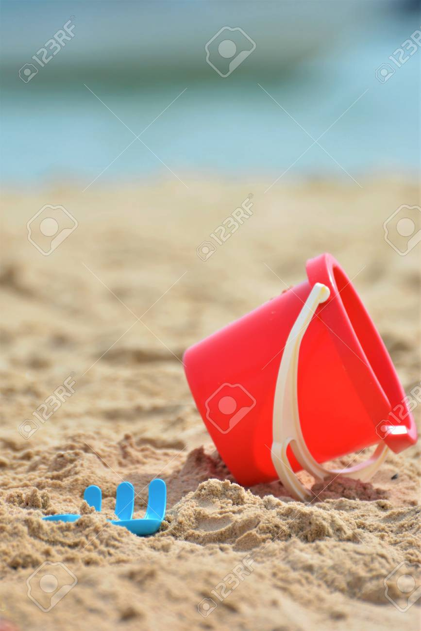
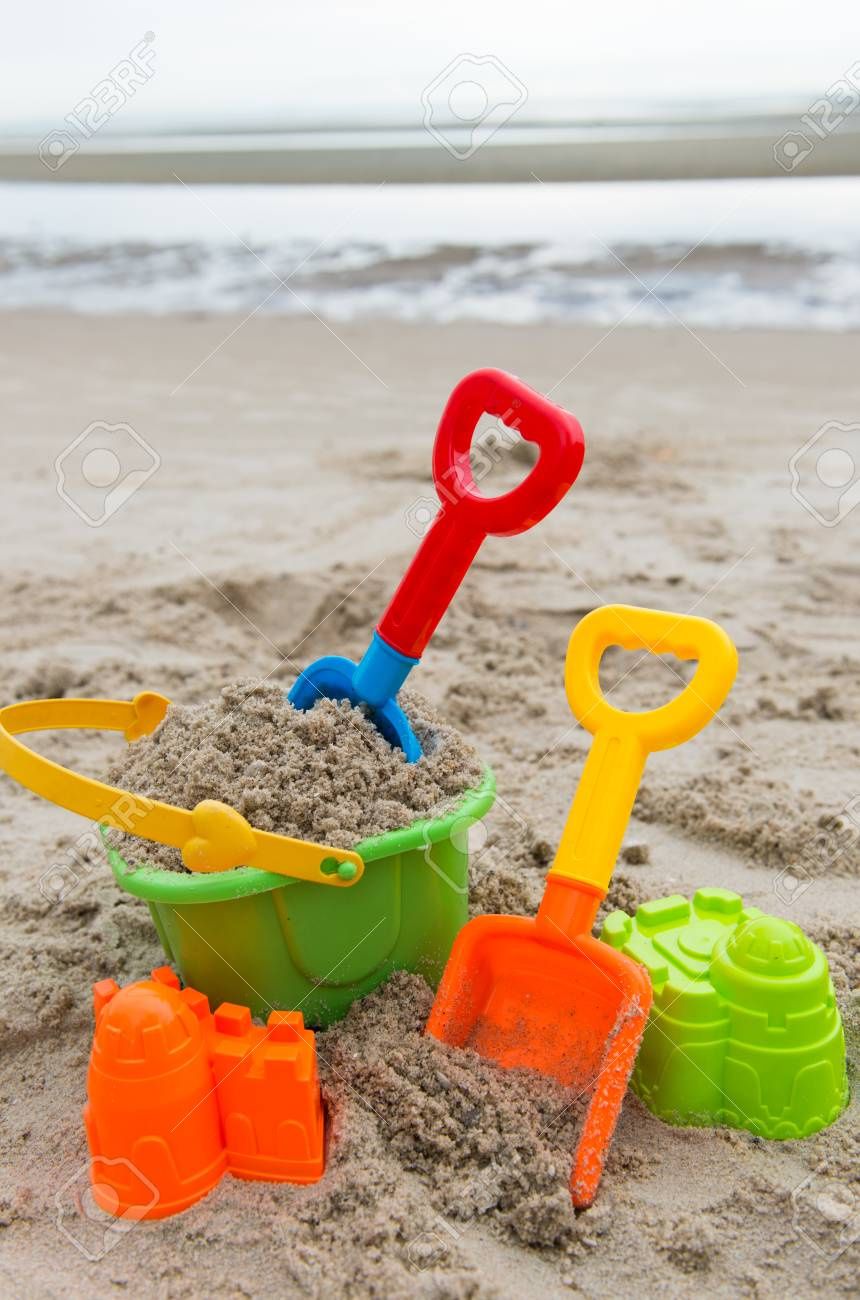
Try this. Just do a mockup with one of the ones I posted. These support your story and help the typography.
Then get some opinions on them both, side by side. Just try it. What do you have to lose?