I’m trying to get into graphic design, so I’m making all sorts of projects and experiments…
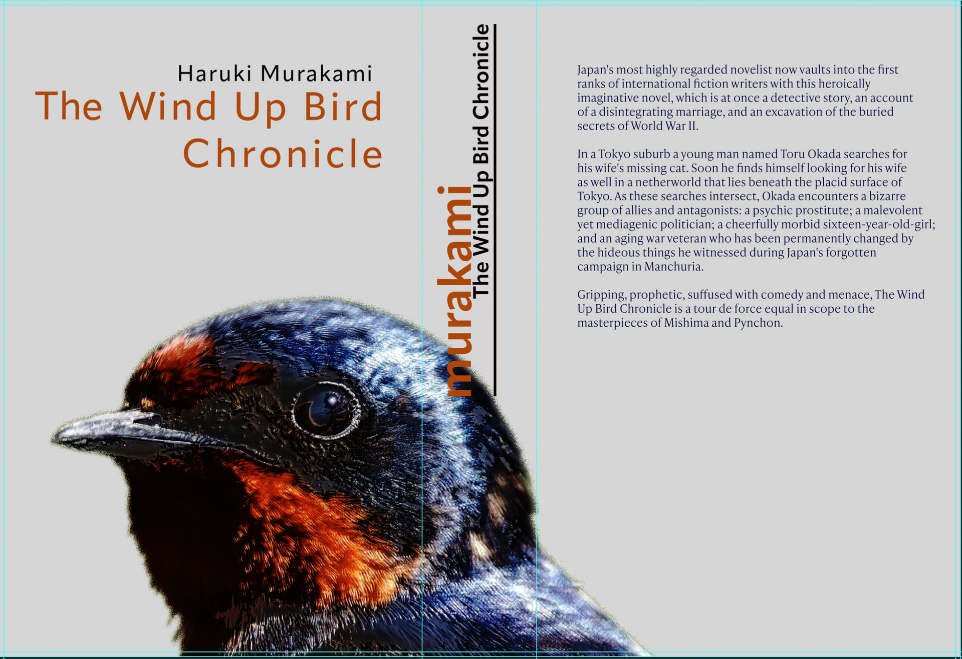
This one is a book cover project for one of my favourite books, The Wind Up Bird Chronicle by Haruki Murakami.
Would love to hear your feedback on it.
I’m trying to get into graphic design, so I’m making all sorts of projects and experiments…
This one is a book cover project for one of my favourite books, The Wind Up Bird Chronicle by Haruki Murakami.
Would love to hear your feedback on it.
For starters, you’ve put the front cover on the back of the book and the back cover on the front of the book. On almost all book spines, the typography runs from top to bottom, not bottom to top. “Wind up” is a compound adjective, which means it’s hyphenated, as in “Wind-Up.” Book covers need the appropriate bar codes, publisher name & logo. If the author’s name warrants the largest type size on the spine, it probably warrants the largest type on the cover.
What I’ve mentioned so far are mistakes (unless you can defend your choices). Since you’re just starting out, I’m going to suggest that you seriously study typography, which in many ways is a bigger problem than just making mistakes on a one-time practice book cover design.
Just one suggestion: The title should be on the top, then after writer’s name. this catch the attention of people, then they know who is the writer (check some books or newspapers as an example).
Yes, it’s a nice design, kudos to them it looks good except for the technical placement. Just need to flip the designs to the different sides.
The spine, think if you lay it flat with the cover facing up you want it to be read, currently it would be upside down when the cover is facing up (when on the right side).
Pretty sure you’d have realised it when you print it out, and fold it, you’ll see that it’s facing the wrong way.
You can be pretty imaginative with the back - the text looks poorly laid out, lazy selection of font.
When you say you are “trying to get into Graphic Design” do you mean the field or just wrapping your head around the idea of design? As you can see from B’s post, there’s way more to it than pretty pictures, and formal schooling is highly suggested these days with all the ‘“competition” out there.
And speaking of pictures, the wind-up bird is never seen. Do you want to pin it as a real bird? That’s not the point of the story….
Thanks a lot for the feedback, everybody, and for correcting my noob mistakes.
I’m interested in getting into the field, yes. I know it’s going to be tough without a degree, but I’ll try and see how far I can go. I do have a half finished art school degree I might come back to in the future, and also some ideas for further courses I might take soon…
I don’t think my idea contrasts so much with the book… notice that almost all of the other cover art for this book features a bird I don’t think it’s a problem, especially since it’s mainly for practice.
I’m also reading quite a lot of books and watching a lot of content online, I don’t think the information is really gatekeeped very well by the schooling systems.
It is better than just reading books or taking online courses (like those I did on Coursera). That’s what I started with, but then I focused on practice and connecting with real graphic designers—that is much better than any other method.** Getting a degree at university with teachers is also great because they provide excellent guidance for you.
Online content might be okay for learning “how”….sometimes, not always the right way.
Not so much for learning “why,” though.
I’m glad you weren’t scared off by my blunt criticism.
Design is about problem-solving, and too many beginners jump straight to aesthetics, as though it were the goal rather than just one part of the solution.
Every design problem has parameters that the solution must fit within. You can’t ignore those parameters; you must understand and consider them from the start.
Some parameters are practical, and some are imposed by clients, budgets, timeframes, target audiences, and so on.
This relates to your book cover design because you didn’t fully consider the basic practical parameters and considerations of what a book cover design requires. Instead, you rushed straight into solving an aesthetic problem without first considering the practical ones.
Pick up three or four books and really study the covers — they all have things in common, and those commonalities must be considered. To be blunt again, you didn’t do this. You didn’t even open a book to make sure which side was the back and which side was the front.
In other words, pay attention, define the problem, and think it through rather than jumping straight into trying to make it look nice.
Japanese books read from right to left and bound on th right side, making them look like they are back to front compared to western book.
Pretty nice layout, I would flush right the authors name with the title. The authors name is a bit off.
I like the bird wrap around but the author name in the bird makes it a bit hard to read.
You’re totally right if this were localised for the Japanese market, right-to-left binding would be standard practice. However, since this concept is aimed at a standard Western audience, designing it right-to-left ends up creating functional issues (a reversed spine on the shelf and confusion about which cover opens first).