Hi all,
I sometimes play around with graphic design but I would love to improve my skills, so I’m looking for honest feedback to help me grow.
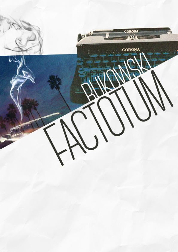
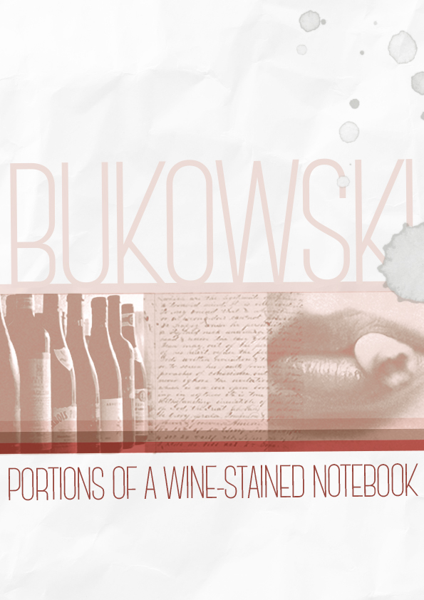
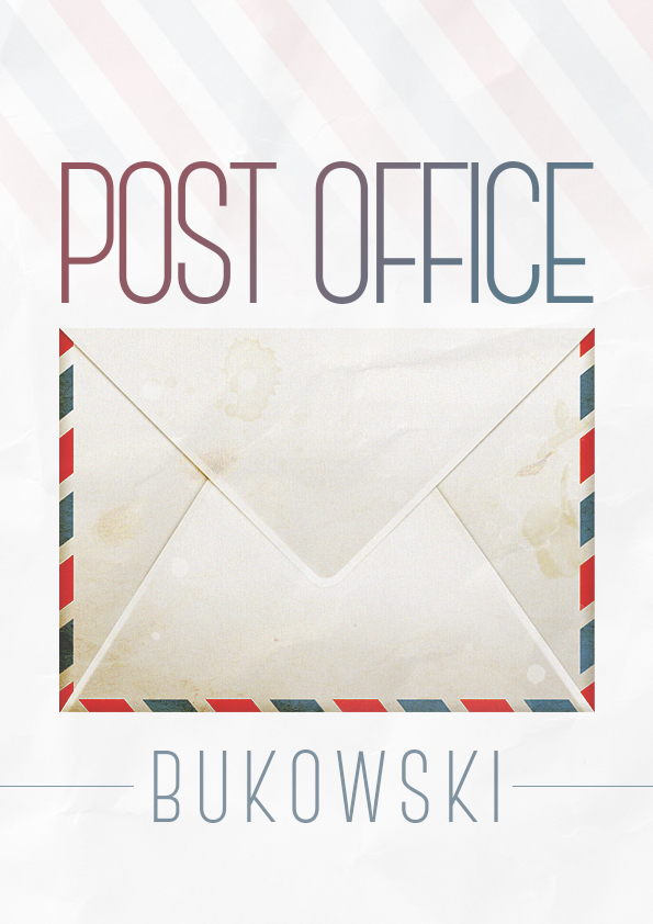
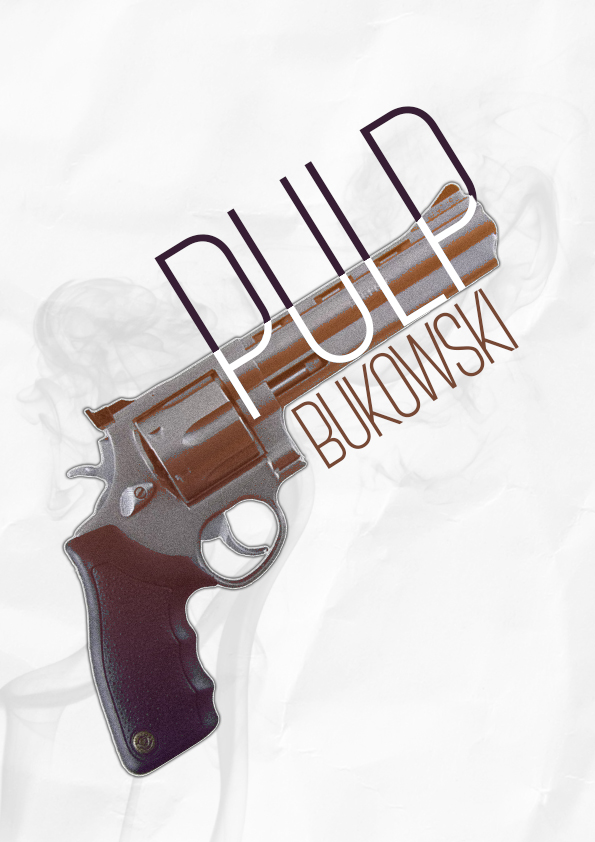
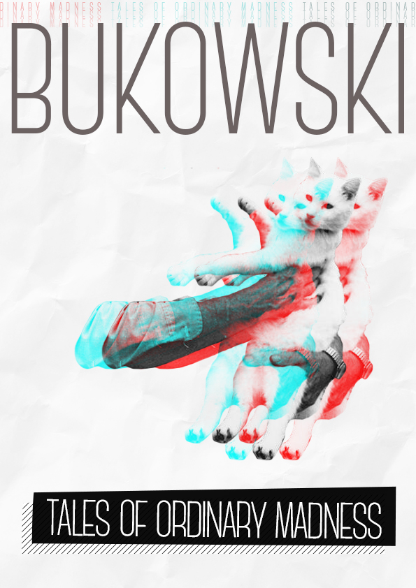
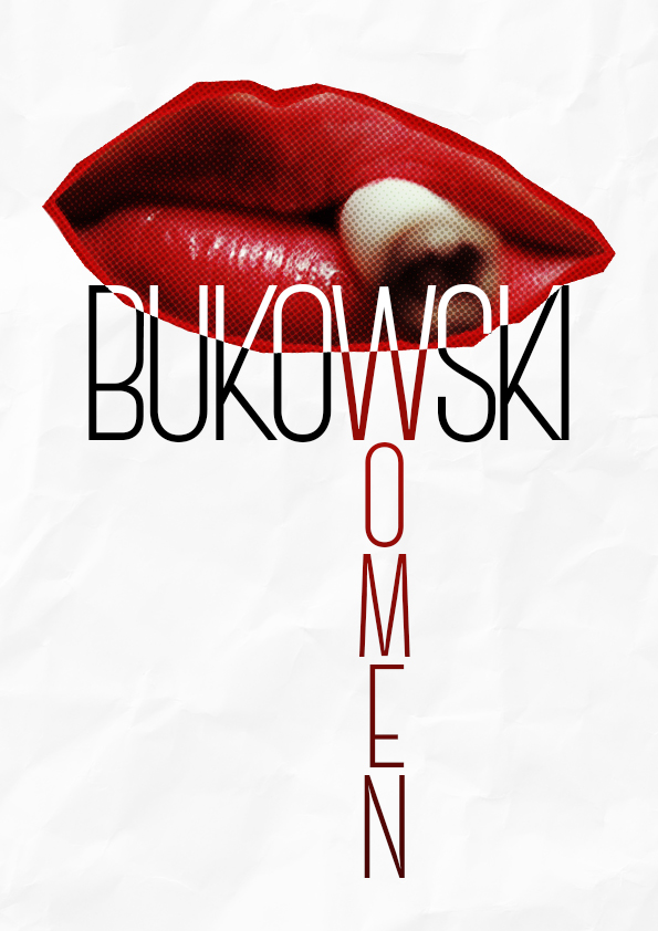
Any Bukowski fans here? Recently I have come up with a series of minimalistic posters/book covers for one of my favourite authors, Bukowski. He was really prolific as a writer, his life and writing were inseparable, thus the folded paper background. He was straightforward, many a times offensive but at the same time authentic. He saw great strenght in brevity. I wanted to capture that feeling of less is more.
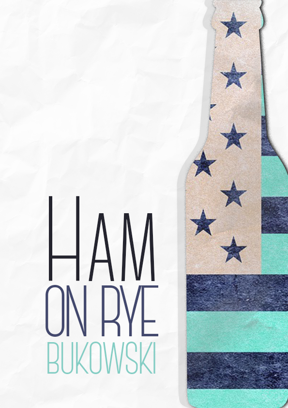
I am completely unfamiliar with Bukowski, his work, themes, etc., so I feel a bit like I’m offering an opinion in a vacuum. That said, my overall impression of the work is favorable. The type on the Ham on Rye cover isn’t really grabbing me; maybe spend a little more time on that one. And I’m not crazy about the Post Office. The envelope looks like a piece of clip art from Shutterstock. I think you could push this one and come up with something more in the vein of the others. Other than those two comments, I’d say good job.
Is Bukowski considered a Beat writer? As for the art I like a few as posters actually. I don’t think I’ve ever said this but there are some serious traces of Andy Warhol in this style. (That’s a very good thing.)
Critique: I keep going back to the smoke on the very first one- where it passes over from white to blue my eye stops. I think it’s because the smoke looks cut off on left and right but passes through the break in the middle.
Fix (imo): Sample the area where the paper is folded to pick a slightly grayish white and darken the smoke over the blue (just bout 3-5%) because it’s your whitest white.
Then continue the smoke through, even if the pic used doesn’t have this (fake it). That will allow the eye to move through the design easier. It’s ok for the smoke to change color with the background, but that hard line is hurting the flow.
Jut remember, Warhol, even though he was weird and maybe even an alien, kept learning. His art improved dramatically when he met Jean Michel Basquiat. Actually, both artists got better in their collaborations.