Hi everyone,
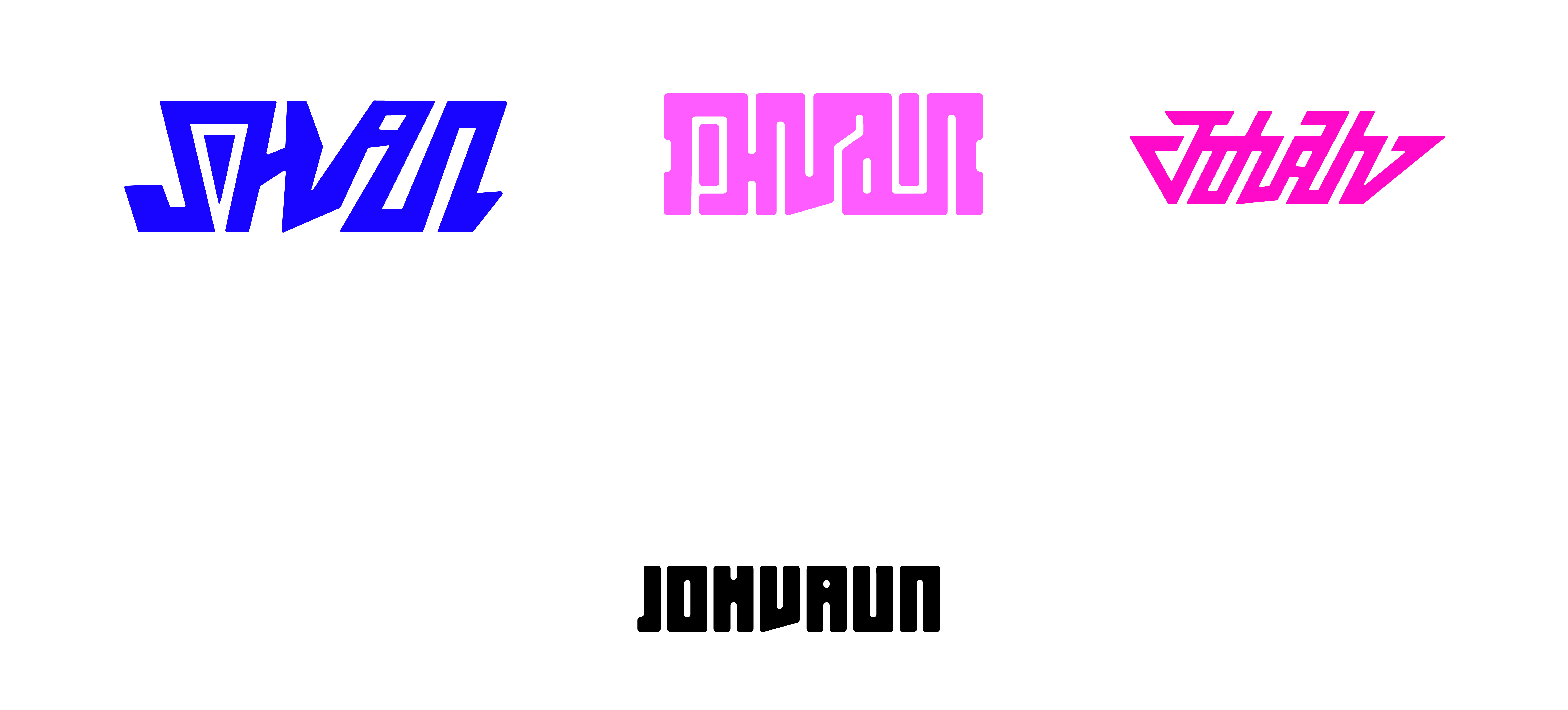
Here are some logos I have crafted for my clothing brand. I would love to get some feedback on them as I’ve never gotten any from designers. Positive or negative, anything is fine really . Each logo is supposed to read “Johvaun”. They were all created at different points in my design career. The logo most left was crafted when I was really into graffiti. The middle has more of a “barcode” / perfect/ symmetrical feel. The third, to me, gives maybe more of a sports feel due to the slant, the sleekness and refined silhouette. I like to call them “logo mechs” or the 1st, 2nd, and 3rd ligature.
Thanks for taking a look guys! Also feel free to follow my clothing brand on IG! @at.johvaun
I wouldn’t have had a clue what the top 3 are unless you told me.
I read Shan, Pvain and Johah.
… and welcome aboard! 
2 Likes
Had I not read your post to see what the name of your company is, I would have read the first logo as Shan, I would not be able to read the second logo at all, and I would have read the third logo as Johah.
1 Like
Give me a moment and I will curate some comments on them …
Nope. They’ve already been said.
Thanks for the comments all. I also didn’t mention how I am not going for legibility at all, but rather an abstract mark made of letters.
Then you achieved your goal. They are completely illegible.

May I ask why that was your goal? What is the benefit of a blurb of letters that no one can read? No one is going to know who the heck you are. How is that in any way beneficial to your business? I totally get that you want something cool and different … but if no one can read it, it’s useless. No one is going to remember that a particular blurb or squiggle of letters is your company.
Yes I have always been quite the achiever
I come from street / graffiti / streetwear culture, where things are not so generic. And while I appreciate the feedback I completely and utterly disagree that any mark here is useless as it is recognized by over 1400 people currently :). And that is what a logo does. It is a recognizable mark that should be as far away from other marks as possible. These marks are to aligned with makes such as the Apple logo, the Lacoste crocodile, etc. where you recognize the mark but you do not read anything. That is for typography which I included 
Perhaps you misspoke a little since your second statement contradicts the first. That’s not a criticism (I’m less than clear at least half the time), it’s just a possible explanation for some of the criticism about illegibility.
And that answered the question I was just about to ask. 
Considering what you’re selling and your audience, I think what you’ve done is good. I think I like the top middle one the best since it’s all but completely illegible, and hardly anyone will try to read it. When it’s pointed out that the shapes are actually highly stylized letter, it becomes something of an Easter egg surprise, which is sort of nice.
Welcome to the forum, by the way.
Thank you for the warm welcome!
They are to be read, but only if you can read them. But yes an Easter egg for certain !
Hey there! I like the some of the logos you created style wise, I think they’re successful in reflecting your background as someone who’s very into graffiti. They also have good positive/negative space balance, which I appreciate. I’m sure the typography could use some refinement, but since you’re going for the handmade streetwear look, I see why it could work. Although, the third one I’d disagree on the sports connotation, I get a much more a 80s vibe from it, but maybe it’s just me.
I’d be careful when comparing illegibility with logo symbols from very known brands, as they also have their versions with clear and carefully thought out typography, because that is usually necessary. Also, it’s just not the same thing. I feel inclined to point out that a logo being a recognisable mark that should be as far away from other marks as possible is a poor definition. A logo is the face of your brand, it does need to be recognisable, but also align with your brand principles, expression and strategy. It should only be “as far away from other marks as possible” if that makes sense with all those three things I said.
But I don’t blame you, branding is a very complex subject.
I think that if you wanna go for the illegible type and promote more of that stylistic graffiti feel, that could be a solution, but you should go a little further away from it looking like a typeface so people won’t try to read it, and more like it was inspired in letters but it visually isn’t, because that could read as a mistake. Or go the other way around, like your most recent logo, which I particularly like.
2 Likes