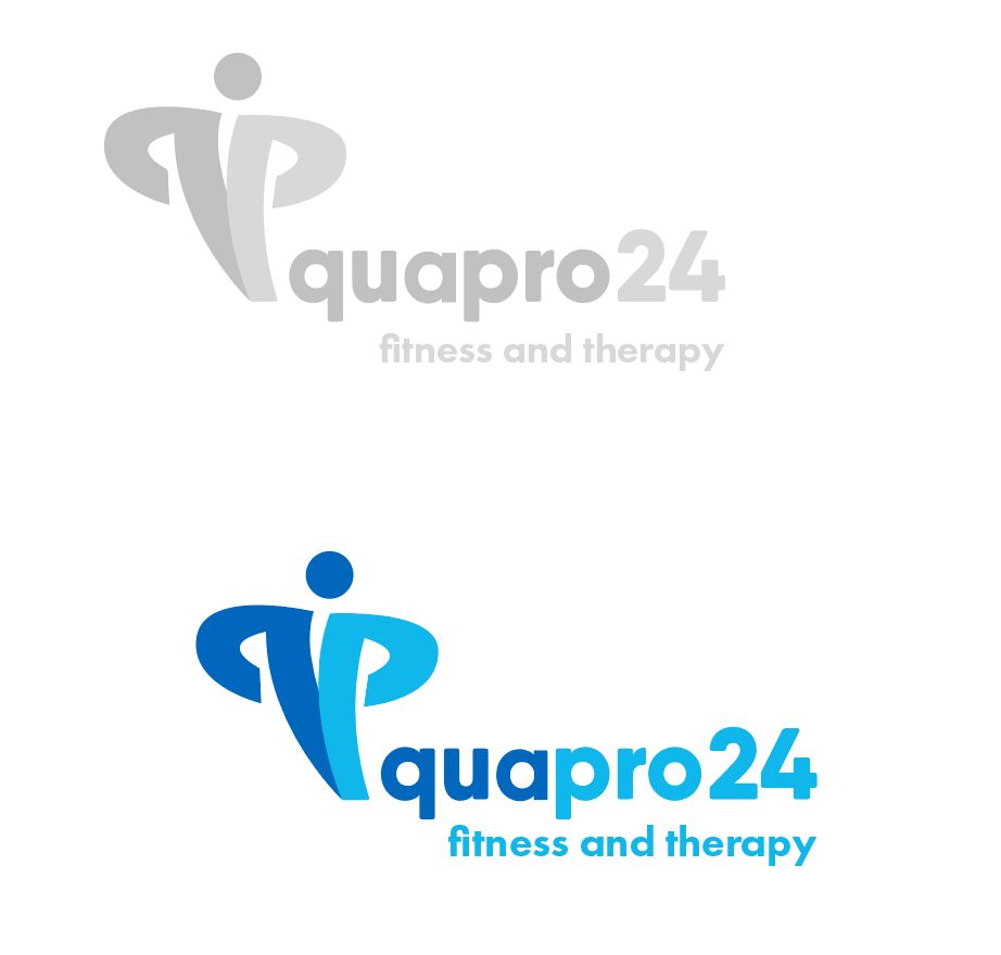
Would love some feedback on this not-so-finished logo for a physiotherapy/fitness company.
Going for a healing, empowering and strength vibe. Colors are not at all final, just picked some quick to show what it could look like with a little color.
Do you think blue is the right color for this industry? In my opinion, blue would be a better fit for business/finance or medical industries. I would use yellow/light orange here.
I like the idea of forming a person with the q and p, but the execution feels a bit off. I’d suggest you spend more time fleshing this out. Shoot to come up with three or four possibilities for the figure.
I agree with @Steve_O. The execution almost comes off as confident (which is good) or aggressive (which is bad). What I mean by that is the ‘q’ and ‘p’ look like the arms/hands are on the ‘waist’ and the ‘chest’ is puffed up and comes across as aggressive (just a thought). So I would also come up with a few more figures keeping tone and figurative-abstract body language in mind.
Also, the name itself–while odd, is unique. Has there been any discussion as to a certain typeface, or custom font? The horse may have left the barn on that, I just think these abstract figures for use in fitness/therapy are oversaturated. It’s difficult to stand out in a sea of sameness.
Thank you, good critique from both of you and I will continue to mess with it, including creating several other iterations.
While the name is set, there’s freedom to change typeface of the logo and the brand font. I’ll play with options that are more unique since this one does look (and is) a bit generic. A custom font is probably beyond the scope of the project for now.
Right, my hope is that the incorporation of the q + p gives it a bit more flair. Not sure I can escape it looking like those logos and still maintain simplicity. Will try some more ideas though.
Bro, my opinion would be symmetrically your design needs improvement. You can scale up the text or scale down the logo icon itself. Think of this logo going on a website horizontally, if you set it at 200px in height proportionally you might end up getting the font from this logo really very small and will for sure look messed up.