Hello all! I’m a fairly new designer interested in focusing on branding and I am currently working on projects I can use to showcase in my portfolio.
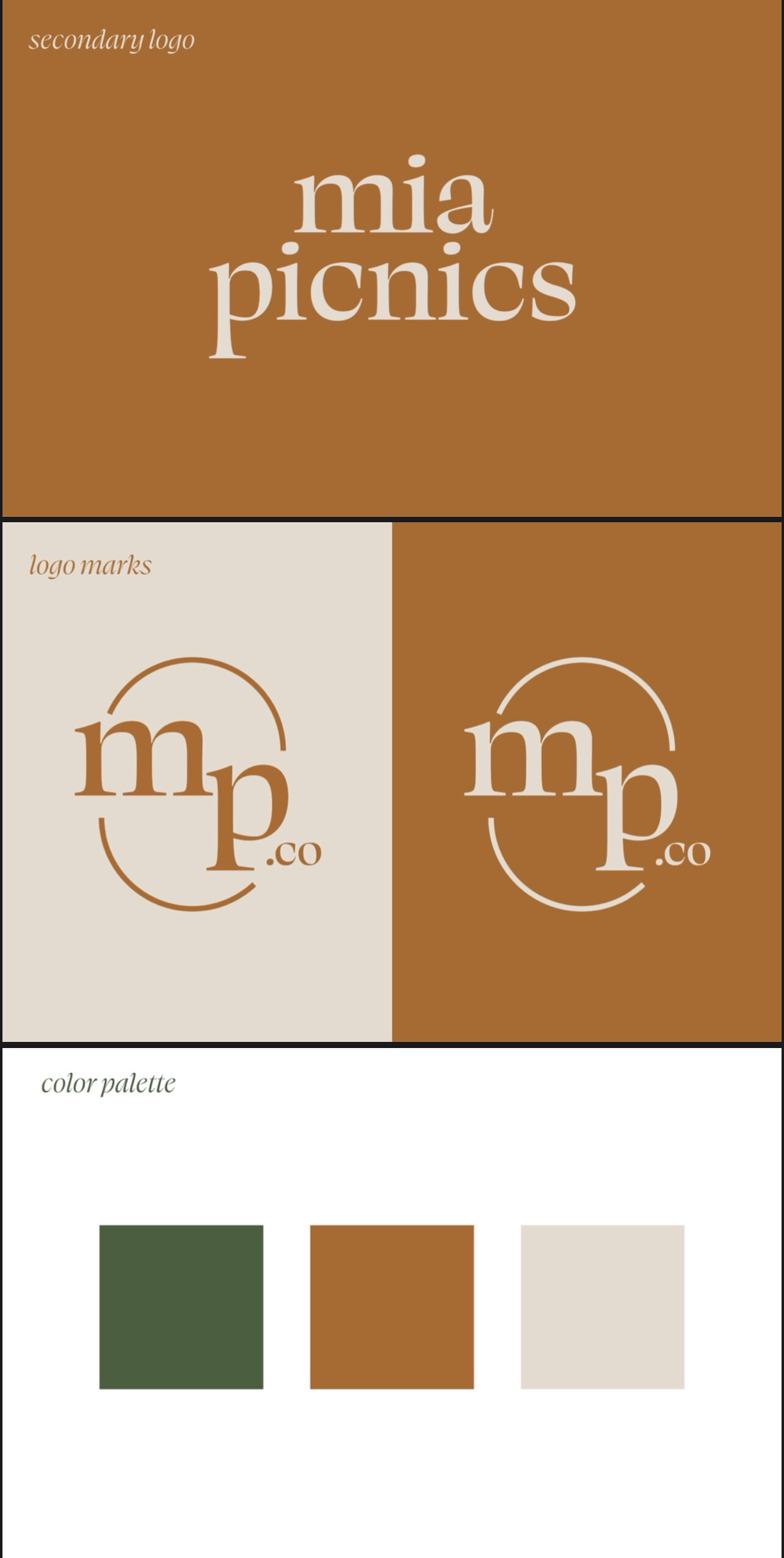
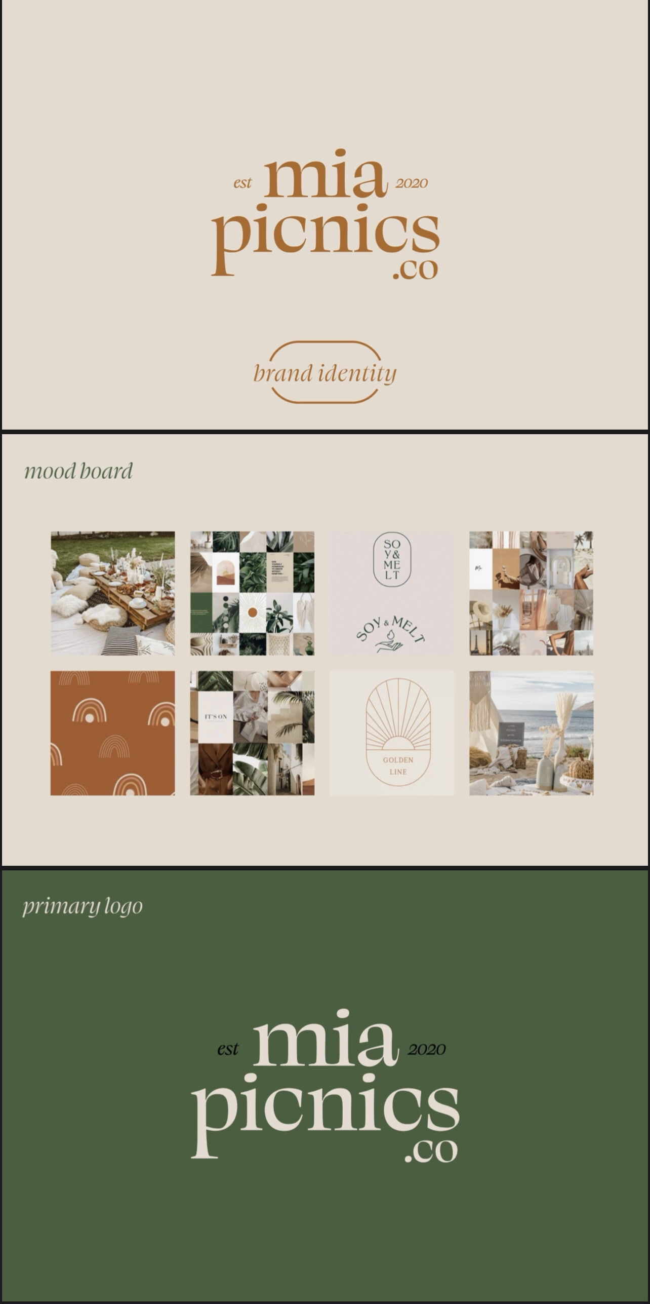
I designed this branding for my friend’s custom picnic business called Miapicnics. co. She has been running this small business for about a year now so I didn’t want to suggest any changes with the name.
The main service that the business provides is creating a custom picnic experience in the client’s location of choice. They are able to select add ons such as food and a photoshoot. This business is intended for all ages but most of her clients tend to be in the 20s-30s age range.
The style of her picnics lean more towards the boho style and that’s what I wanted to stick to for the branding.
I would love to get your feedback on this project.
On one hand, there’s a lot to like. The color choice is elegant and classy and adds a feeling of luxury and opulence. The typeface also does this, while still having a quirky personality to it, although I’m not sure if the quirky nature sits well the luxury/opulent angle.
On the other hand, it doesn’t feel wholly like the right direction for the company.
The company does seem like it is providing a luxury service, it’s good to convey that. But it also seems like a business that revolves around the personal touch (i.e. they are going to make a picnic that is just for me). And I don’t really get that aspect from your design. It looks a bit too corporate (especially the MP logo which feels like something from a solicitor). Picnics are supposed to be fun, and I don’t really get the message of fun from your work.
I think the color choice works well as it brings out the opulence part, but I would be tempted to play around with the other aspects. I definitely experiment with a different typeface and try to select something that has a personal angle to it. I’d also try a different logo, maybe using a more icon-based approach that communicates the fun aspect.
I’d also think a bit more about the “est 2000” bit. At the moment, it just feels like you found a bit of spare space to plonk it on. And because you’ve already got the “.co” bit hanging from it, it doesn’t really work.
Overall, it is good, but I think you need to think more about the messages you want to convey and focus on them a bit more.
I scrolled down through the post compiling my reactions, then I got to Sabrina’s critique and found out she stole my thoughts before I even had them.
I’m not sure I see anything I’d call “boho” (honestly I wouldn’t call anything that, but I understand the spirit of it, I think), about the branding you’re showing here. Whatever it ends uplooking like, the ‘est. 2020’ will ruin it aesthetically, and in meaning. “We’ve only been doing this since last year” is not a selling point, and it would be superfluous in any case.
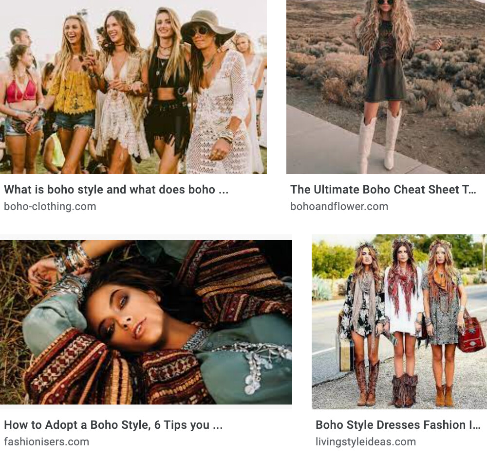
I needed to look up boho since I’d not heard the term before. After scrolling through the Google images, I don’t see a correlation between what you’ve come up with and what Google showed me.
Your logo, colors, and style look a bit more classic, corporate, and earthy. That’s a nice look, but is it boho?
I’d definitely get rid of the little “Est 2020.” Is that date somehow relevant to anything important? Seriously, it’s just a trendy little hipsterish add-on, isn’t it?
Does she really use the .co as part of her everyday name or is it just the corporate/legal designation for her business? Any reference to corporate anything seems at odds with both picnics and the boho thing, which I’m really having trouble relating to picnics at all, but that’s another matter.
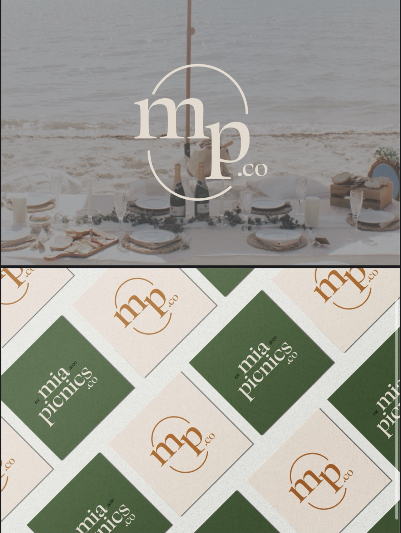
To me, it seems like you’ve paid more attention to designing your presentation of the branding than you did to developing the brand itself. I have my reservations about this seemingly trendy presentation approach. It’s great to provide examples of how a logo might be used, but I see no particular usefulness for the client in showing a bunch of patterns, logos superimposed over photos of picnics, and mood boards of seemingly irrelevant images.
I don’t want to come across as only negative, though. As I said, it all adds up to a nice look. I like the colors, the typeface, and the personality. I just don’t see it as boho, but I do see elements of 2018–2021 trendiness.
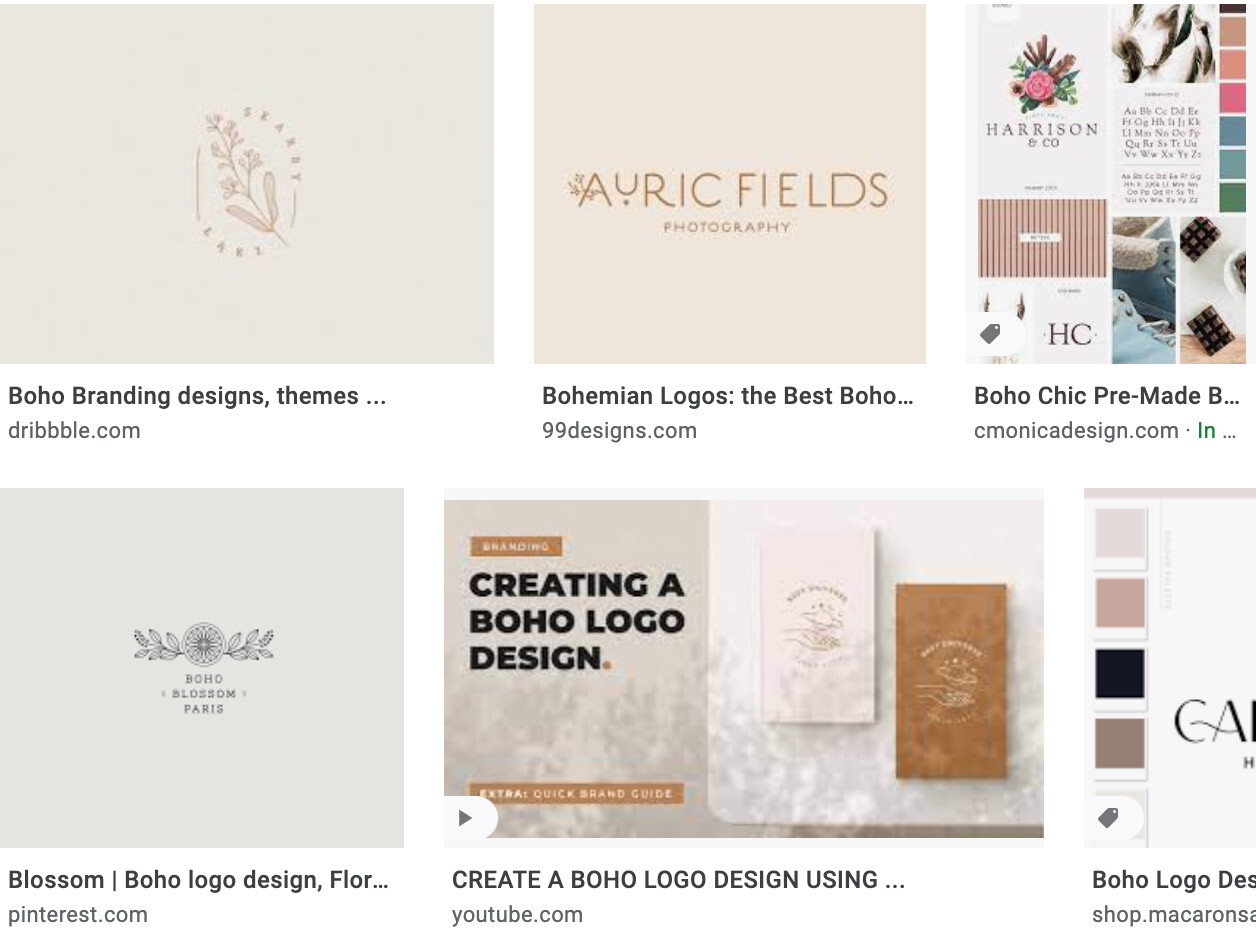
Thanks for your feedback. Respectfully, I’m not sure what you googled because I think that the colors and font fit very well with the boho style, but like you said you’re not familiar with it. Look up boho branding and maybe that would help. Also I have seen many designers take on the approach of showing the logo in it’s environment with placing it on photos and that seems to work very well for them. As a new designer I think it’s very difficult to understand what’s “good” because my client was very happy with it and I’ve taken a lot of advice from other designers who have a similar process.
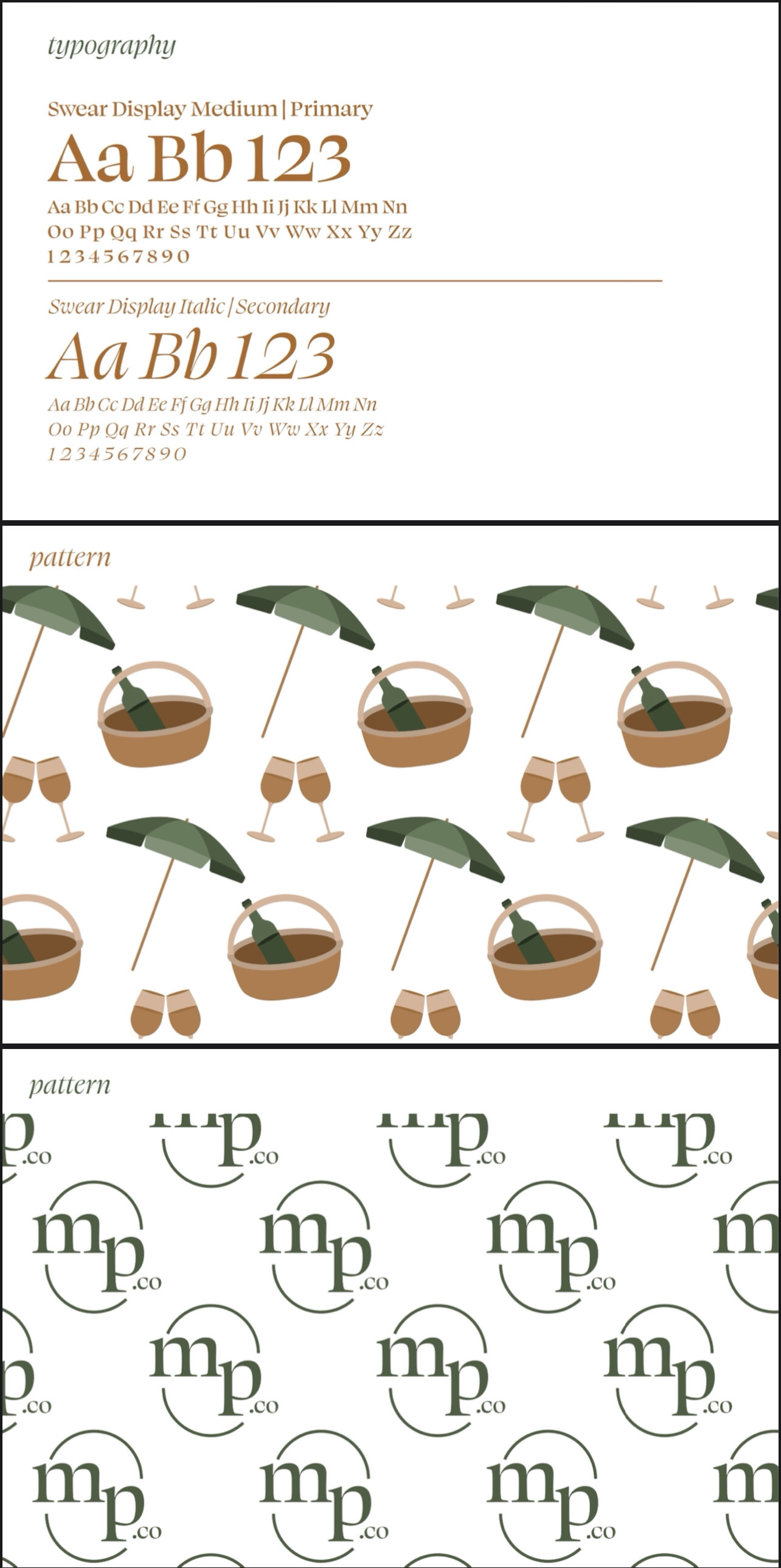
I really, really like this, excellent work. Here’s my critique- when I look at the logo mark, nothing says picnic to me. I’m basically looking at a very nice logo mark but it’s not telling me anything. BTW, love that typeface.
I typed in “boho branding,” as you subsequently suggested, and got this, which seems completely different and totally in keeping with what you’ve come up with — perhaps too much so. It’s weird that the same basic term would yield such dramatically different results.
You seem to be stuck on the new designer trendiness bandwagon, which, as an experienced designer, I’d suggest climbing down from.
I’m not trying to be snarky, but following trends isn’t a good design habit. I’ve seen hundreds of portfolios, and if there’s one recent trend that causes a less-than-good immediate reaction with me and many other art/creative directors, it’s the trendiness trend that so many new designers seem to have inexplicably embraced.
I love discussing things like this … here’s my take on it.
Boho .. short for Bohemian has nothing to do with just earth tones … at least to me and my understanding of it. It’s bright and airy, offbeat and carefree. It could included earth tones but not exclusively. It has nothing to do with anything classic or traditional.
It was originally based on the Romani people. Bohemian was used as a derogatory description because of their lifestyle. They were far from classically earth toned people
Now the word Bohemian aka Boho has come to mean artsy fartsy … or unconventional. It’s another word that is being over used in my opinion.
Now if you look sloppy or dress like you stepped out of Woodstock .. you are so Boho!
At this point in time to me Bohemian is colorful. Full of rich jewel tones. Something like Moroccan design. Not someone in 12 layers of lace covered in a crochet shawl and wearing army boots.
It really goes to show how everything is relative to the preconceptions of one (group of) person(s) or another. When the idea of “Bohemian” was first applied to “lifestyle” in the US, it probably meant something along the lines of “not fit for corporate culture,” or at least differentiated from the suit-and-tie mindset that pervaded even the “blue-collar” classes in the mid-20th century.
By now, however, capitalism, technology, and the neverending fashion carousel spawned by them have obliterated our ability to delineate language, color, and style effectively. So not unlike colors that have 6 differnt names, uttering “boho” to a dozen people could easily evoke an equal dozen of distinct mental images associated with it, not to mention those turned up by the inevitable use of search engines and social media to form the requisite perceptions.
I would agree there’s plenty to like about the OP’s brand design, but it doesn’t at all tickle me where my perception of “Bohemian” lives. As I’ve been implying here though, aiming for that is tantamount to lottery.
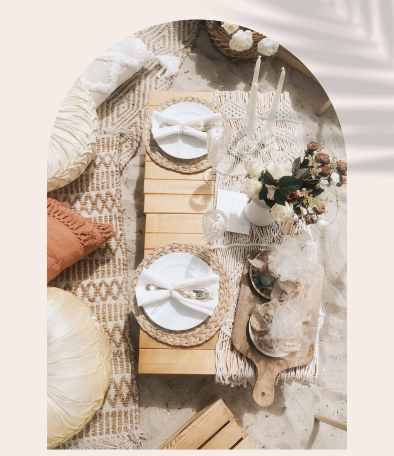
This is an example of the type of picnics that she creates. Based on my knowledge I believe this fits the boho interior design style that I mentioned, but I guess there are different interpretations of that.
See, that’s exactly what I meant. The original concept of “Bohemian” and the very thought of “interior design” were diametrically opposed, and really should still be so.
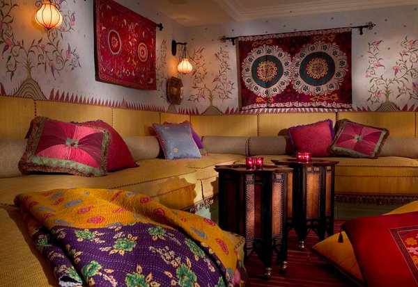
But concepts, beliefs and people’s perceptions change over time. Bohemian is absolutely a style of interior design now. RKK posted a fine example of it.
I think your work matches the look of your friend’s business and the visual branding she’s already developed. It’s good. I think you’ve captured it.
The discussion veered off into a discussion about trends and styles, which is interesting but a little removed from whether or not what you came up with works for what it’s intended to accomplish.
As I said, your branding work is good. What you’ve done works nicely. Whether it’s part of this or that style or fits in with this or that trend doesn’t matter. So quit trying to match trends and styles and describing your work in those terms. Doing so places artificial sideboards around your design problems that don’t need to be there. The only thing that matters is whether the solutions you come up with are appropriate for the problems at hand.
Right, my “shouldn’t be” comment was probably off the mark, although I’m sure there are fellow cranky old bastards who would understand.
And then again, RKK’s example alongside the OP’s subsequent picnic photo demonstrates that different people are calling different styles by the same names—kind of the point I was trying to make. Mining examples of “Bohemian” results in a range of styles, so nailing down what a client means when they say “boho” is entirely a matter of gleaning client’s respective associations; there’s no empirical or universal boho to reference.
What’s with the inclusion of .co in the name is it a URL?
Maybe I don’t understand your mates business well, but that doesn’t really feel consistent with organic/earthy/carefree feeling of the rest of the branding.
I get that you might have included it counterbalance the visual weight of the “P” - but I’m not sure this is the best reason or solution.
My $2c for what it’s worth - like the colour palette.