Lewis, you mentioned the cinema being historic, so if that’s the case, the character and history of the cinema should be considered.
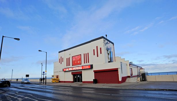
I took the liberty of looking it up based on the clues you provided. I’m assuming we’re discussing the cinema near Redcar, England, correct? (Photo below)
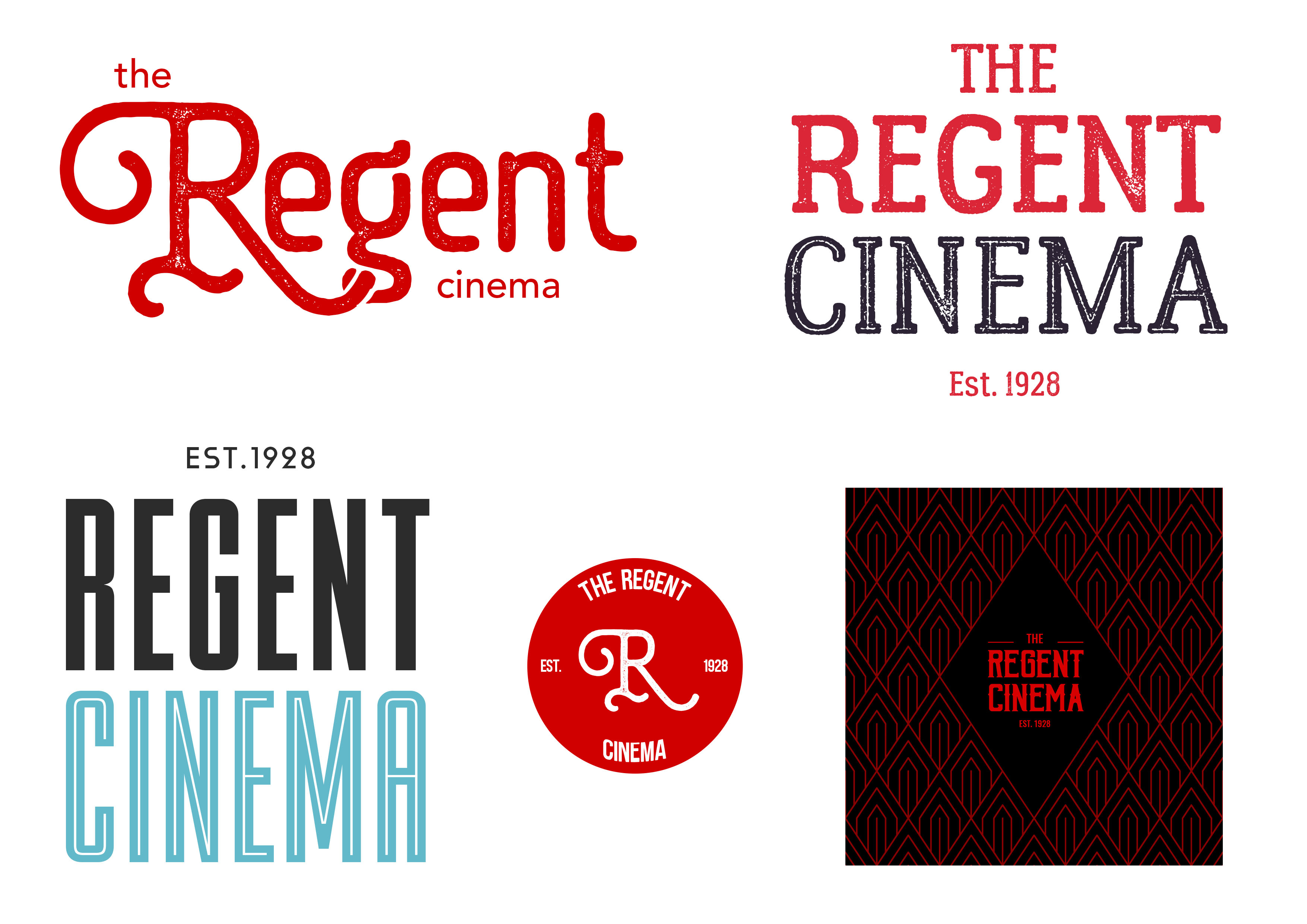
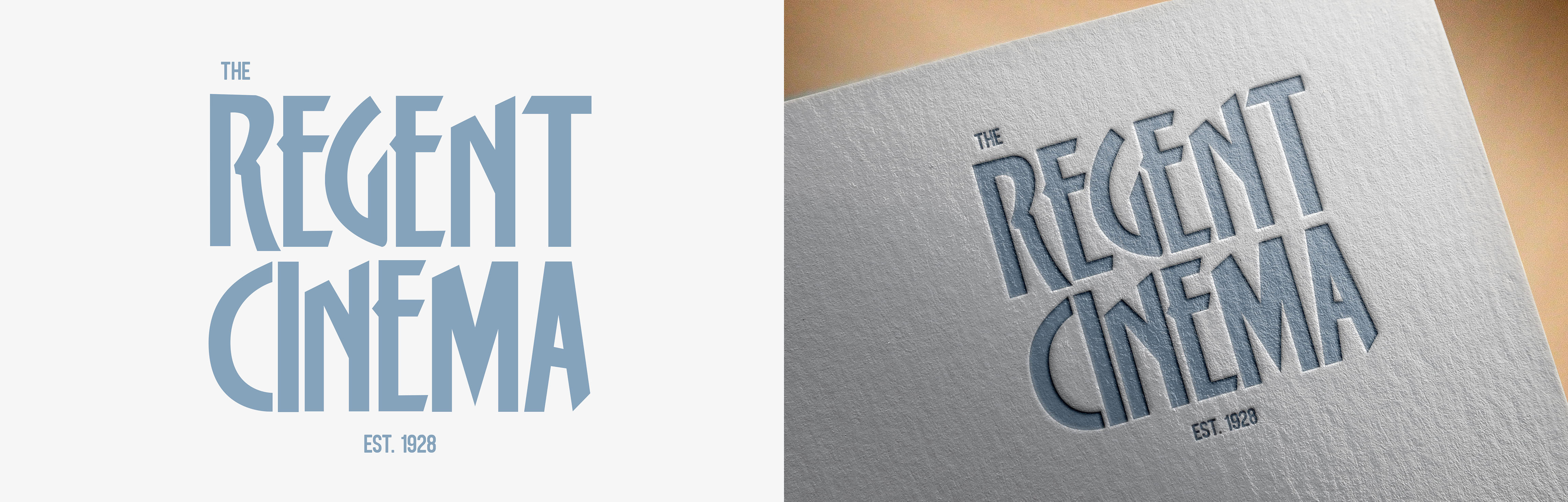
If so, the building is unusual, with an Art Deco facade.
A little more research shows that the cinema was recently renovated with overwhelming support from the local community — many of whom have good memories of the cinema, apparently love it and want it preserved.
The reason I’m mentioning all this is because it’s a prime example of how a logo and visual branding can’t be designed in a vacuum that focuses mostly on aesthetics.
Instead, a logo should be considered as part of a larger brand that reflects the personality (or desired personality) of the entity it represents. It also needs to resonate in an appropriate way with the target audience.
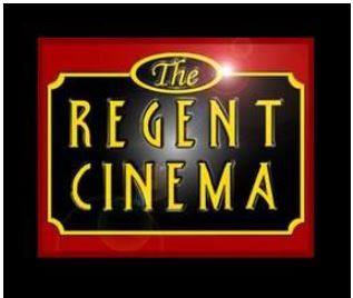
In the case of this cinema, it’s a quirky building in an interesting location with historic Art Deco motifs. It’s also loved by both the local community and visitors to the area who probably all have fond memories of the place.
In visual brand design, it’s extremely important to do research, then develop a visual identity that is in keeping with the findings uncovered by the research.
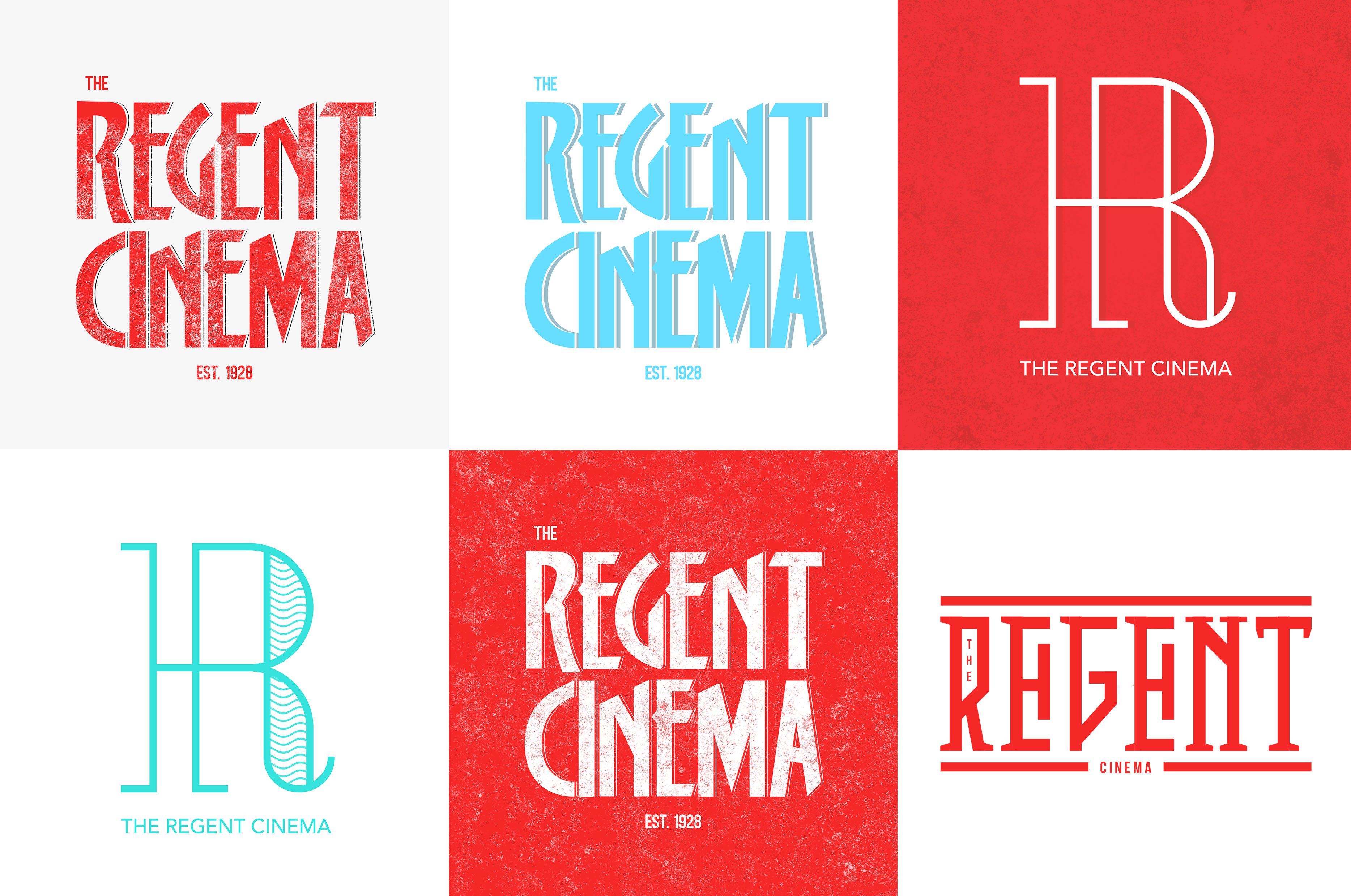
Just based upon the little research I did, I wouldn’t even consider a modern logo that might be more appropriate for a newer, multi-theatre strip mall complex. This cinema is special, unique, quirky and beloved for what it was and still should be. Any branding modifications need to be in keeping with that.
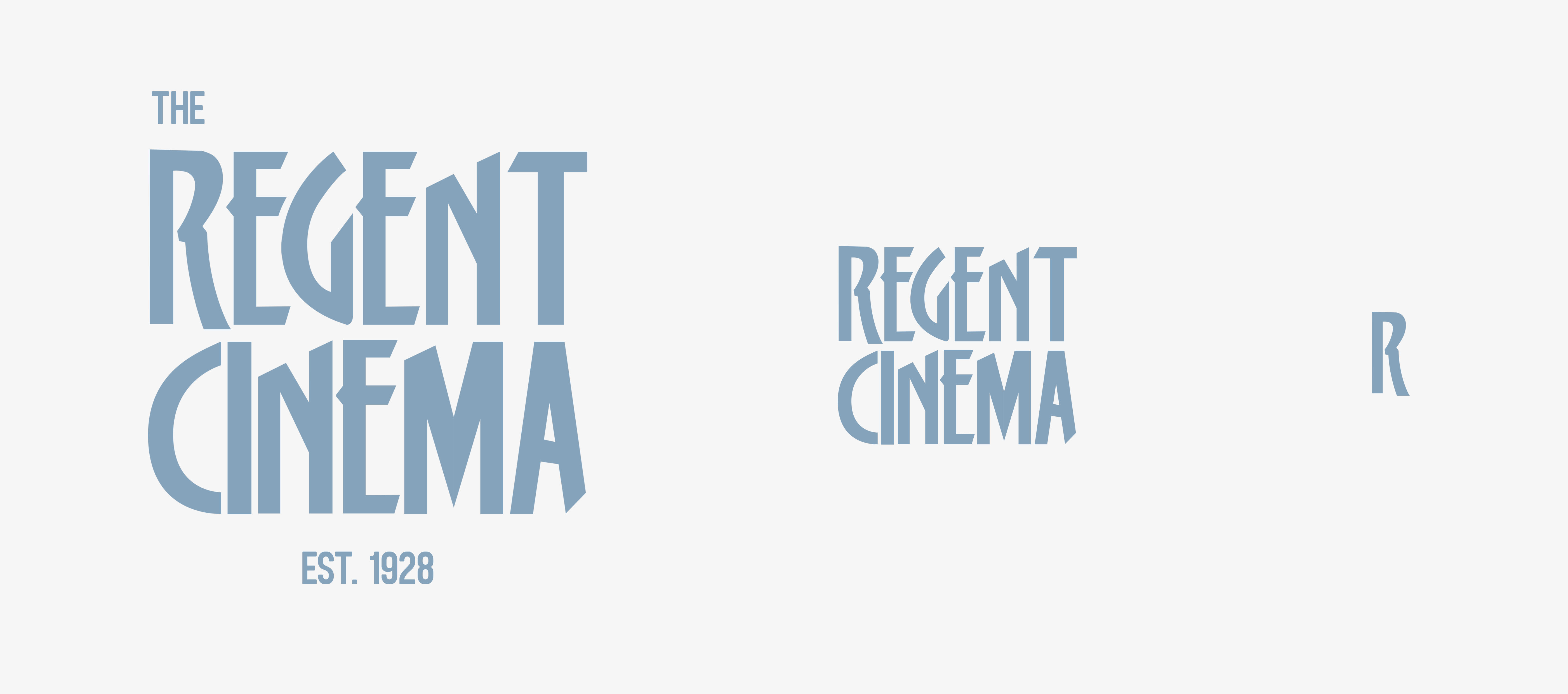
All this considered, if it were my project, I’d likely head straight toward a refinement of their existing Art Deco logo with hardly any thoughts to the contrary.