I’d love to hear some critiques
3 Likes
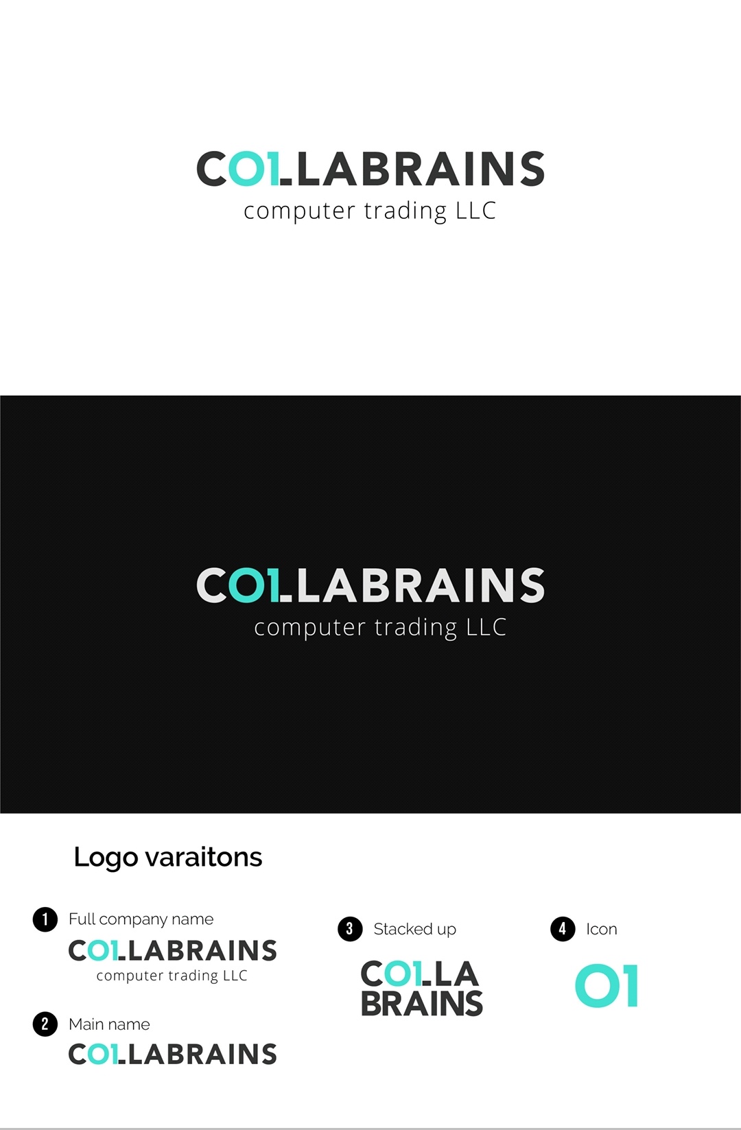
I’ve been looking at this for a while. I want to like it more than I actually do like it. Honestly, I think my holdup is the name. I don’t know what colla means – it sounds slang for collar in my mind – and putting it together with brains doesn’t produce a word that is immediately recognizable. I think since it is not a word that is immediately recognizable, working the 01 into the word mark makes it a bit too tough to read. Is it C 01 Labrains? Col LA Brains? To my eye, the visual emphasis is on LABRAINS. I realize that, assuming this is a real project, you probably didn’t come up with the name.
I’d recommend pushing this a little more. What if COLLA was the teal and BRAINS was in black? That might help the legibility. Or maybe it needs a mark that is separate from the type. Maybe you can do a CB monogram and work an 0 and 1 into the monogram.
I’ll be interested to hear what others have to say.
2 Likes
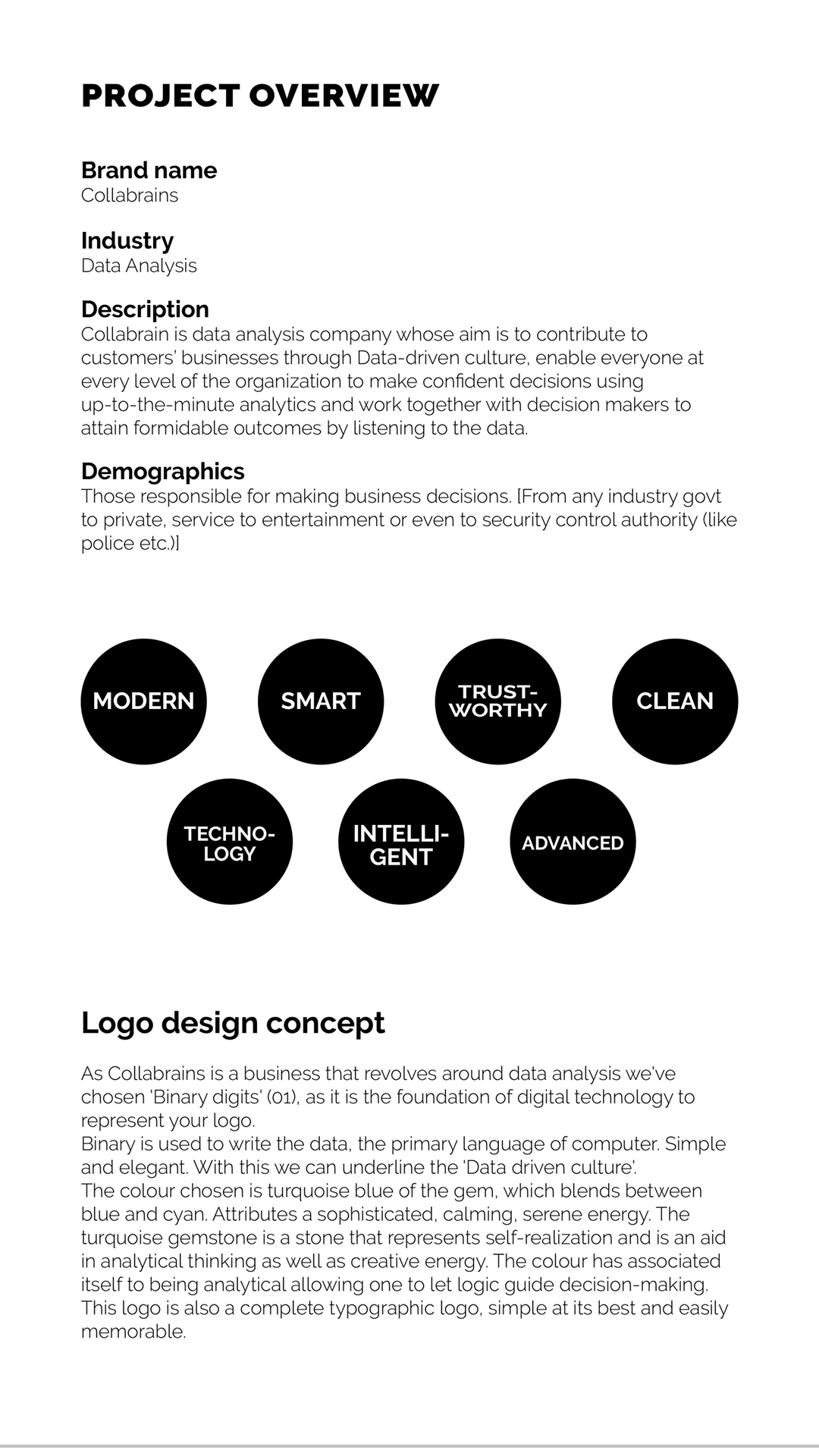
I’m assuming it’s a mixture of collaborate and brains. I see how they’ve isolated “0” and “1” in the word as a visual nod to binary data which is at the heart of “coding” and computers. I think all in all it works pretty well,
My biggest concerns are the sort of sea foam green color. It’s modern, but on white it doesn’t have enough contrast to stand out and tends to get lost, which in turn puts the visual focus on C LABRAINS which is counter productive, IMO.
I also don’t think that the 01 on it’s own works as an Icon. Much in the same way that the 31 within the Baskin Robbins logo would not work on it’s own. By itself, it loses context. Or in a similar way, you couldn’t just use the “hidden” FedEx arrow as an icon. The stacked version is also unnecessary IMO. Not all companies have a stacked version, and in this case, the way the word breaks is very awkward. Since it reads more like “Calla” or “Cola” Brains rather than Co Lab Rains.
Lastly, if you really want to push forward with the 01, I’d at least look at the idea of making the 1 have more of a slight down angled terminal, rather than it being horizontal to give it more of an instant recognizability of being an “01”.
2 Likes
I’m working on another concept. I’ll update after it’s finished ![]()
You’re probably right, but I certainly didn’t go there at all.
I also struggled to recognize the 01 in the name and to read the name.
Have you explored keeping the 01 the same colour as the rest of the word and maybe differentiating it with a different typeface or by putting a slash in the zero to make it more apparent?
Have you also considered making a seperate icon of a brain (maybe with binary somehow??) and leaving the text alone?
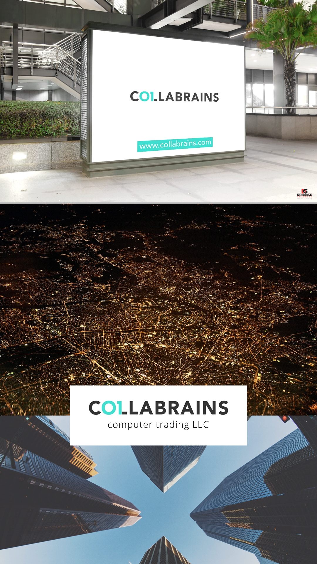
Also would recommend making “computer trading LLC” the same font as the main text (obviously in a lighter weight font like you’ve done).
That said, it’s a clever idea integrating the 01 in the word am looking forward to seeing what you come up with!
1 Like
Thanks a lot for your suggestions. But the client hasn’t approved the concept yet. If the client likes I’ll have to make it better. There is another which they probably like. I’ll post it here right away
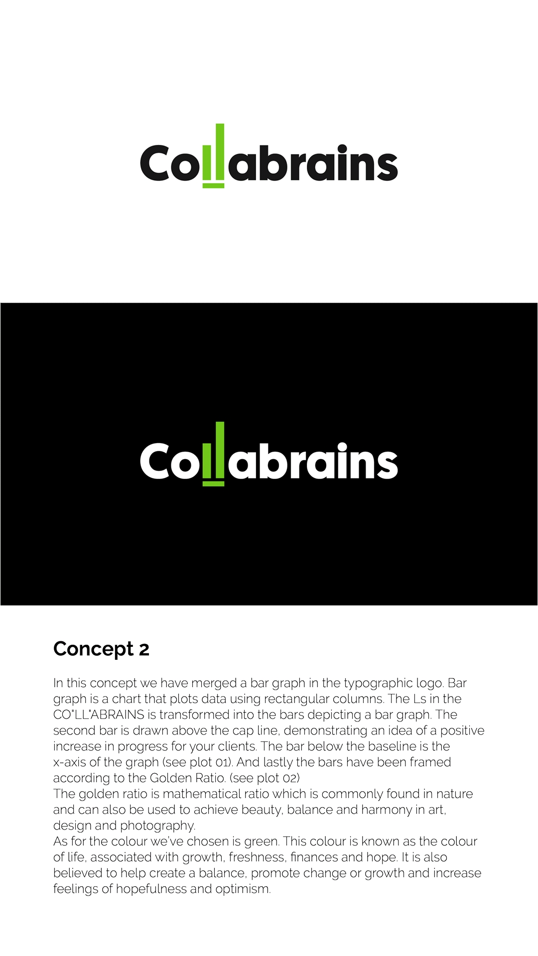
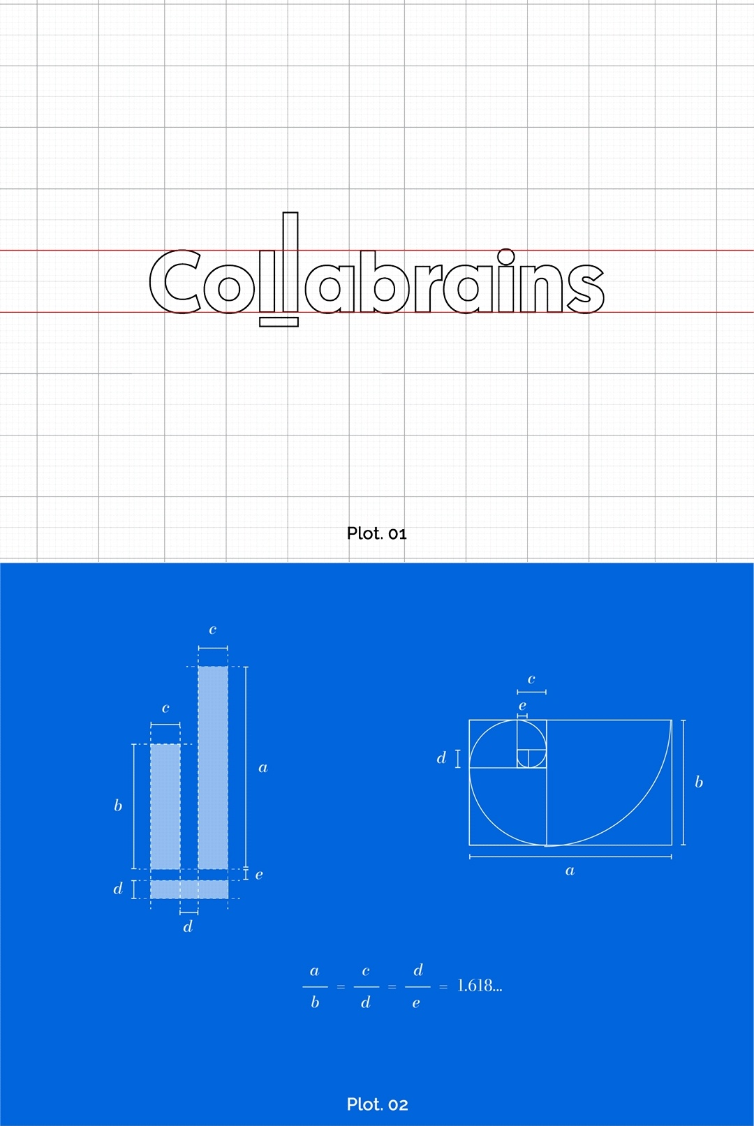

There is also an Arabic version for the logo. Which makes relevant since the company is based in the Middle East
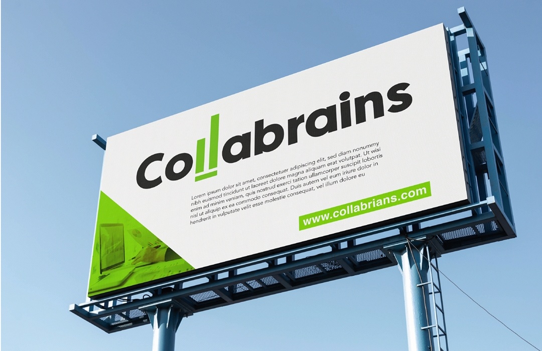
Wow! I really like your graph version. Font choice, ll as graph that stands out but is still balanaced with the rest of the word, the word still reads well too. It’s eye catching in English and Arabic.
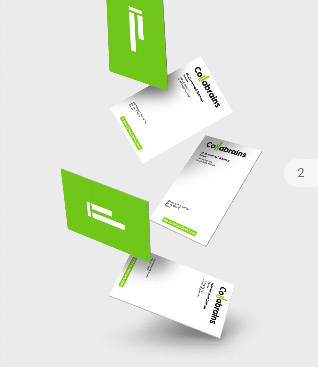
I also really like the one side of the business card with the bar graph alone. Really memorable.
I liked your concept for the binary but almost anytime I think of binary I think of rows and rows of 0s and 1s so just one of each didn’t excite me. I suppose you could try to have a bunch of 01s that create the shape of the ll but I think I still favor the bar graph.
1 Like