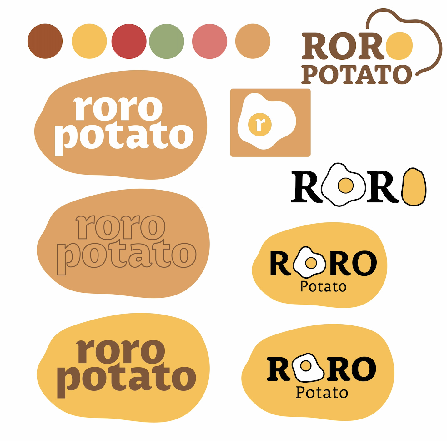
Hello everyone, one of my friend’s family members is planning to open up a breakfast/brunch restaurant and they are having me create their logo. The restaurant is called “Roro Potato”. The overall style they’re going for is something modern. I would love to get some feedback on the ideas I’ve had so far! The one logo with the egg and potato in the text was requested by the client but I’m not too sure that I like it. I also included the color palette for the overall branding because I will also be designing the menu.
Straight away, if modern – for whatever that’s worth – is a requirement, surely appropriate/effective would be a better direction to go in. Of course no-one wants what they do to look like a pastiche of a bygone time (unless intentionally so), but positively seeking ‘trendy / modern’ look will likely send you the wrong way.
With this, the first thing that strikes me is that, it is called roro potato and the thing I am getting from this, predominantly, is ‘fried egg’. I am also not a huge fan of the name. It is a bit of an awkward mouthful – not a good look for someone selling food!
Colours. To me they actually do look quite dated, especially the main sludge/caramel colour.
Type. Some of the letter shapes really jar, especially that crossbar on the lower case ‘t’, the top curve of the bowl of the ‘p’, bowl on the ‘a’, and the shoulder of the ‘r’. Is this a freebie font? It hurts.
Overall it is a bit of a visual cliché and doesn’t tell me anything about the flavour of the restaurant. Potato is not really something I would associate with breakfast anyway, apart from waffles, perhaps. That may be because it is outside of my frame of reference, being a Brit. I’d never have potatoes for breakfast. Eggs yes, but potatoes?! Is that a US thing?
Overall, it isn’t saying breakfast (hearty, healthy, or otherwise) to me, either actually, or emotionally, let alone giving me any sort of idea of the kind of breakfast I’d be getting – apart from a bit brown.
What kind of place is it? Diner-style. lazy Sunday morning, healthy, fast, exciting, fun. See what I mean? I can’t discern from this, colour-, image-, or type-wise what I am going to get. Well, apart from the colour. From this, I do get an idea and it is not all that appealing, I’m afraid.
Again, you have to temper some of my comments, with potential differences in cultural expectations. That is something for someone on your side of the pond to comment on.
Hope this helps.
Sprout, in the US we have Home Fries and Hash Browns. They aren’t french fries. It’s really hard these days to find a restaurant selling real Home Fries cuz the chain markets have decided that’s what they should call their deep fried crap. Real home fries are chunky potatoes (preferably with skin on) with onions and a bit of salt, pan or griddle fried. If a bit of bacon grease happens to get in there, all the better. Hash browns don’t really exist in my book. Hash is hash. It involves ground corned beef and chopped potatoes, pan or griddle fried to crispy goodness (bacon grease is also a plus ![]() )
)
As to the logo, what does Roro refer to? Is the the owner name or some other meaning?
What type of clientele are they hoping to attract?
What are the overall characteristics and demographics of the neighborhood where the business is located?
Is it traditional, American 2000-calorie breakfast or is it more upscale modern with more esoteric ingredients?
Is it Breakfast All Day, or just served before noon? (the reason I ask is you might associate the colors of a fine spring morning at dawn rather than something that looks like the middle of the desert at night.
A logo doesn’t have to mean all things to all people. A fried egg says breakfast. Baby-poo brown, not so much. You can do “earthy” without resorting to unattractive colors.
Maybe this message is underlying in previous posts, but even so, it would bear repeating: with “potato” as the central concept, this cannot work.